Azur Tours
Azur Tours (ATO) is a travel agency. Its identity is an invitation to depart: the blue of wide horizons, the gold of sand and sun, wings and a plane taking off. The promise “Explore The World” sums up the agency’s ambition, opening the world to its clients, from beach holidays to grand tours. The guidelines set the rules that keep the identity consistent on print, digital and in the agency itself.
The Logo
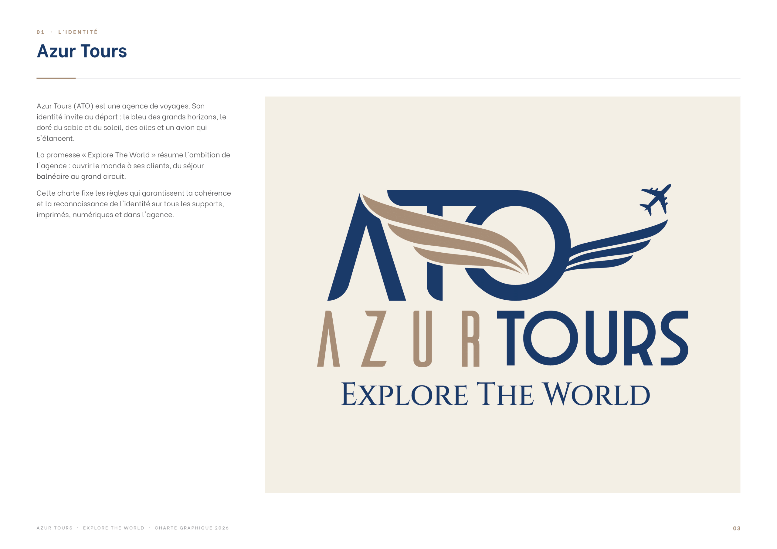
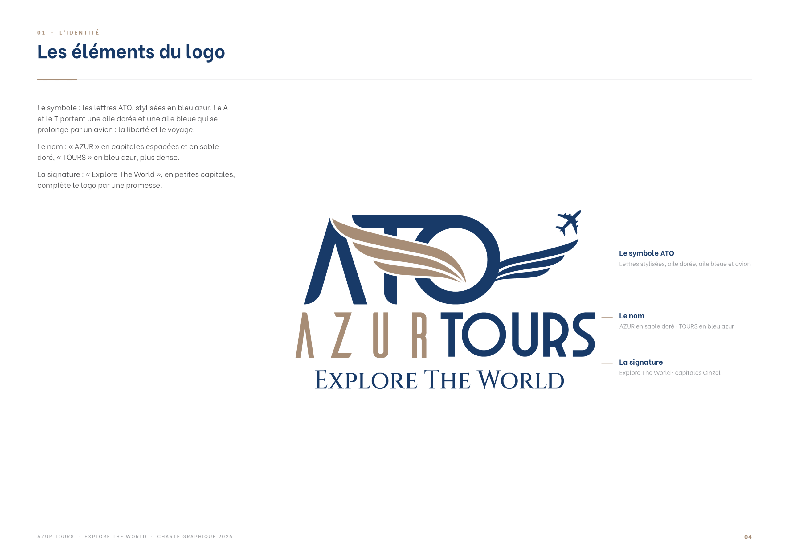
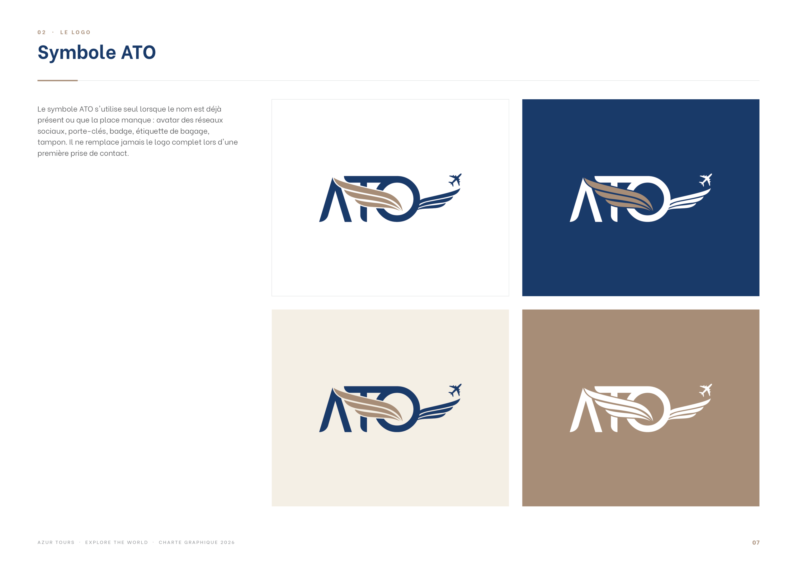
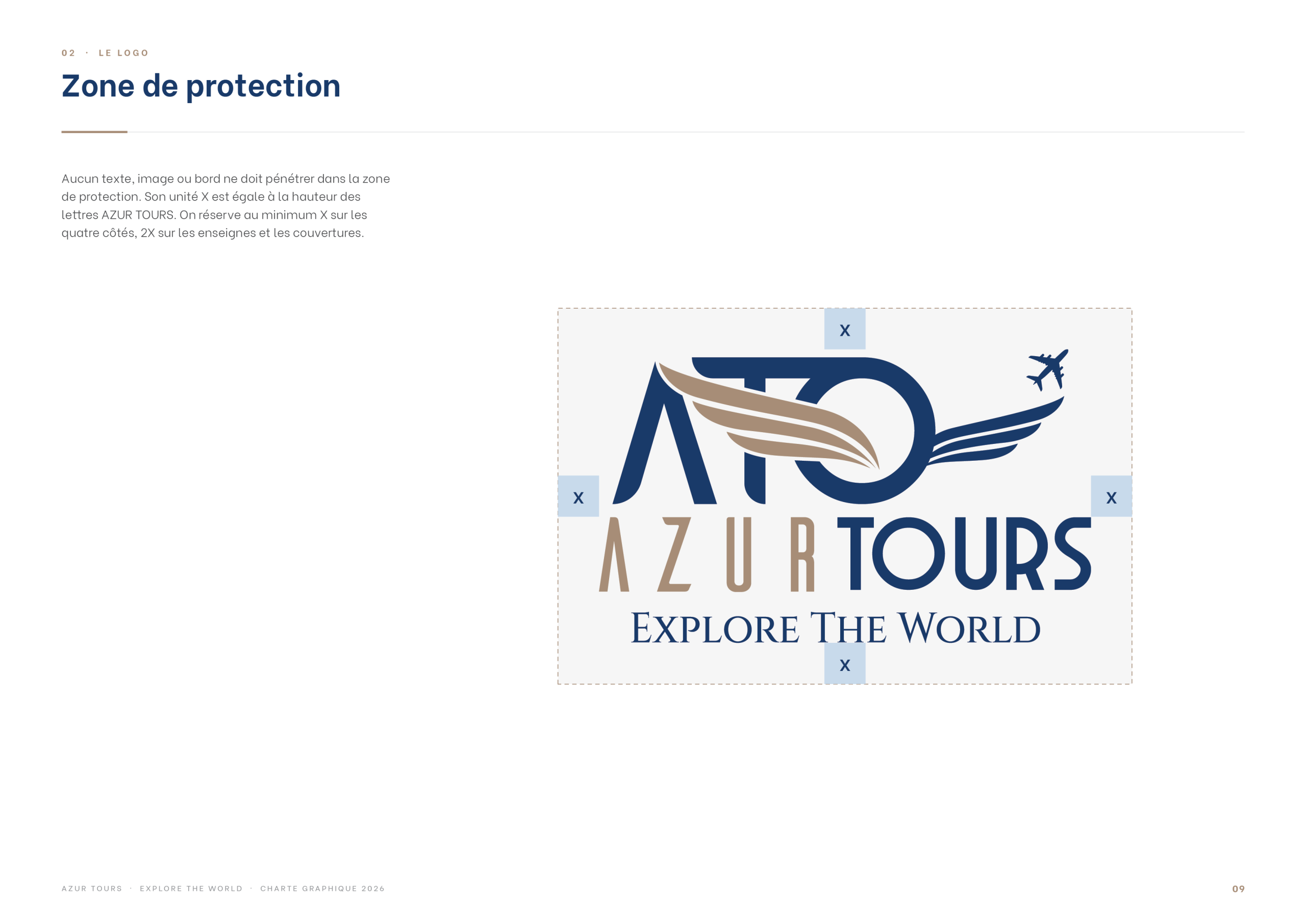
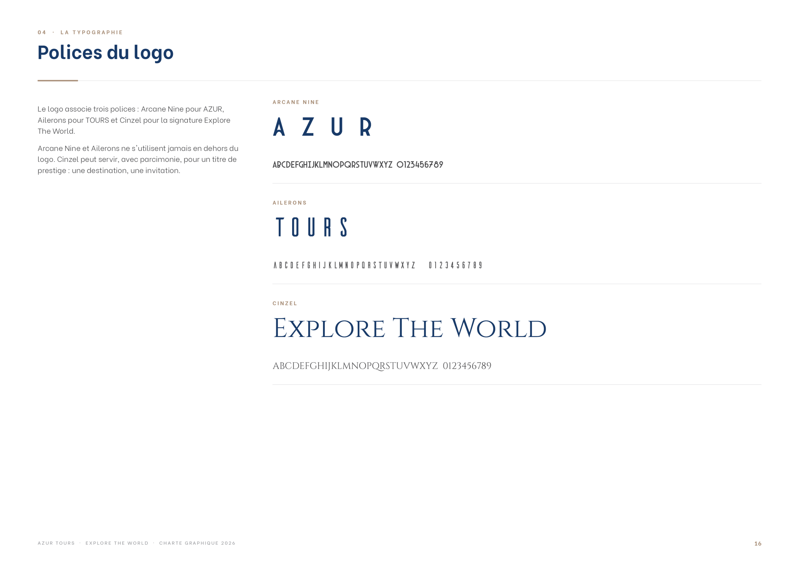
The symbol stylises the letters ATO in azure blue: the A and the T carry a golden wing and a blue wing that extends into a plane, a sign of freedom and travel. The name sets “AZUR” in widely spaced sand-gold capitals and “TOURS” in a denser azure blue, completed by the signature “Explore The World” in small capitals.
Colour Palette
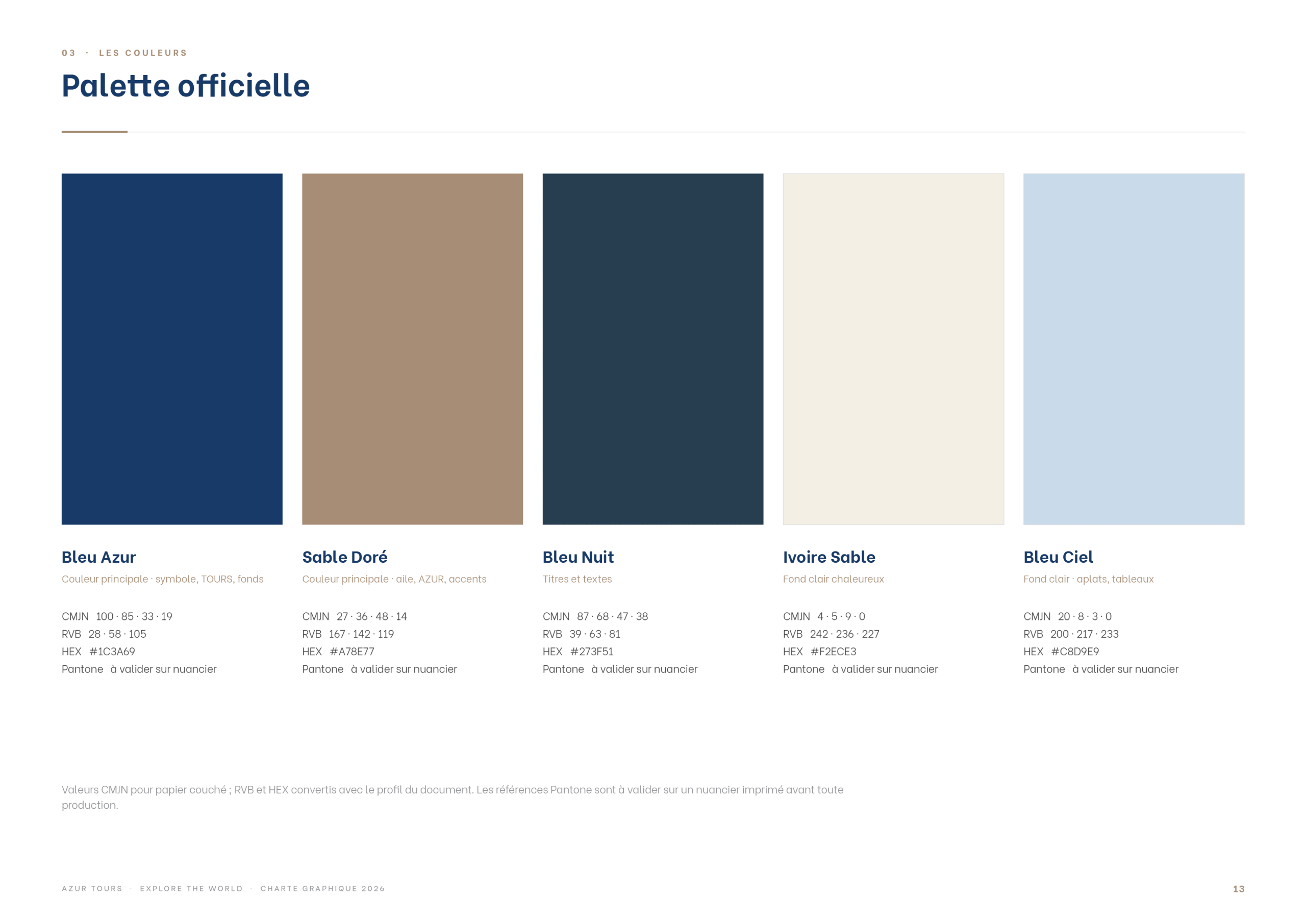
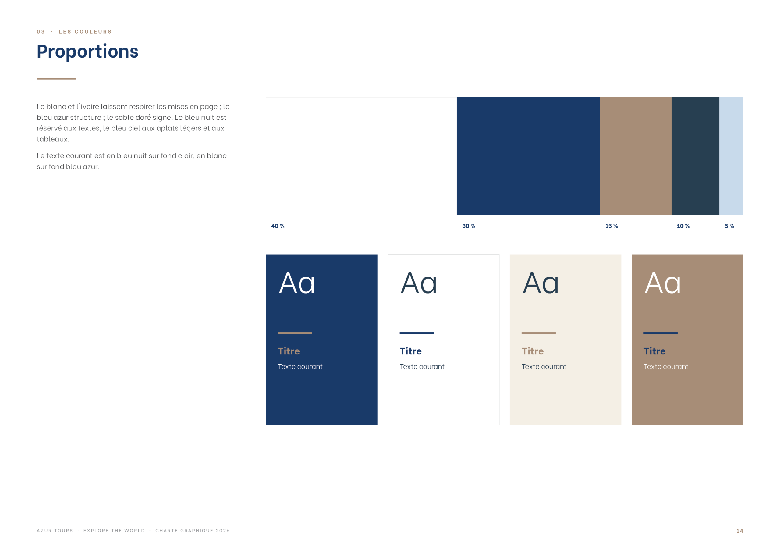
The palette pairs deep azure blue with warm sand and gold tones, balanced by soft neutrals, with clear proportions for every combination.
Typography
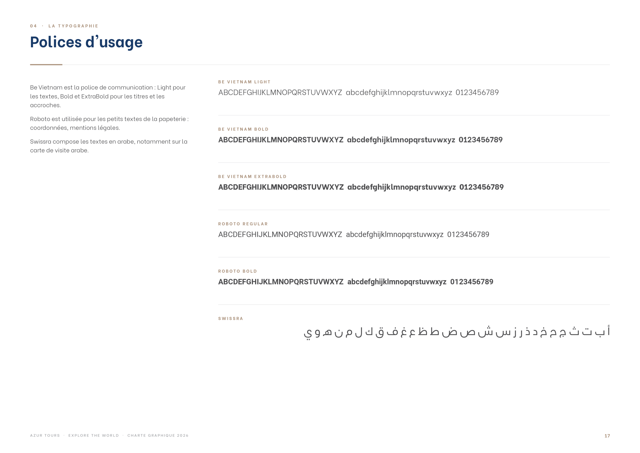
Alongside the typefaces of the logo, a set of everyday fonts is defined for titles and text, so every document speaks with the same voice.
Stationery
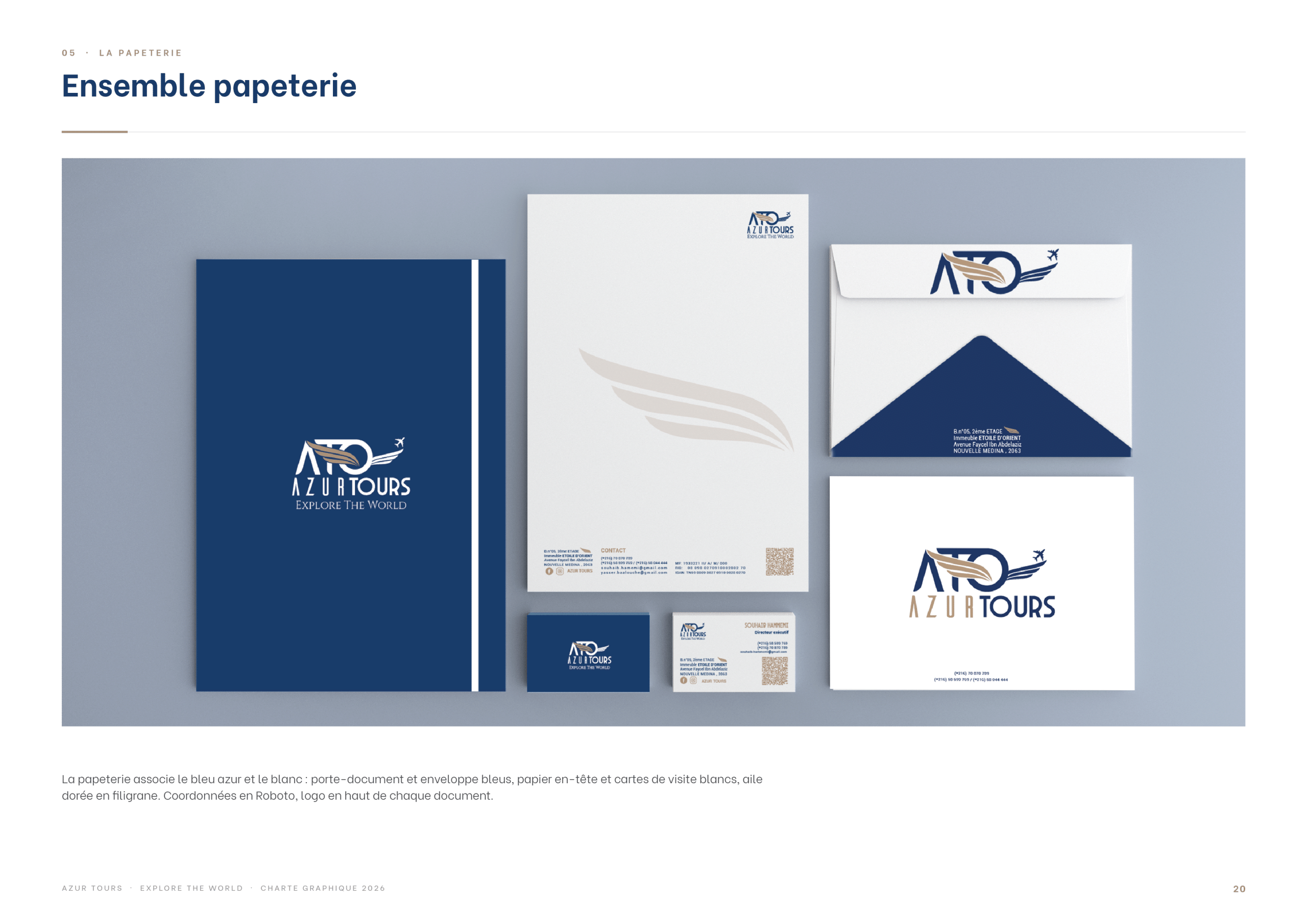
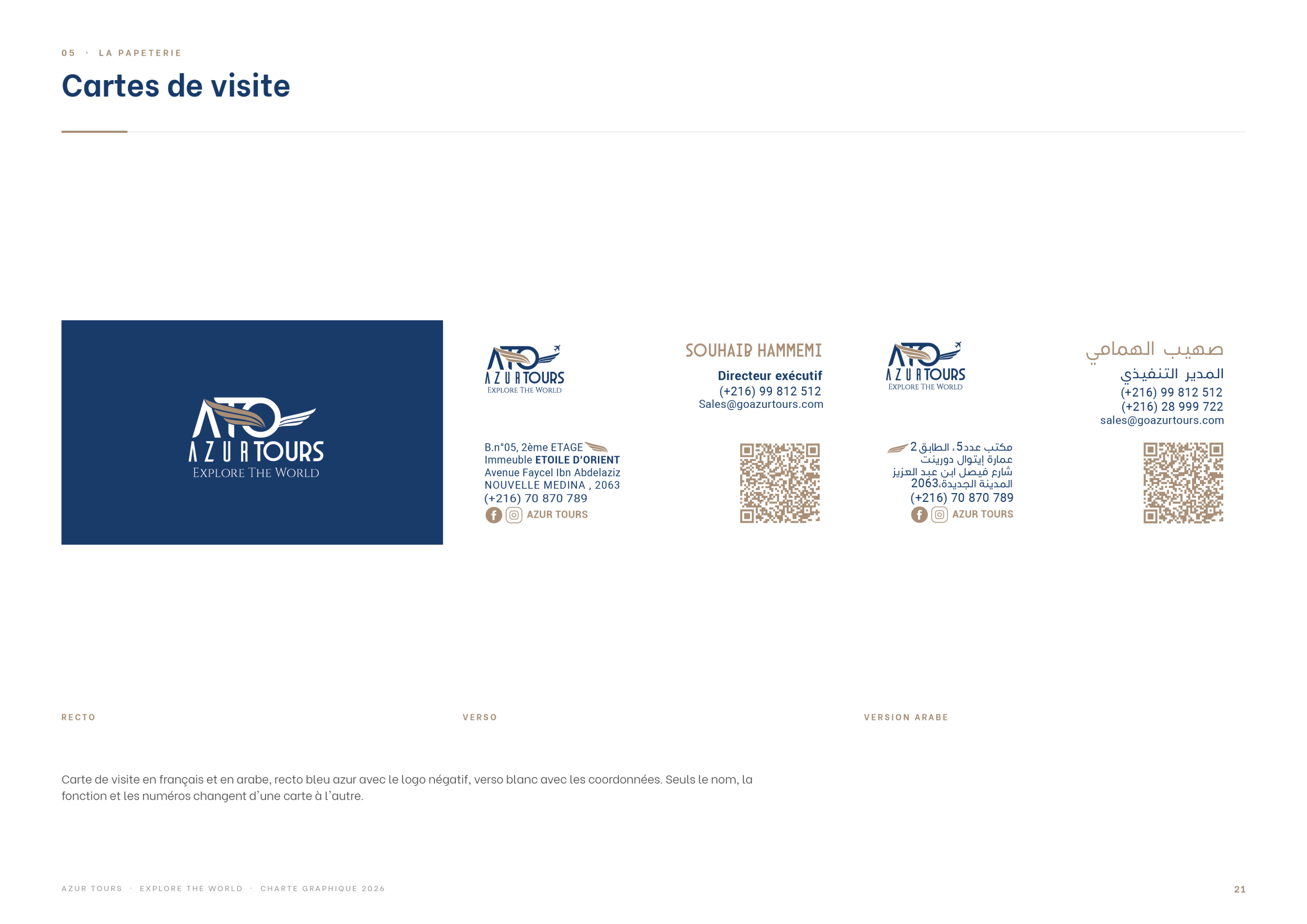
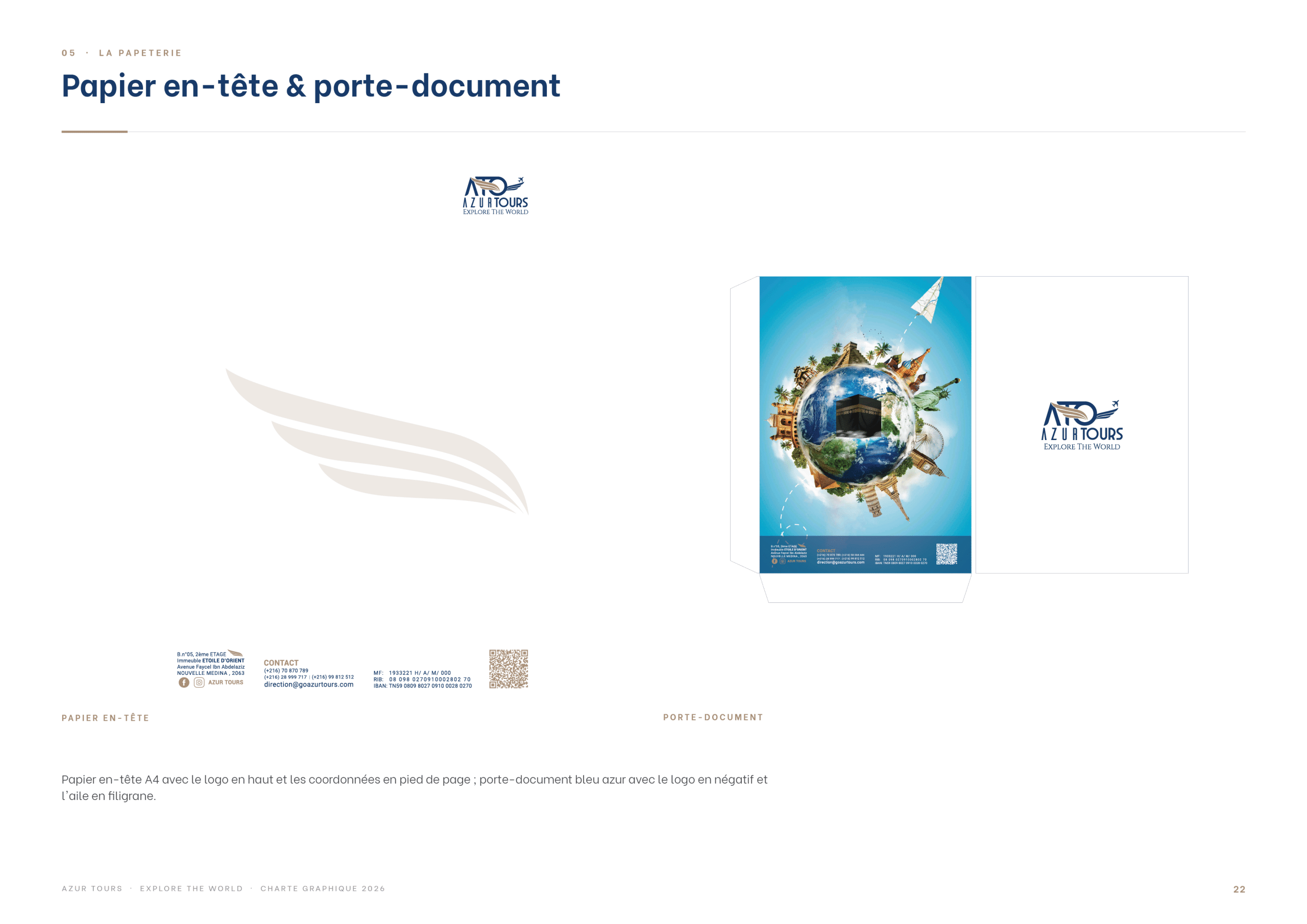
The identity is applied to a complete stationery set: business cards, letterhead and document folder, all in the azure and gold palette.
Print & Travel Documents
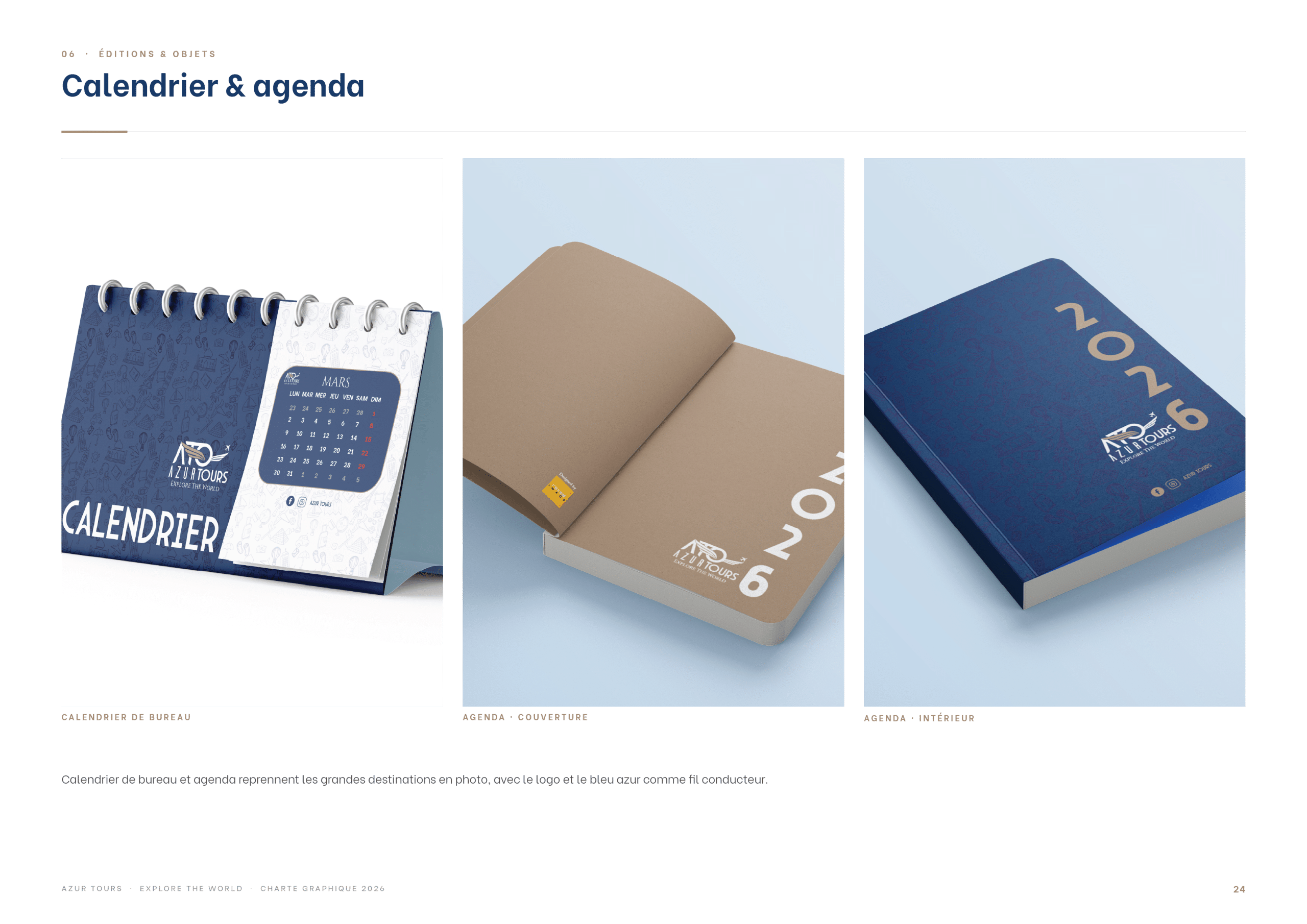
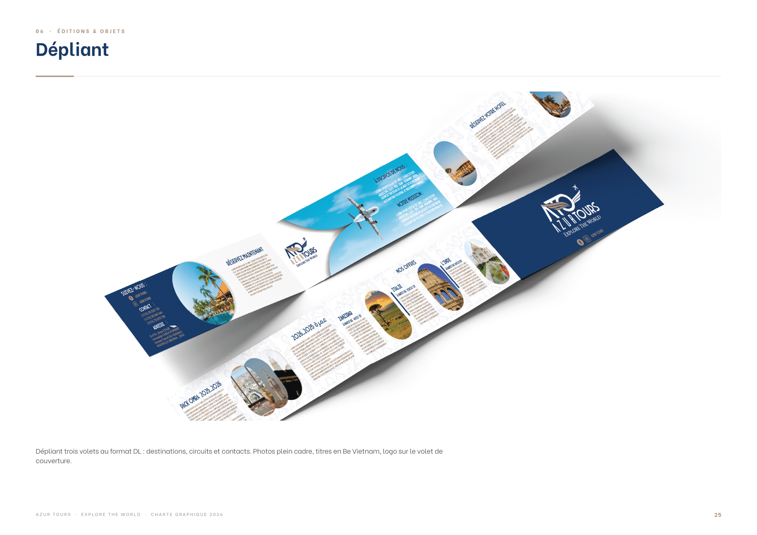
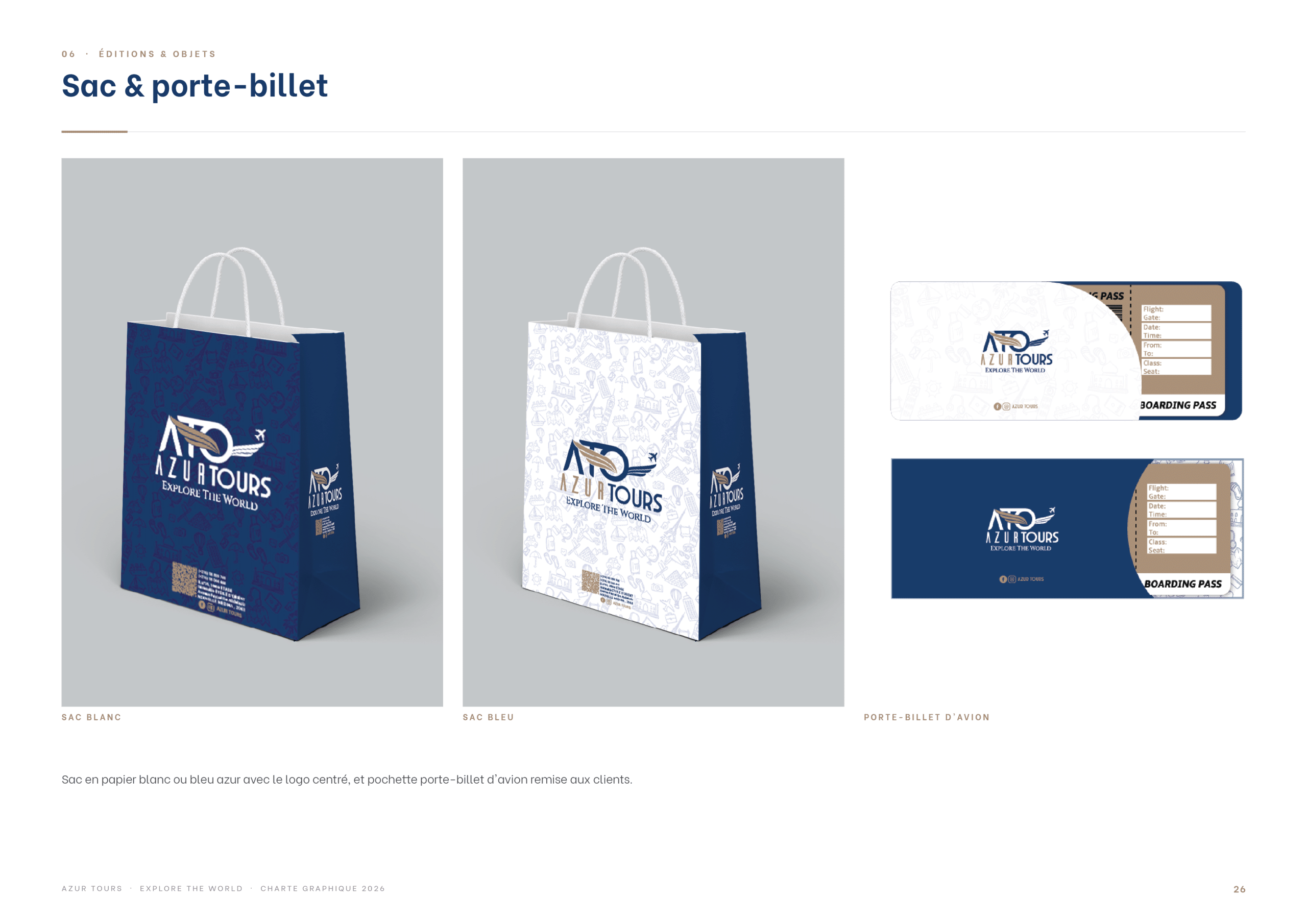
Calendars and planners, a folding brochure and a ticket wallet carry the brand into the clients’ hands, from booking to departure.
Promotional Items, Agency & Social Media
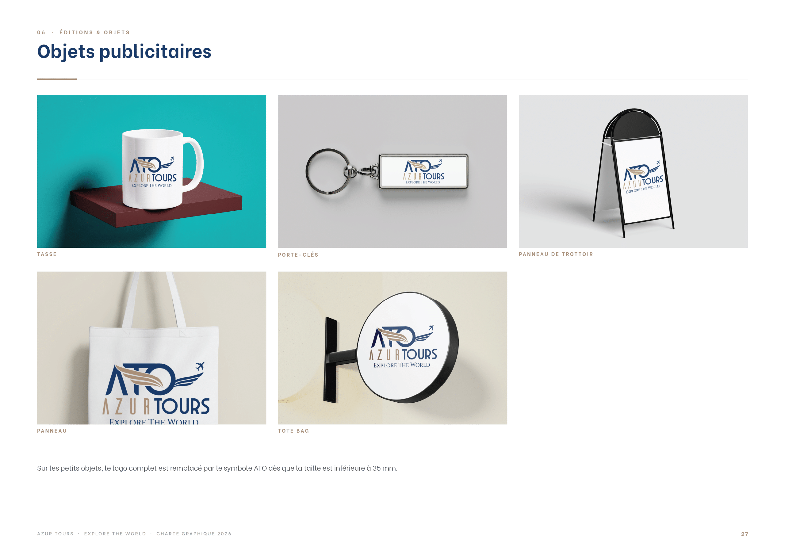
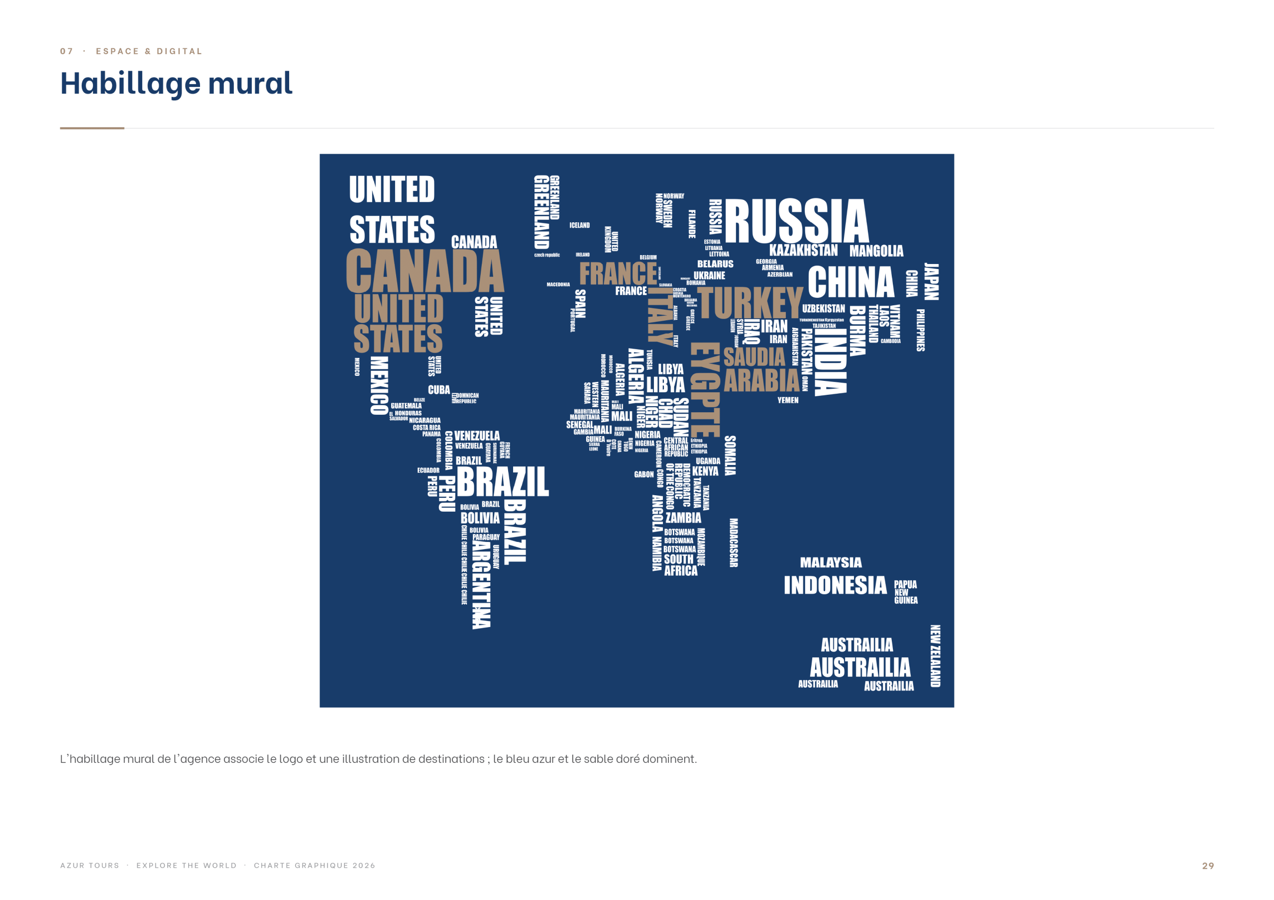
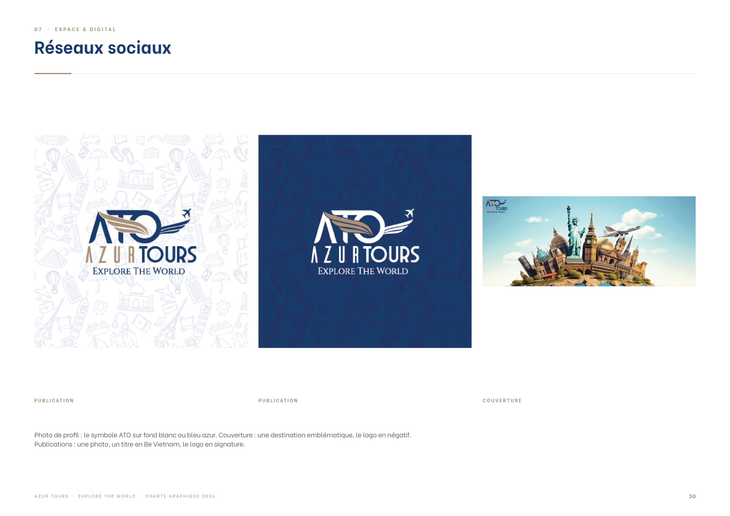
Finally, the brand extends to promotional items, wall graphics for the agency and templates for social media, giving Azur Tours a coherent presence wherever travellers meet it.