Fazendeiro: Café Lounge
Fazendeiro is a Portuguese word meaning “farmer”. The name places the café under the sign of the land, the product and work well done: freshly pressed juices, roasted coffee and homemade pastries. The identity turns the Café Lounge into a warm meeting place between the farm and the city, playing on a contrast: a bold, generous red on slate black, a simple typography and a rural symbol, the windmill.
The Symbol
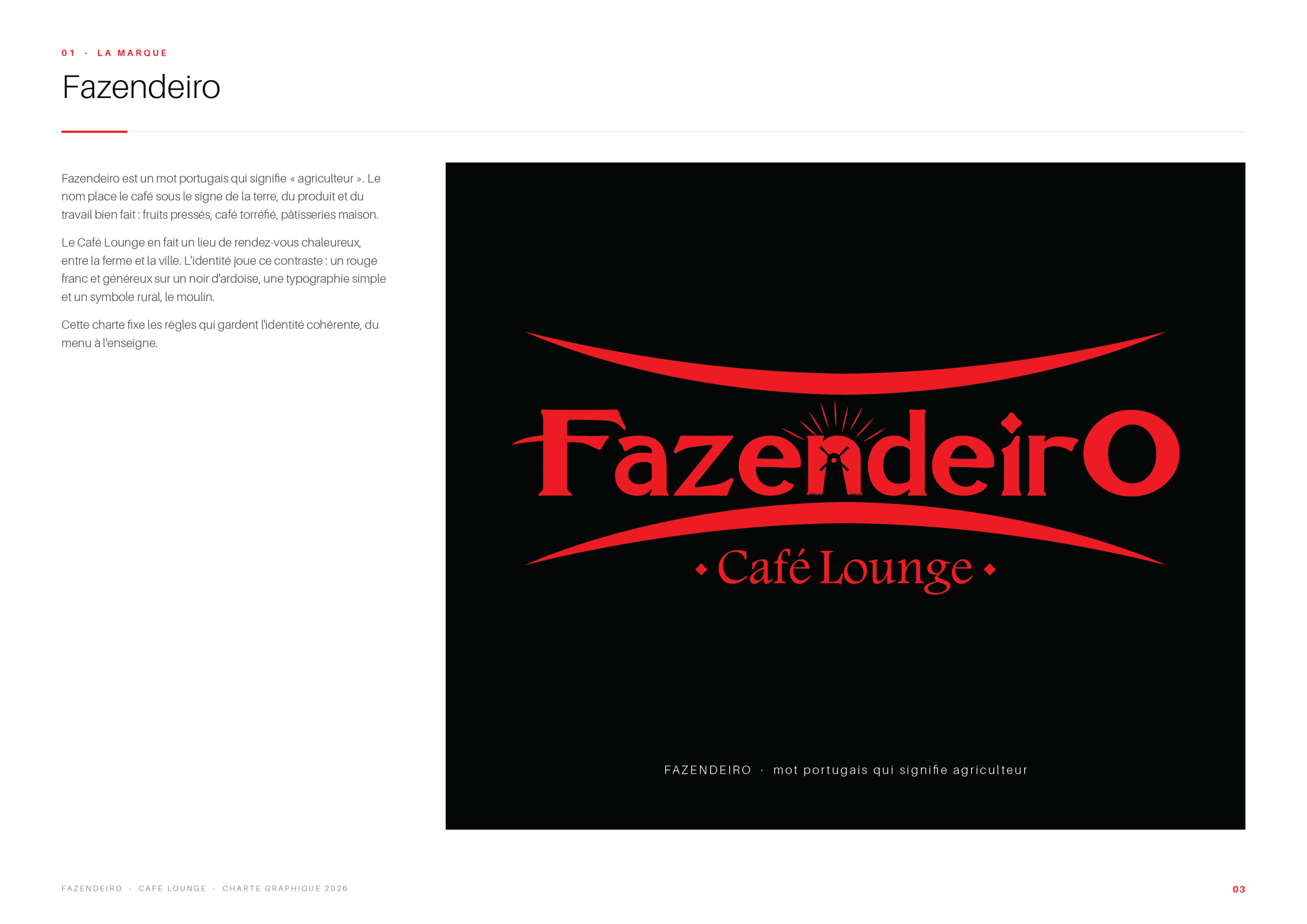
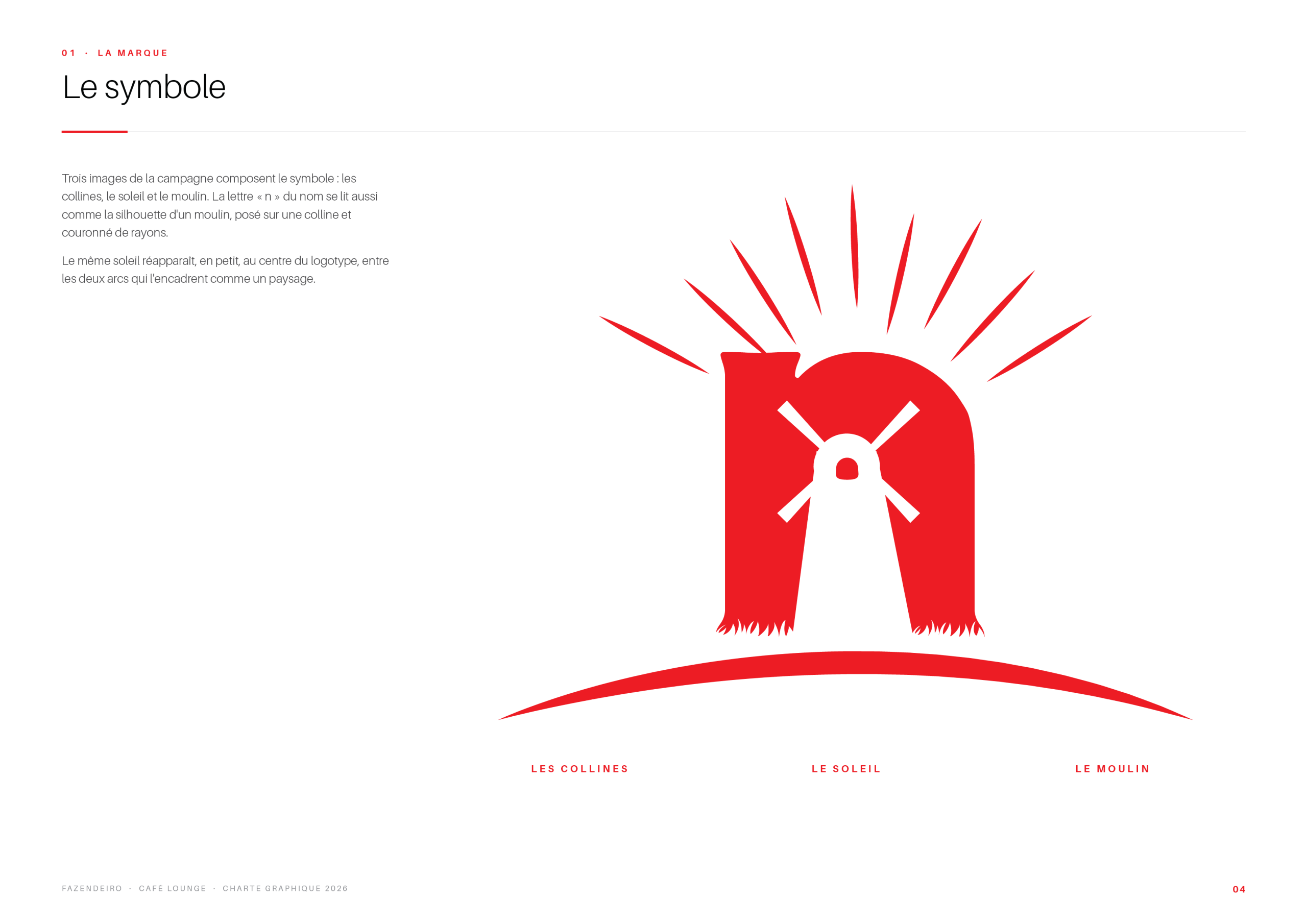
Three images from the countryside make up the symbol: the hills, the sun and the windmill. The letter “n” of the name also reads as the silhouette of a windmill standing on a hill and crowned with rays. The same sun reappears, small, at the heart of the logotype, between the two arcs that frame it like a landscape.
Logo Versions & Rules
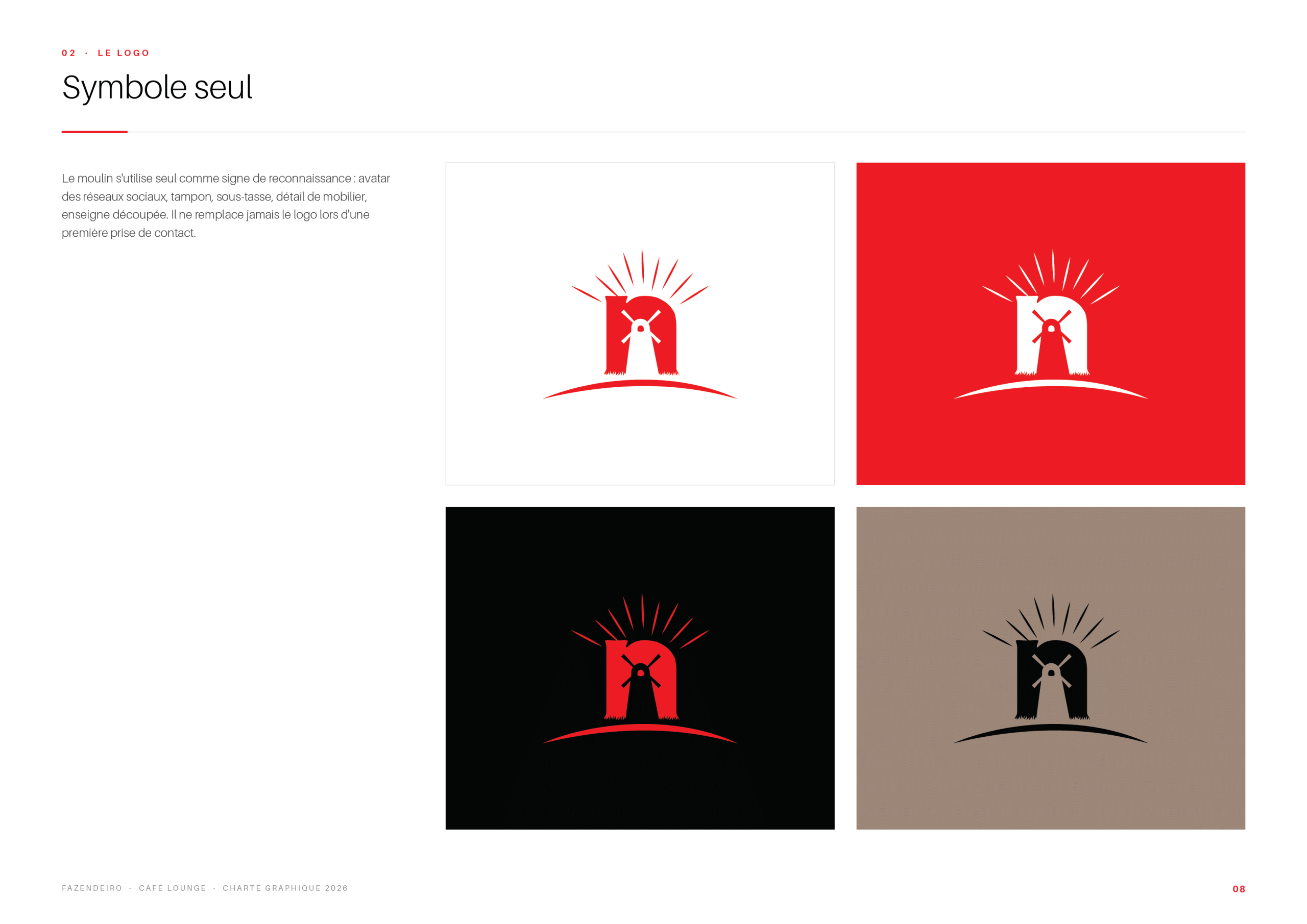
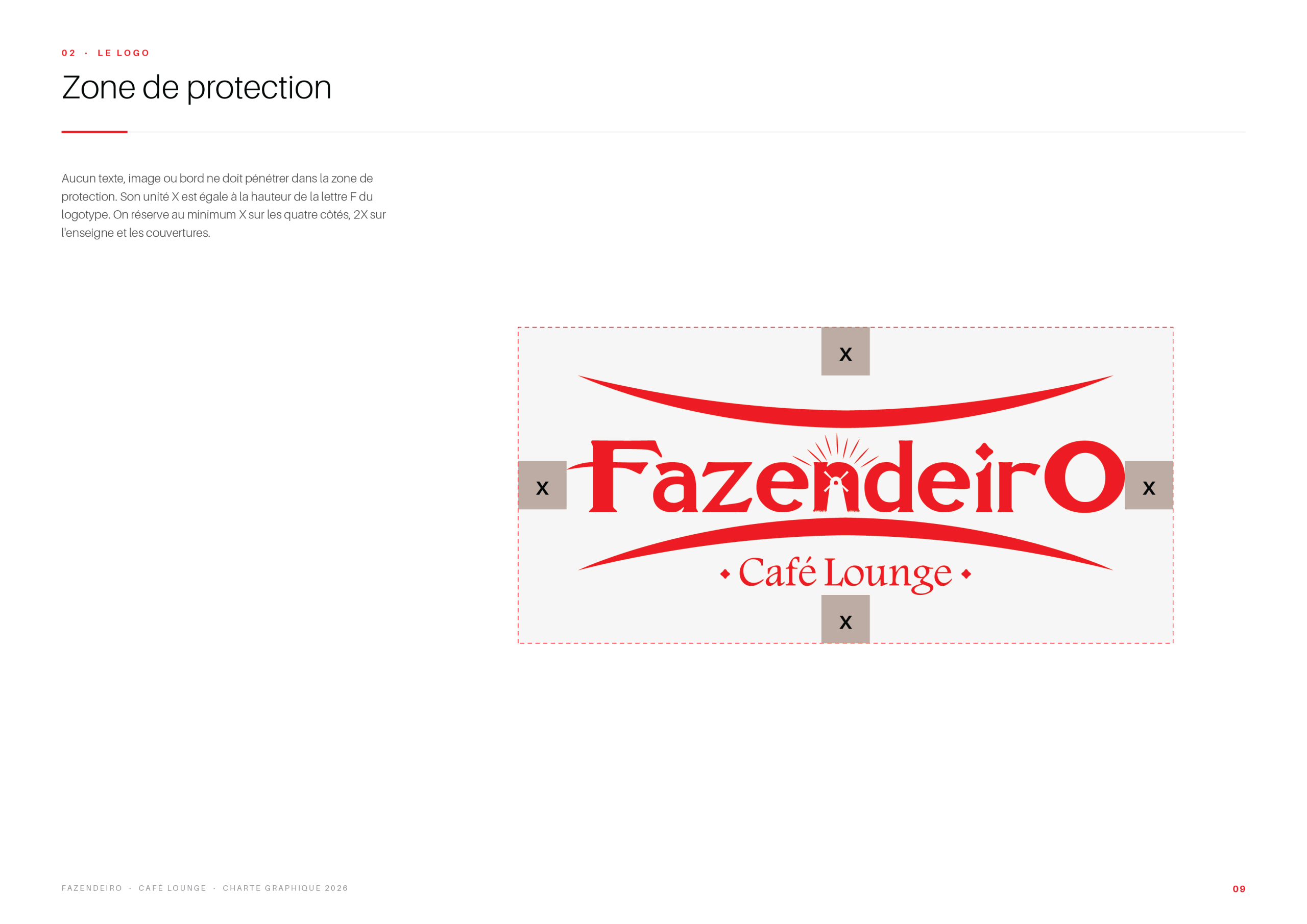
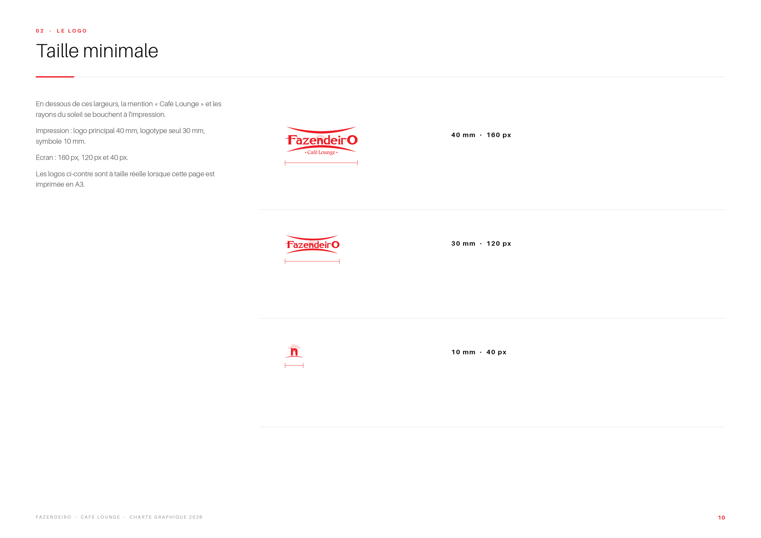
The symbol can be used on its own in red, black, white or on the brand’s neutral tones. The guidelines fix the clear space around the logo and its minimum size, so it stays legible from a coffee cup to a façade.
Colour Palette & Chalkboard Style
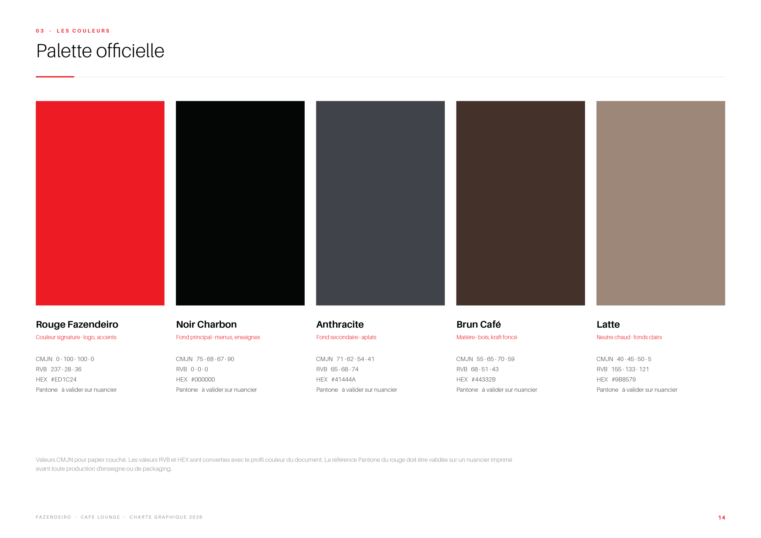
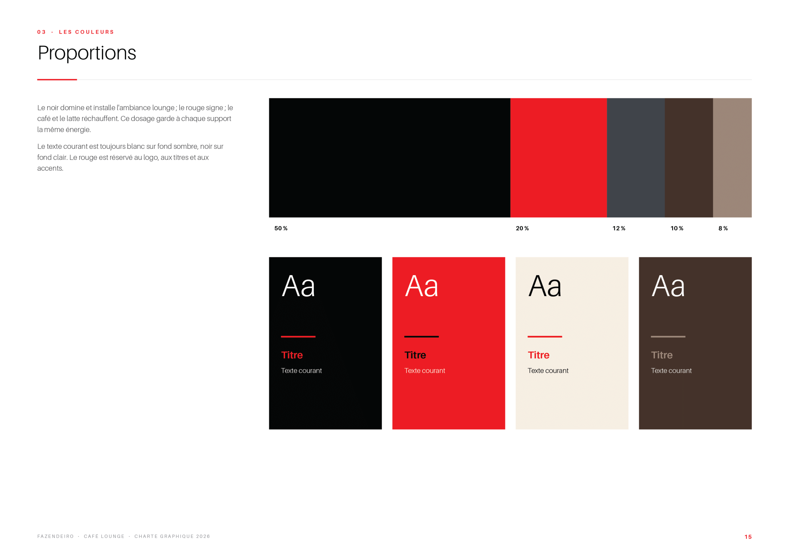
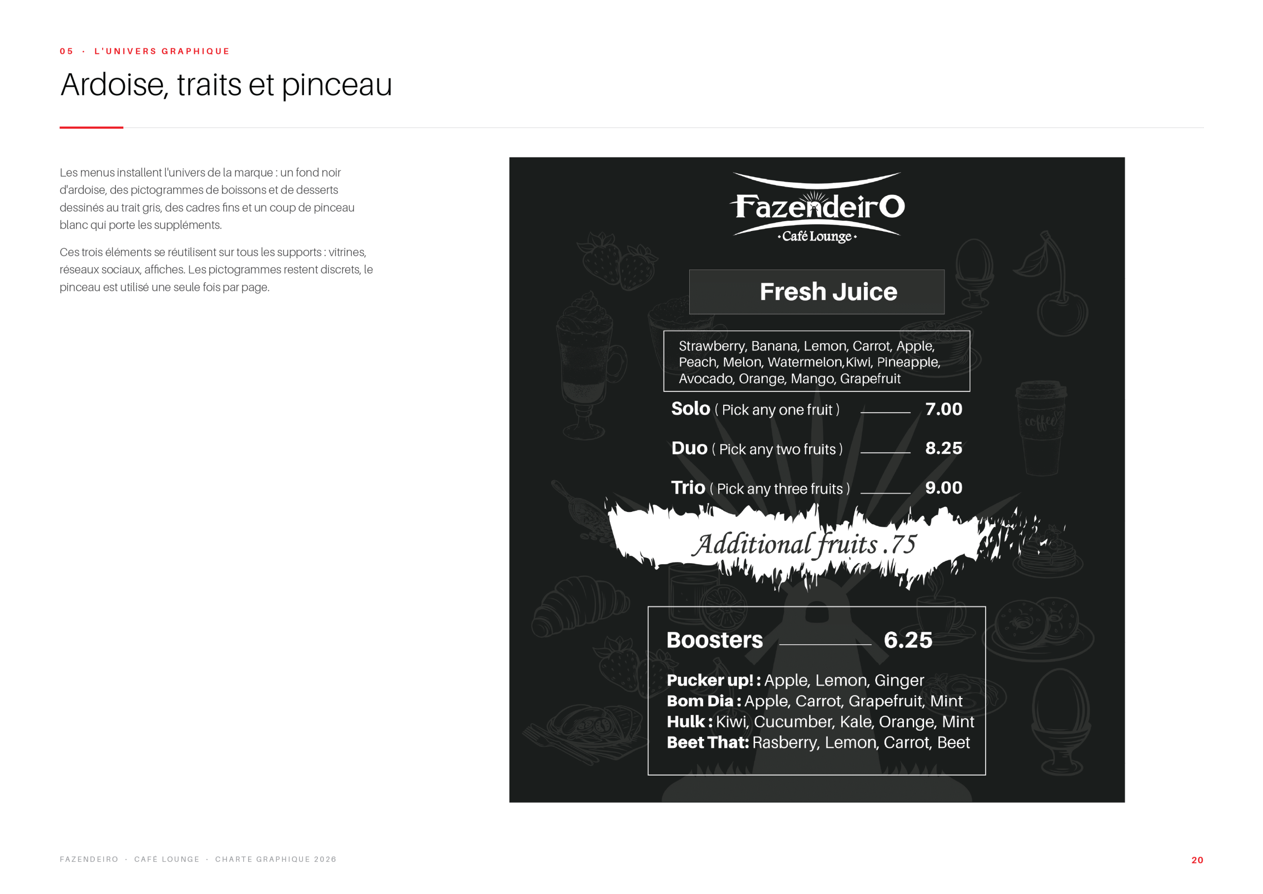
The official palette is built on a strong red, deep black, slate grey and two coffee browns, with clear proportions for each combination. For menus and specials, a chalkboard style with brush strokes brings the warmth of a handwritten café board.
Menus, Packaging & Events
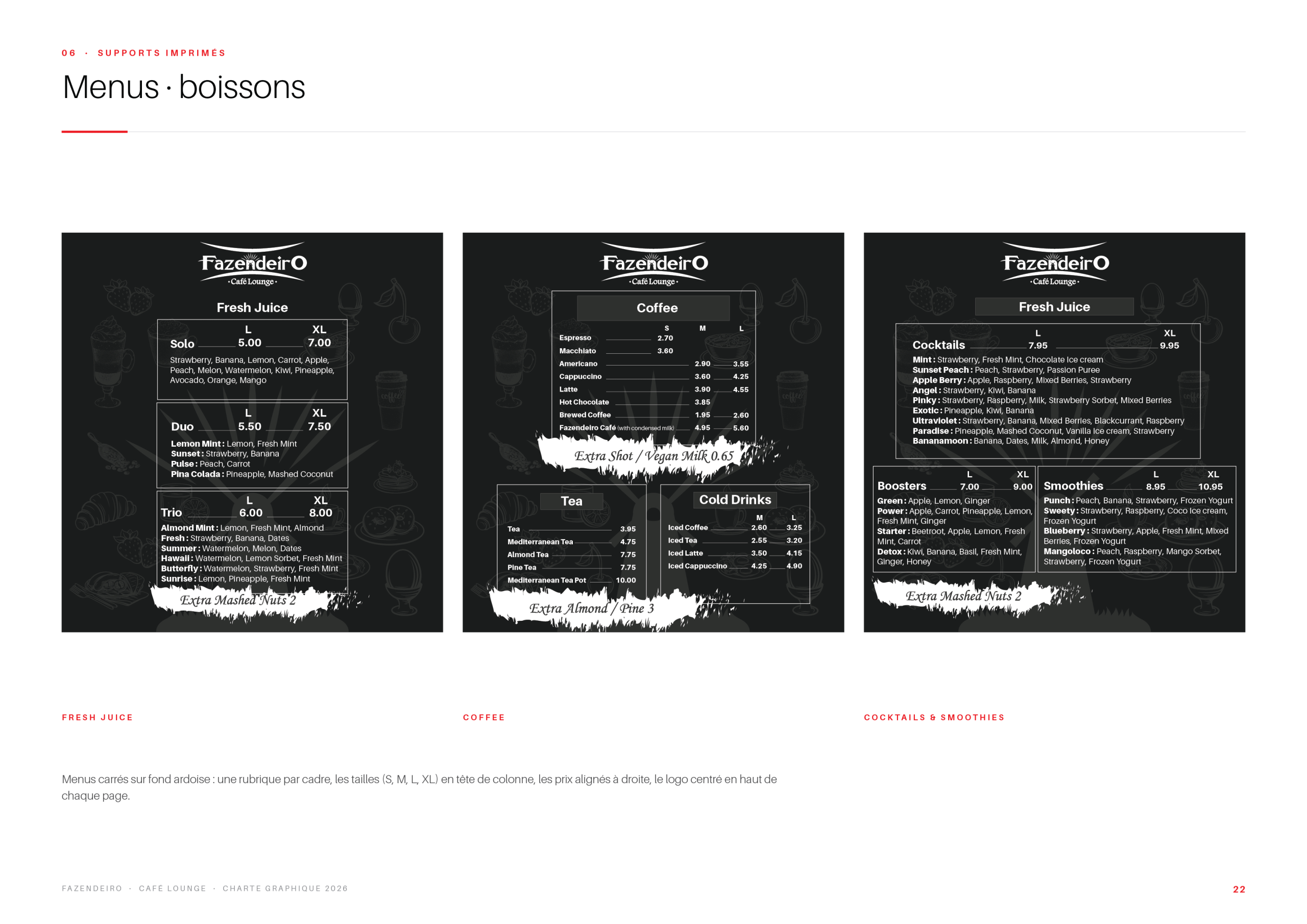
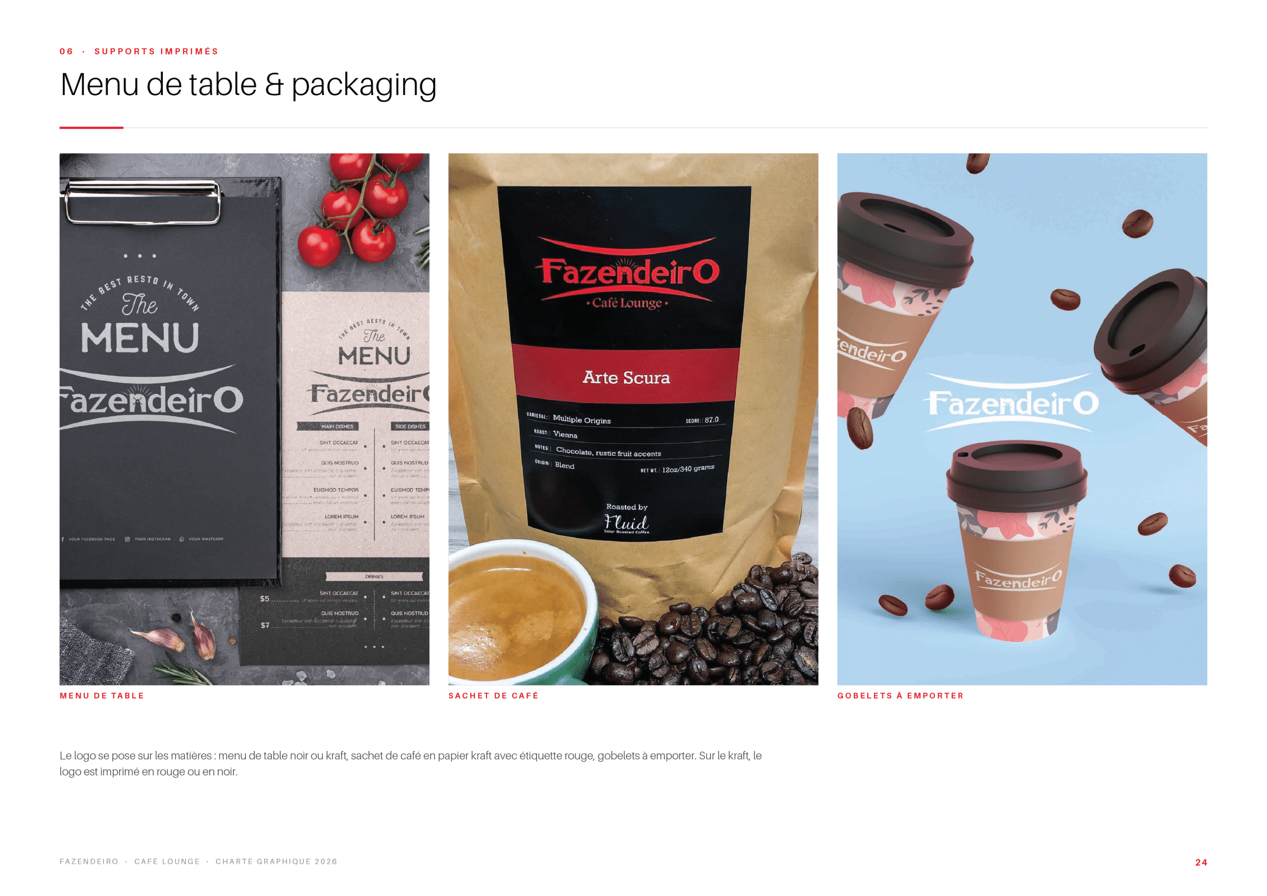
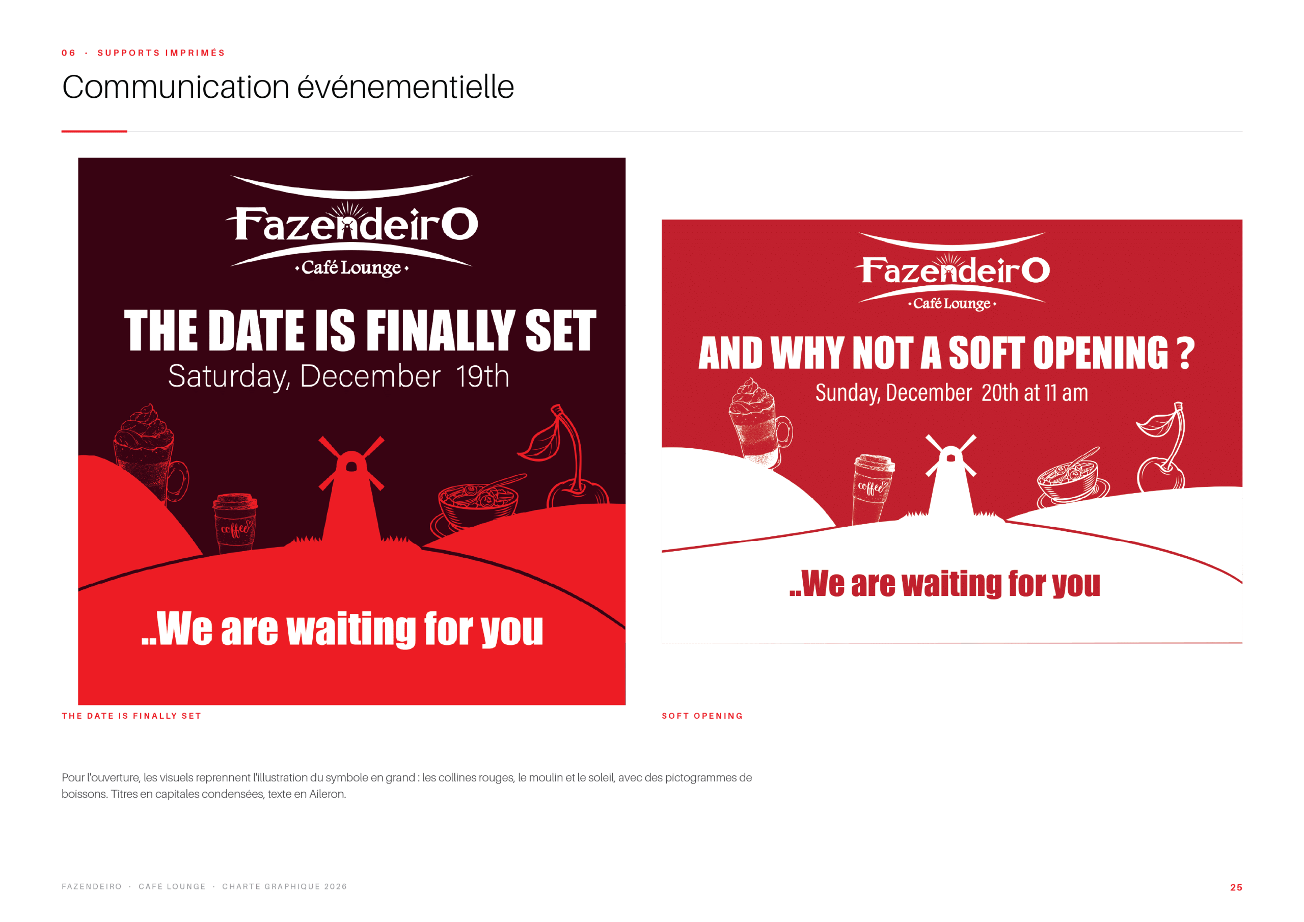
The identity is applied to the drinks menus, the table menu and the take-away packaging (cups, coffee bags), as well as to event communication such as the opening announcements.
Signage & Interior
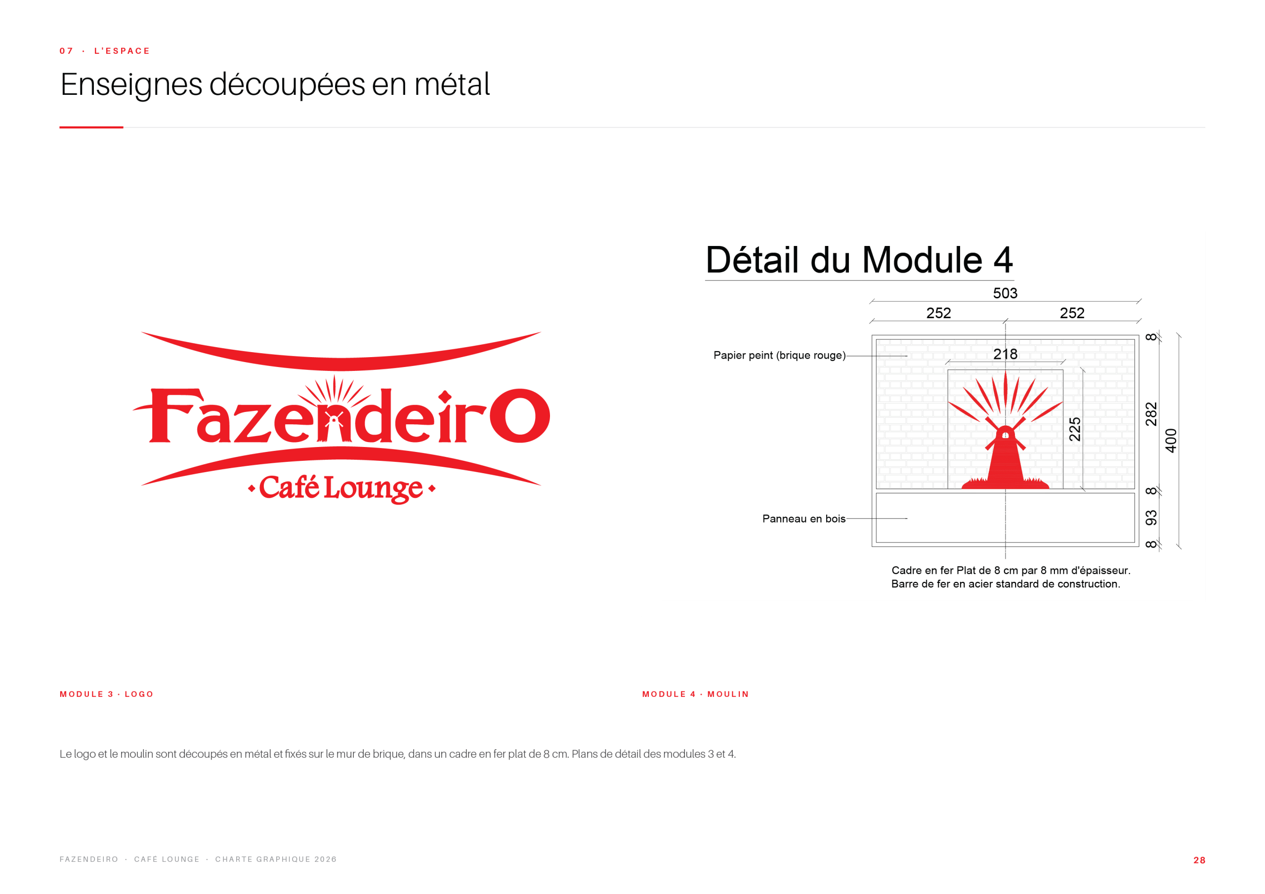
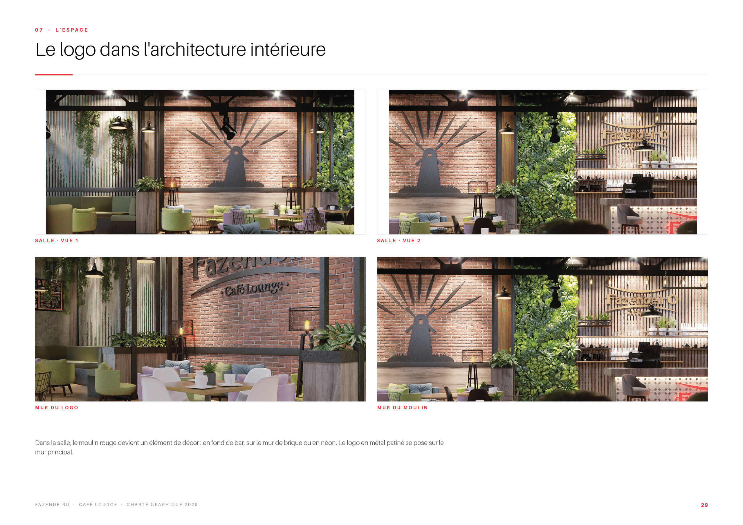
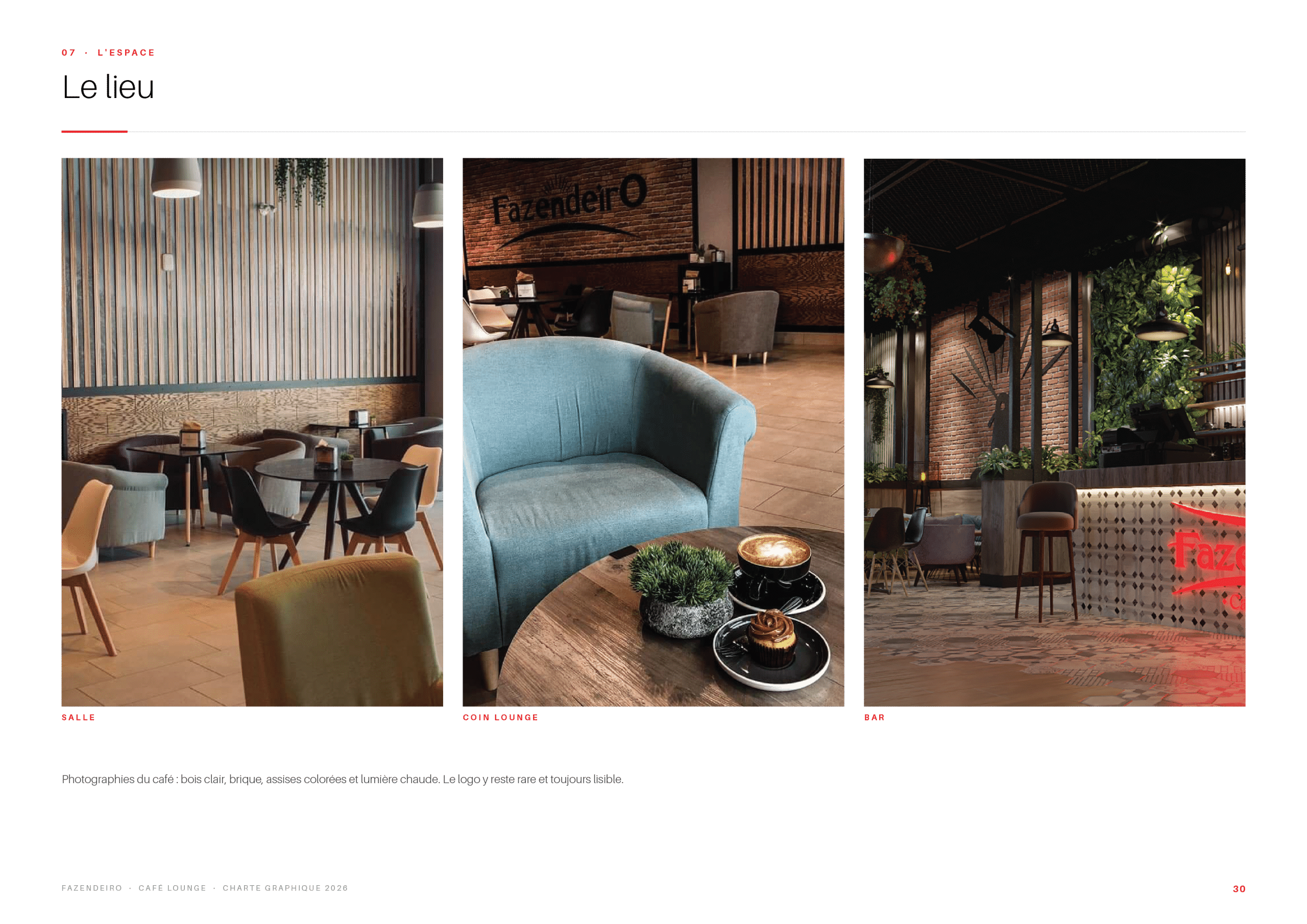
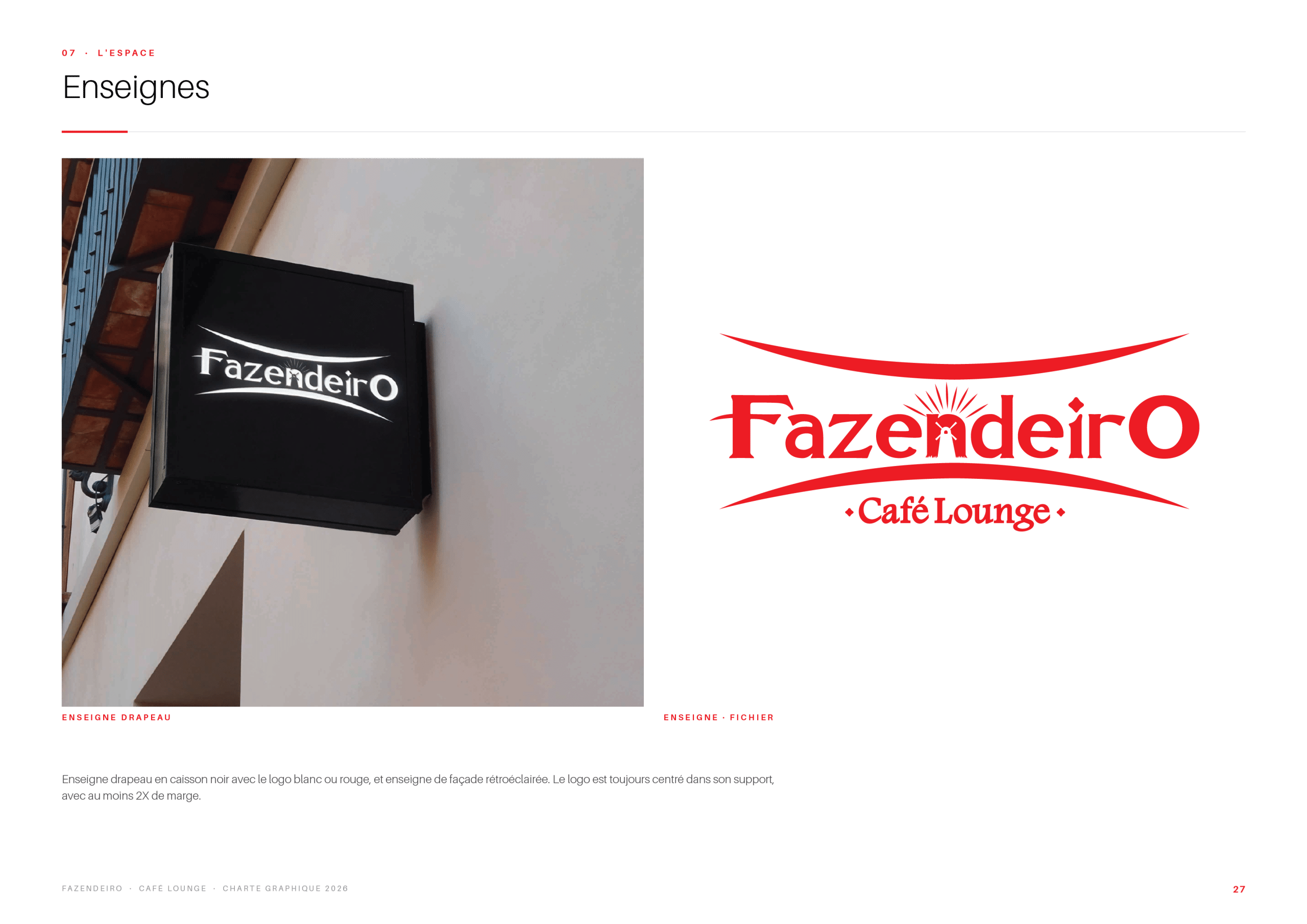
Finally, the brand comes to life on site: projecting and cut-metal signs, the logo integrated into the interior architecture, and the lounge itself, where the red and black identity meets warm wood and soft lighting.