Brand Identity: Inherbell Apitherapy
Inherbell is a care brand built around apitherapy, the use of bee products. The emblem draws a bee landing on a flowering plant inside a fine gold circle, linking the hive and the herbs in one simple sign. A deep green serif wordmark gives the brand a natural, trustworthy base, while the gold handwritten “Apitherapy” adds warmth and a crafted, honey-like touch.
Packaging: Natural & Clear
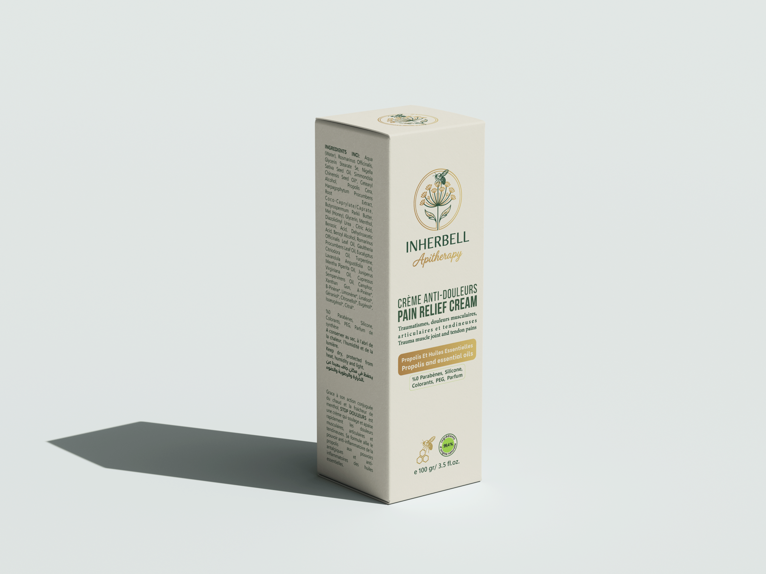
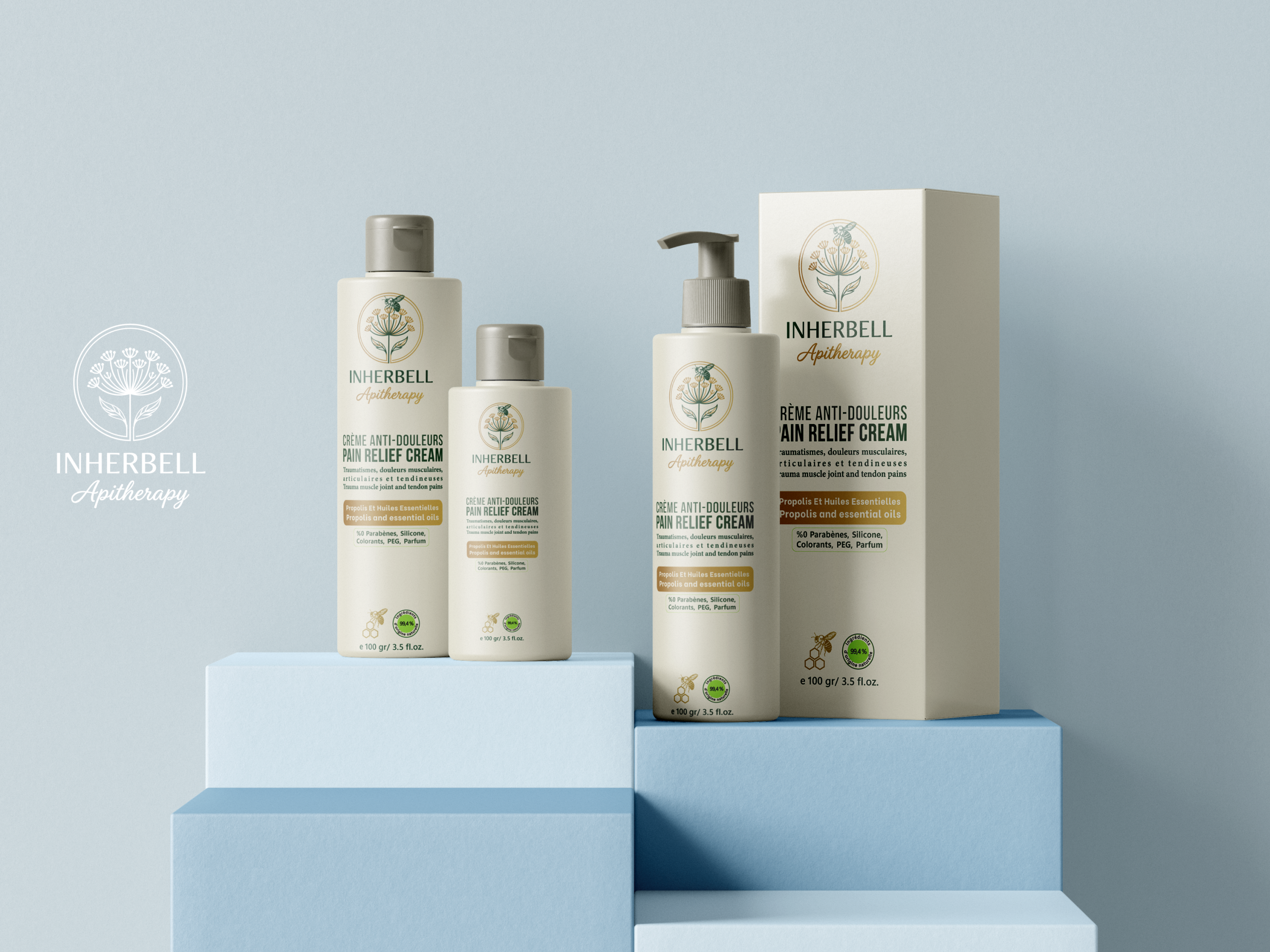
The packaging keeps the same palette: cream backgrounds, forest green and gold. On the bilingual pain relief cream range (Crème anti-douleurs), made with propolis and essential oils, the emblem sits at the top of each bottle and box, followed by a clear hierarchy of product name, key ingredients and details, so every reference is easy to read on the shelf while the range still looks calm, premium and natural.