Brand Identity: The Logo
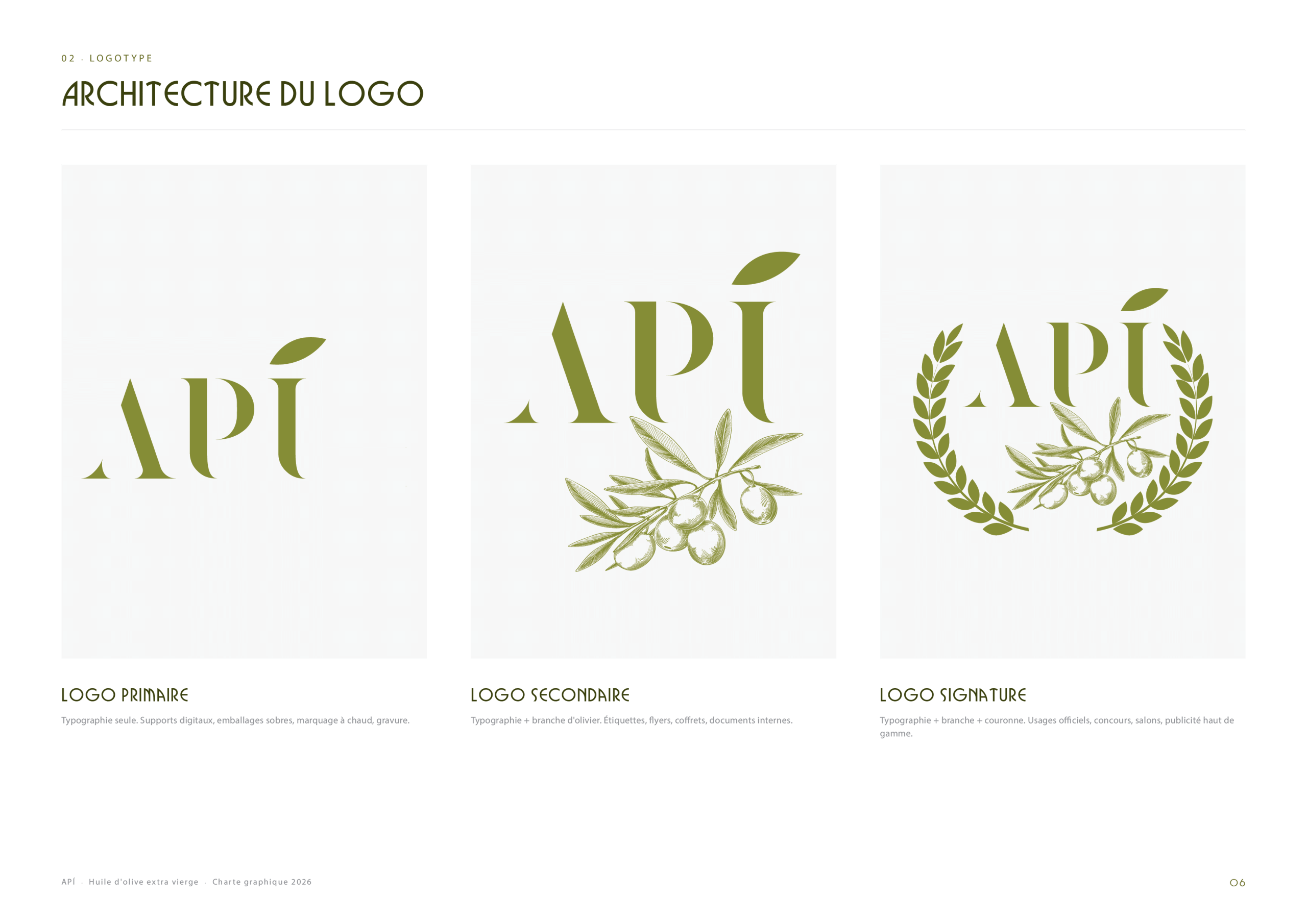
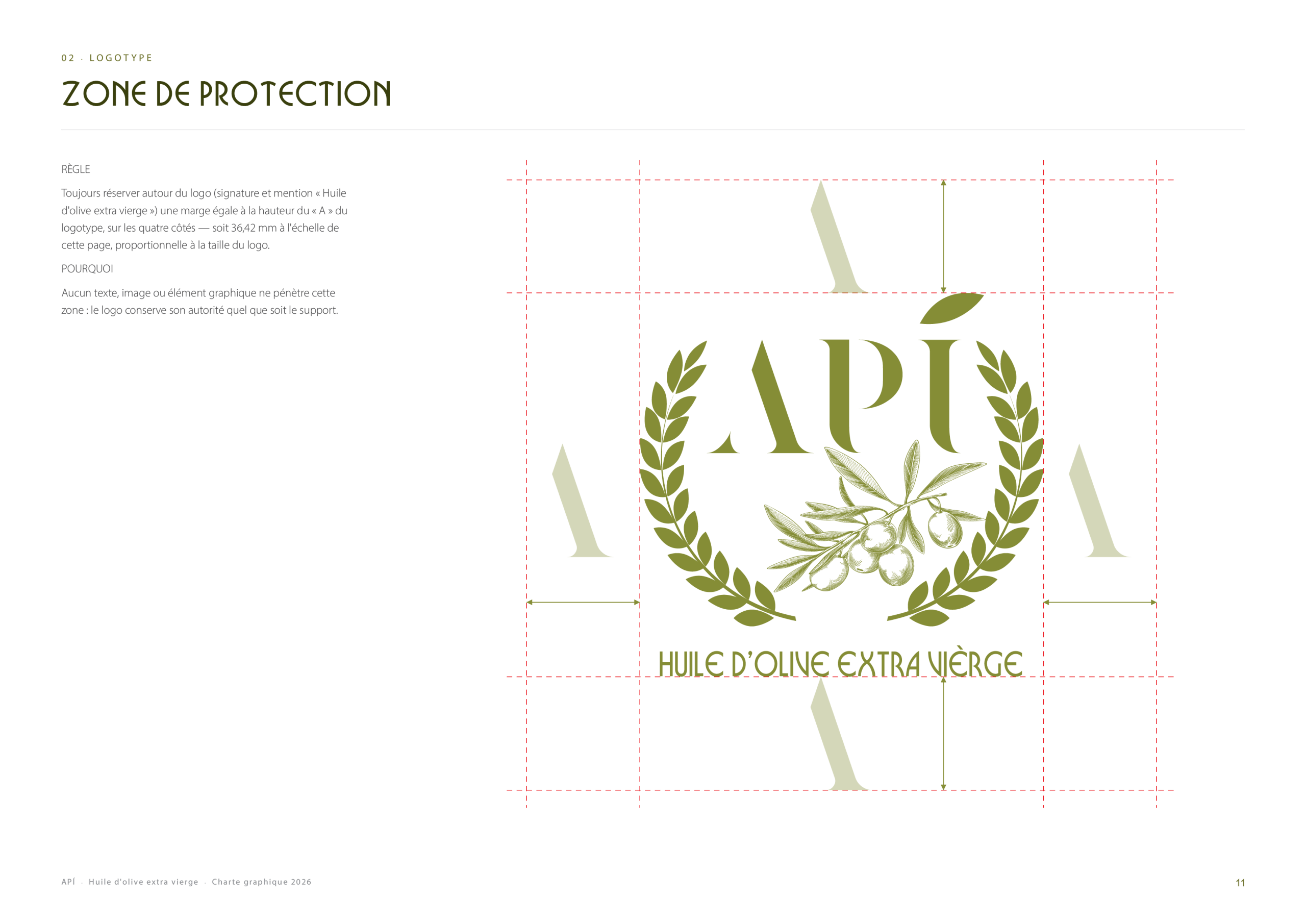
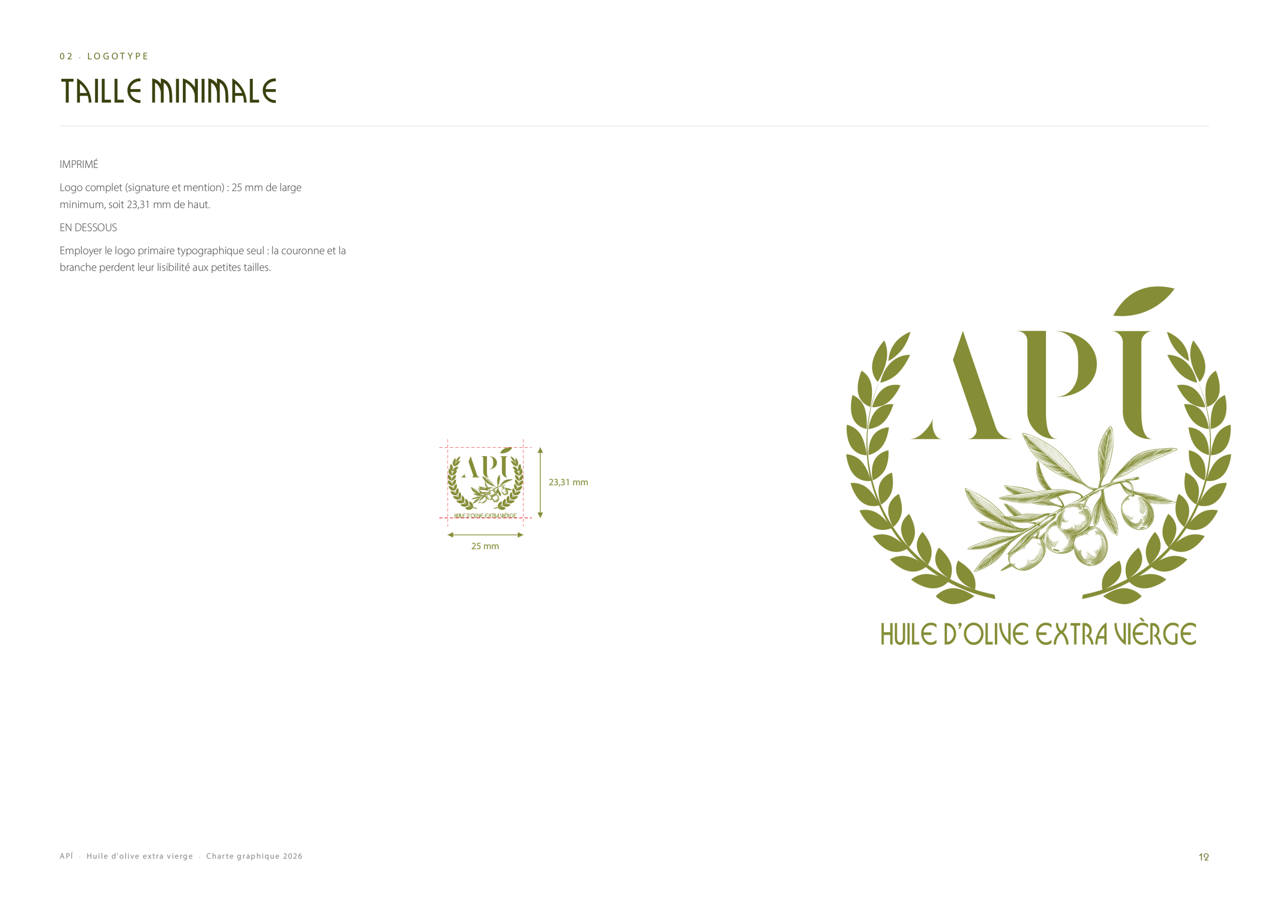
API is an extra virgin olive oil brand. Its identity is built on an elegant wordmark with an accented “Í” that turns into an olive leaf, declined in three versions: the wordmark alone, the wordmark with an olive branch, and a full emblem framed by a laurel wreath. The guidelines then fix the clear space around the logo and its minimum size, so it stays legible on every support.
Colour Palette & Patterns
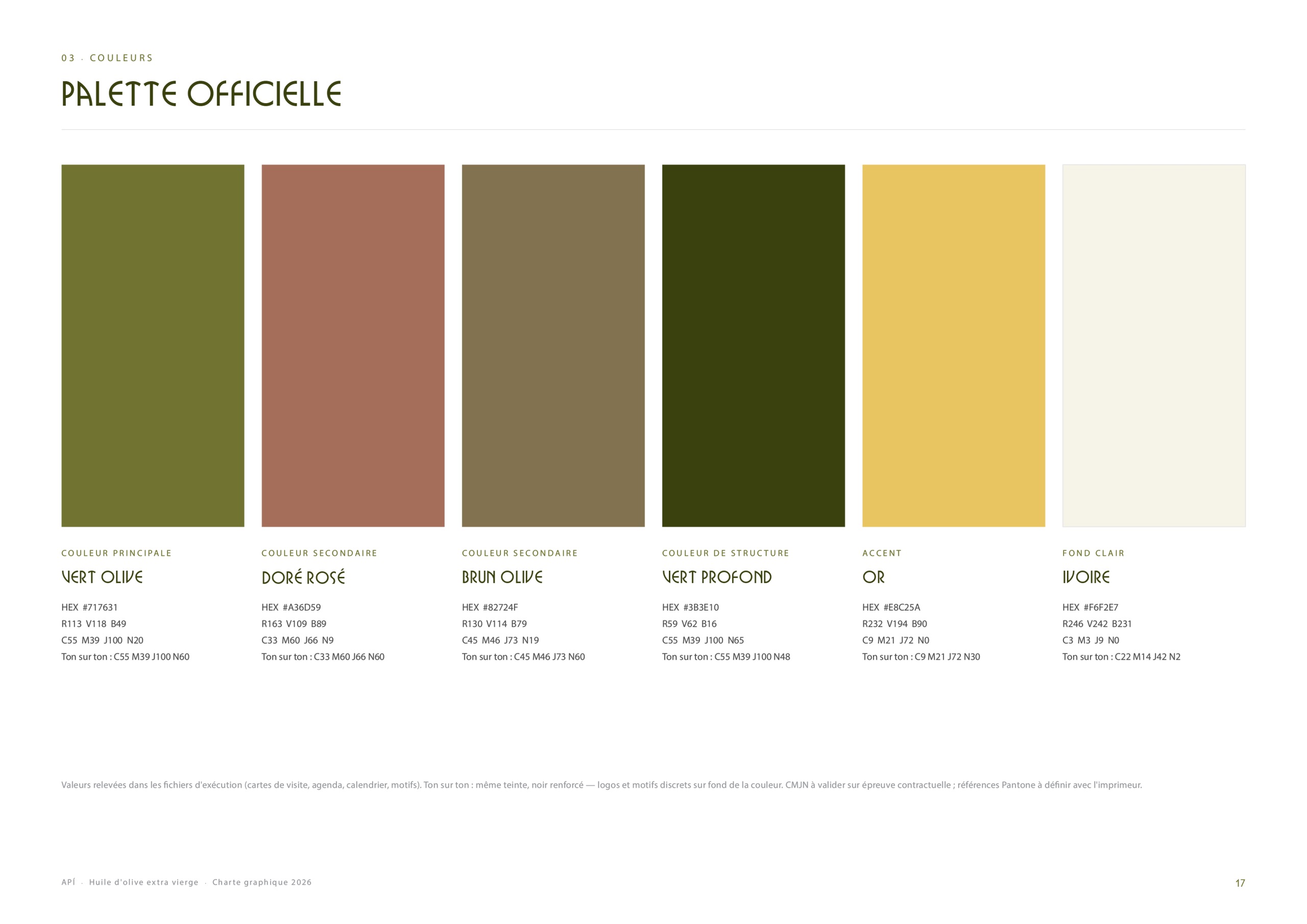
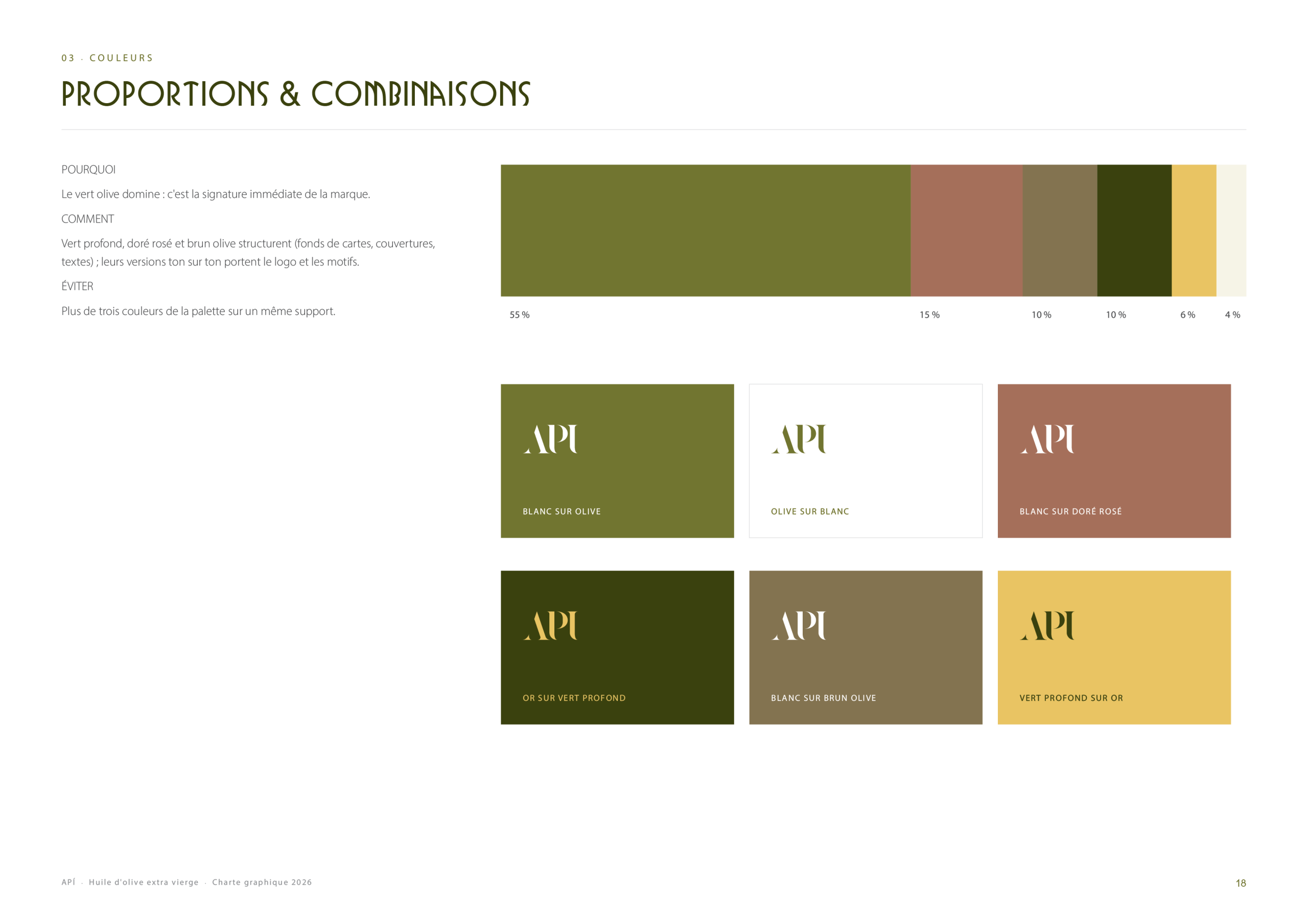
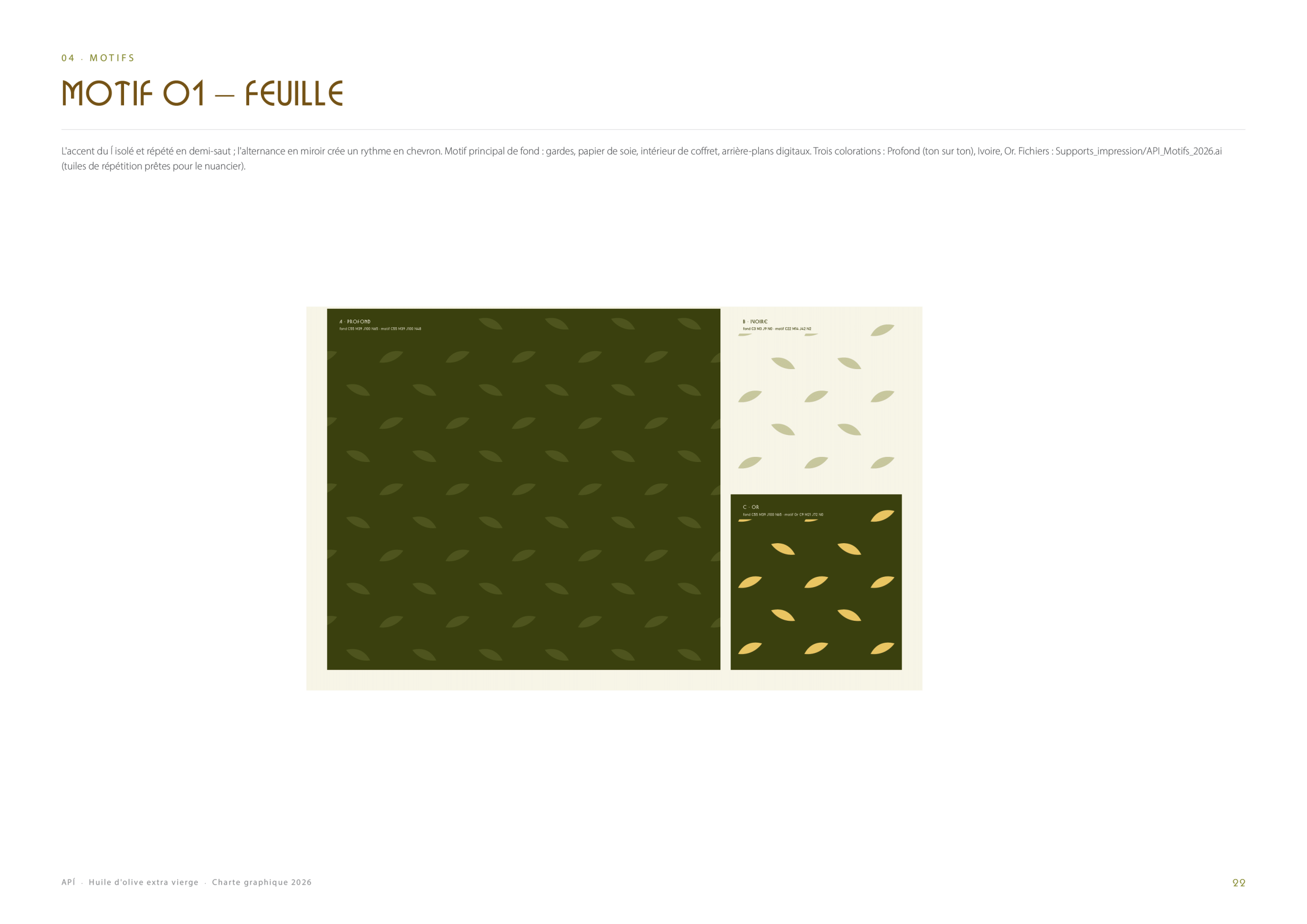
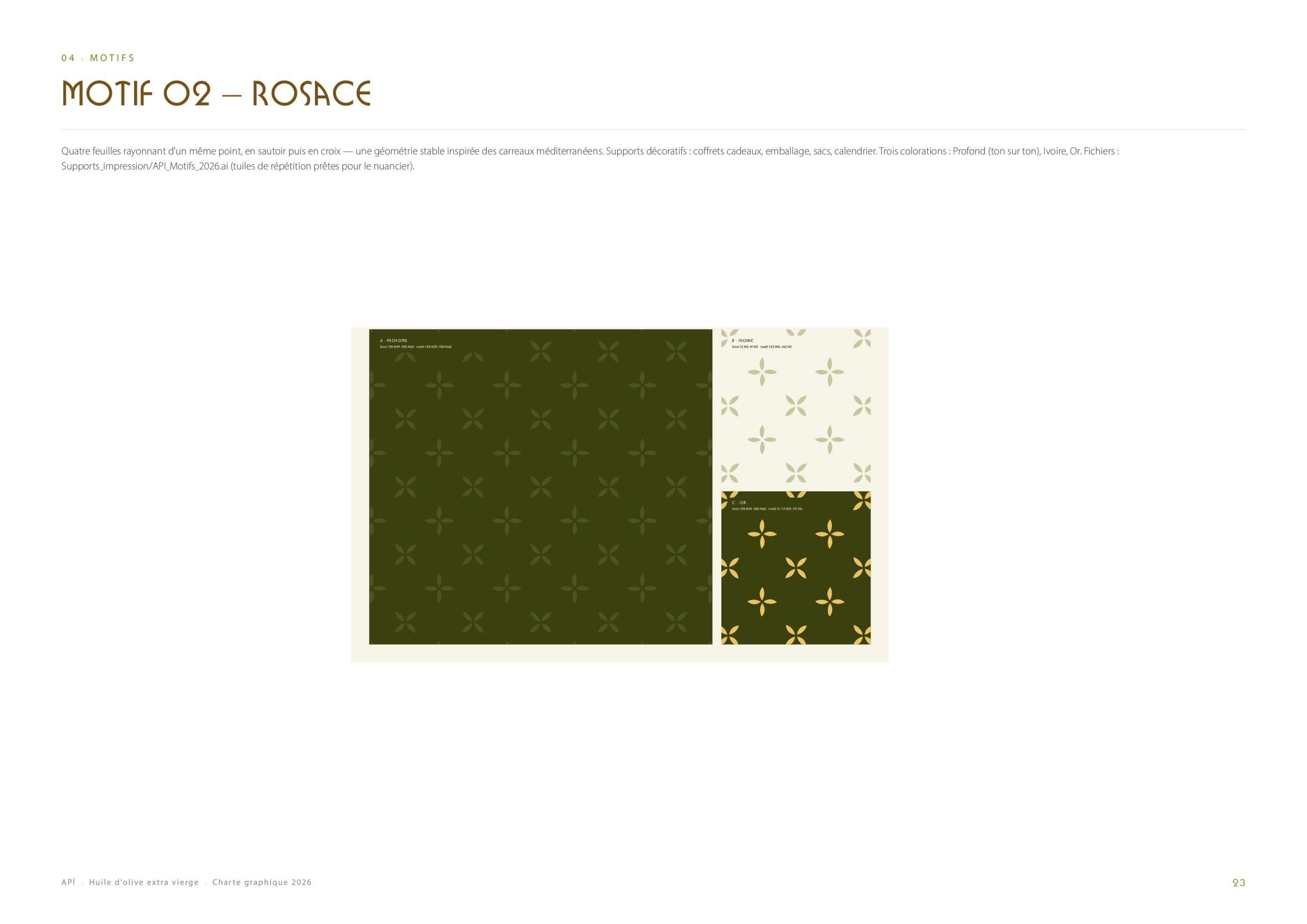
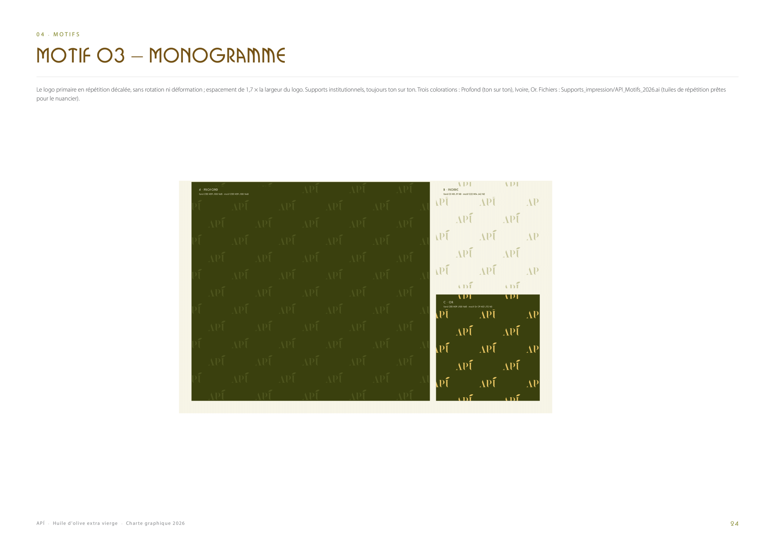
The official palette comes straight from the olive grove and the Mediterranean soil: deep olive greens, terracotta, warm taupe, honey yellow and cream, with clear rules on proportions and combinations. Three patterns (a leaf, a rosette and a monogram) extend the identity and can dress packaging, paper and digital backgrounds.
Label & Packaging
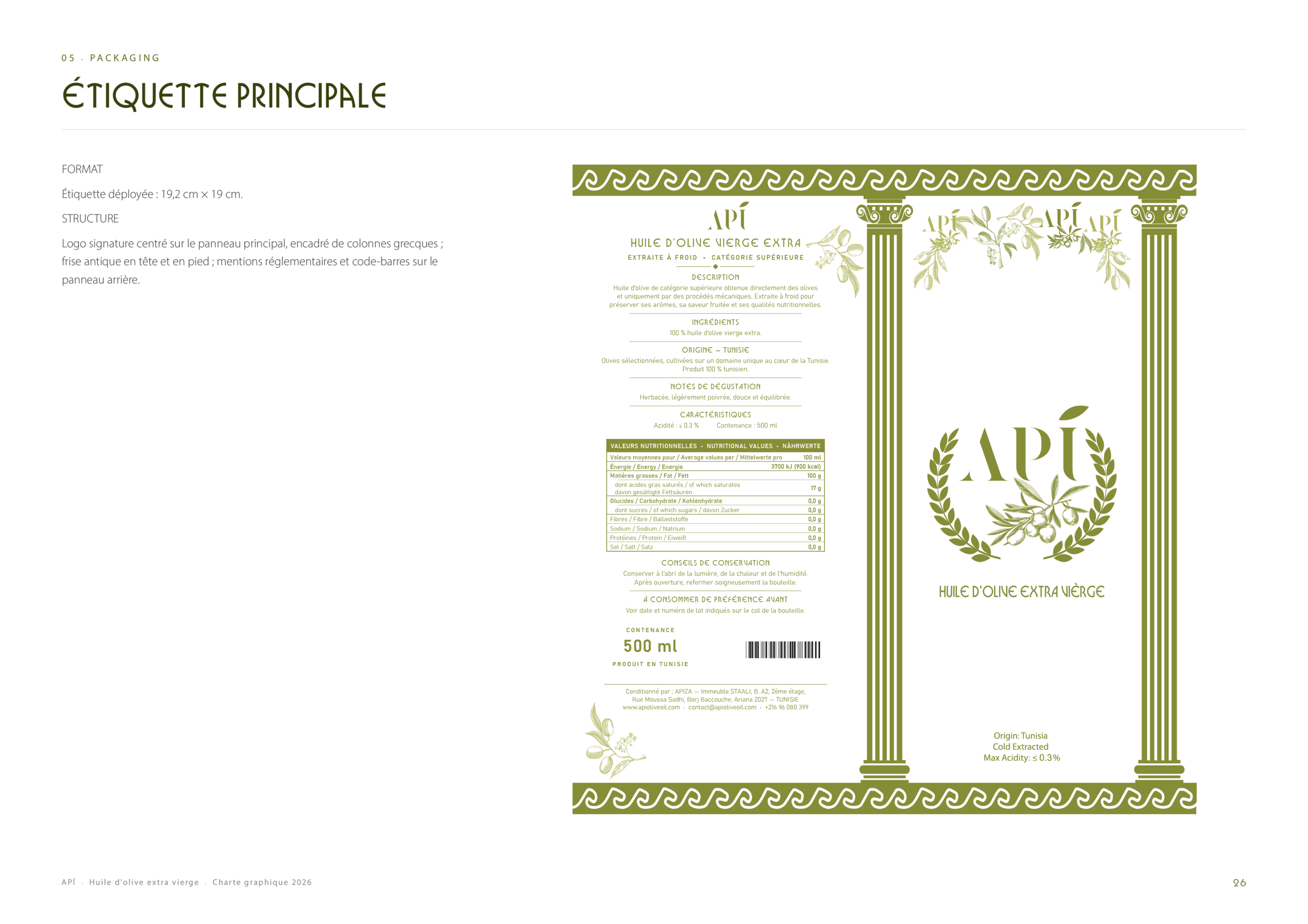
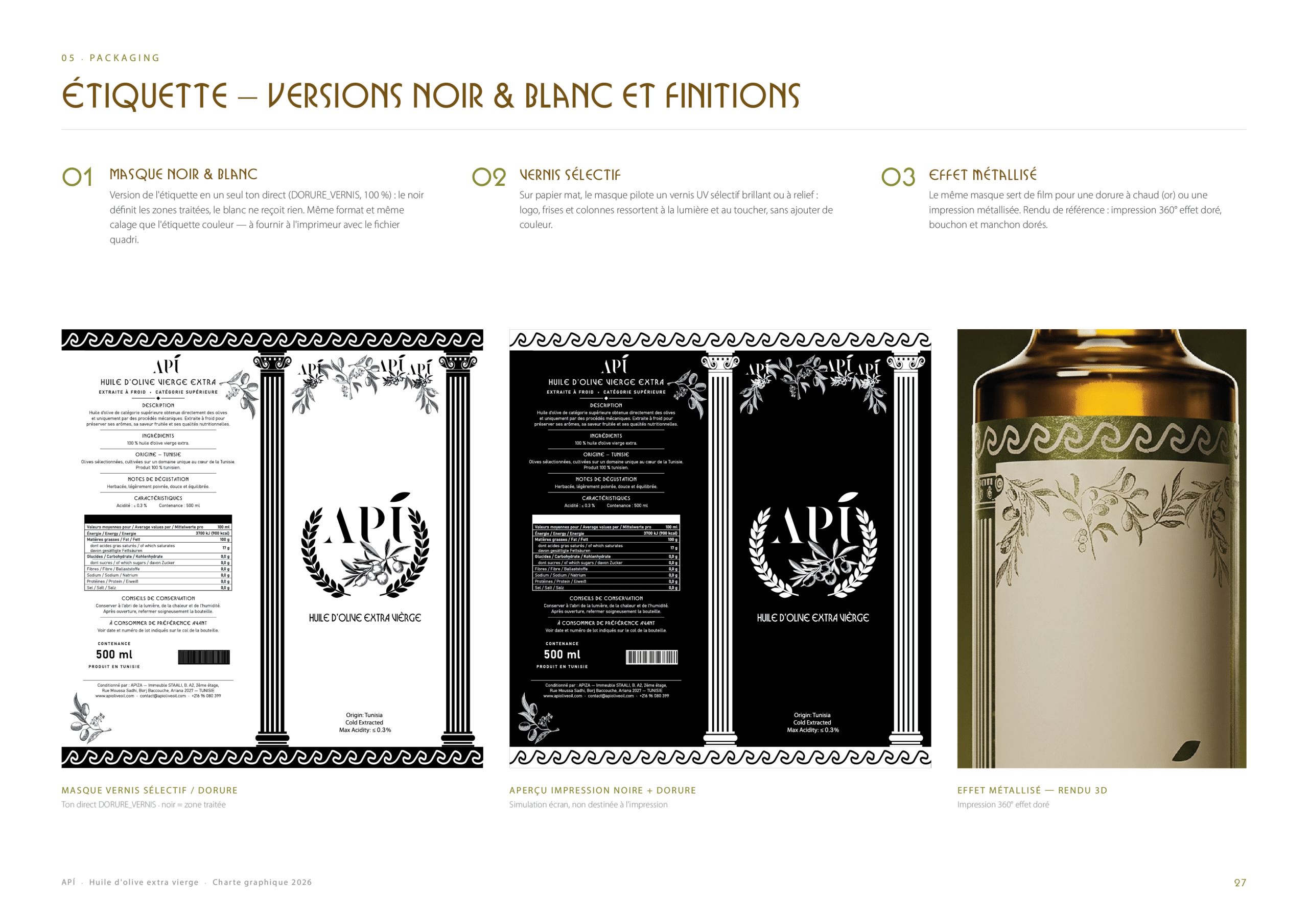
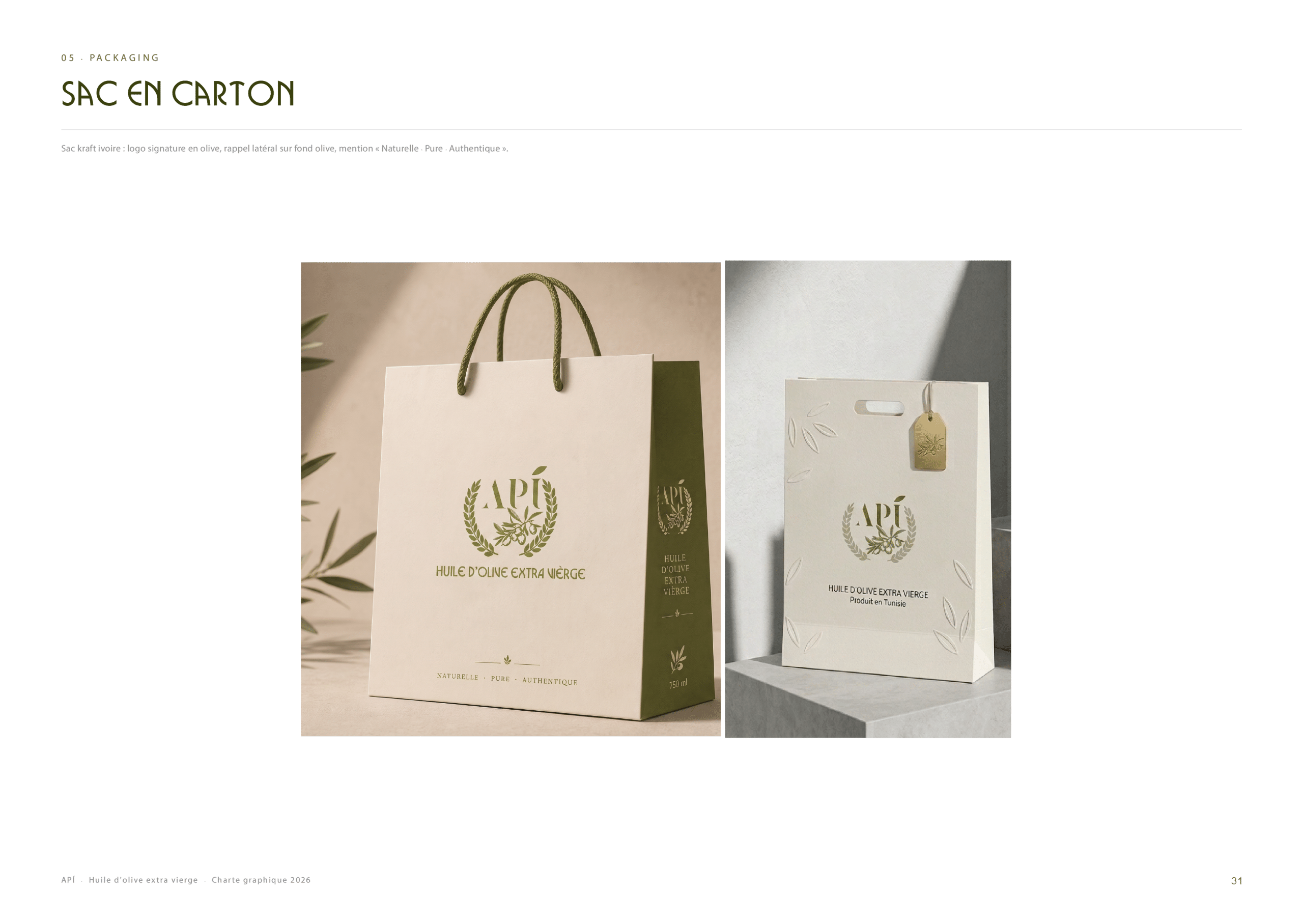
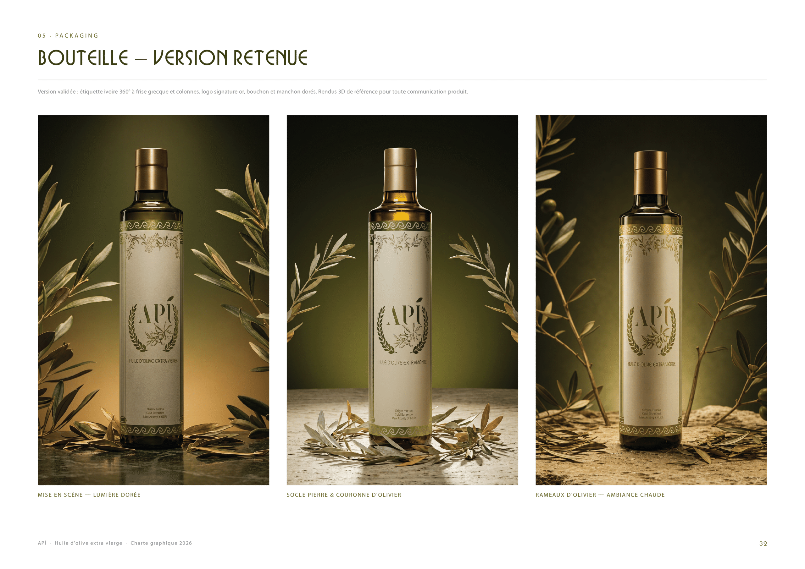
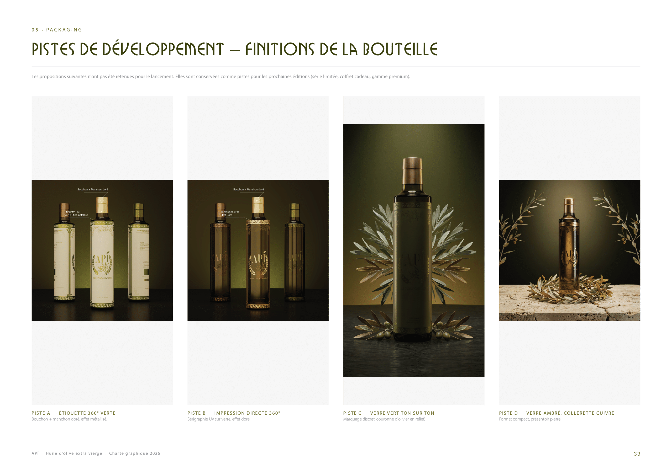
The main label frames the emblem between two classical columns, a nod to the heritage of olive oil. It is declined in colour and in black and white finishes, then applied to the packaging: a cardboard carry bag, the selected bottle and the different finishes explored during the development of the bottle.
Stationery
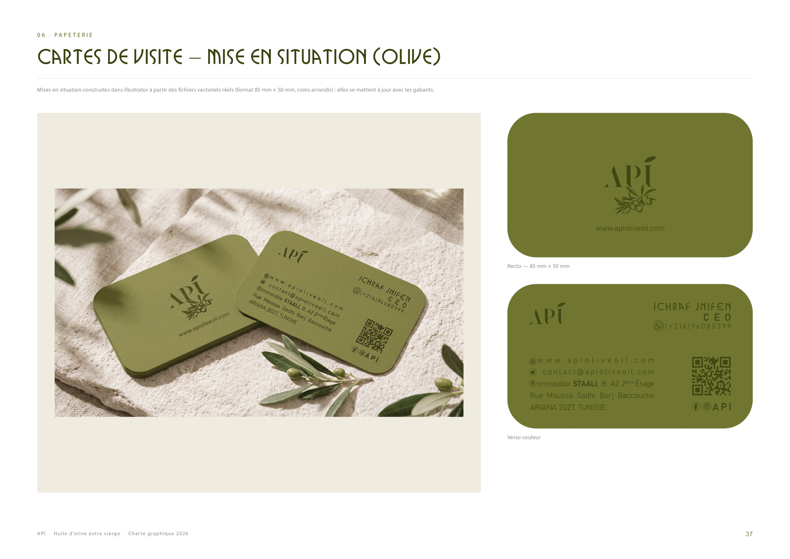
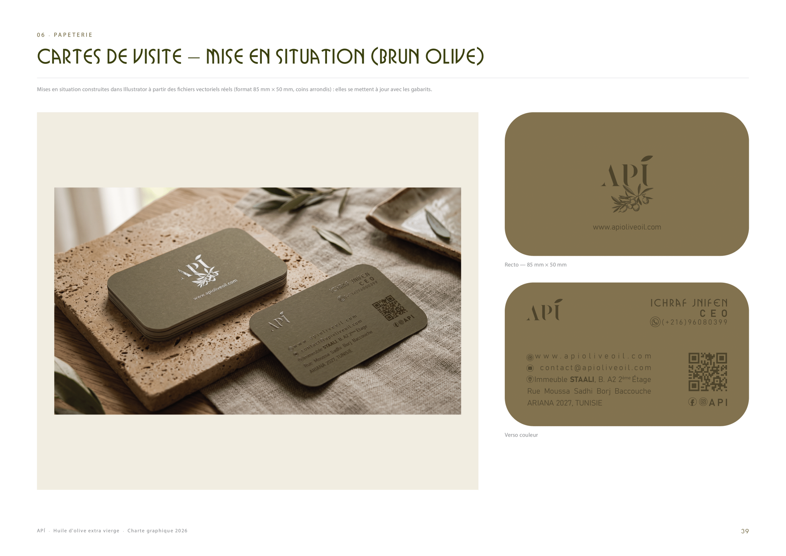
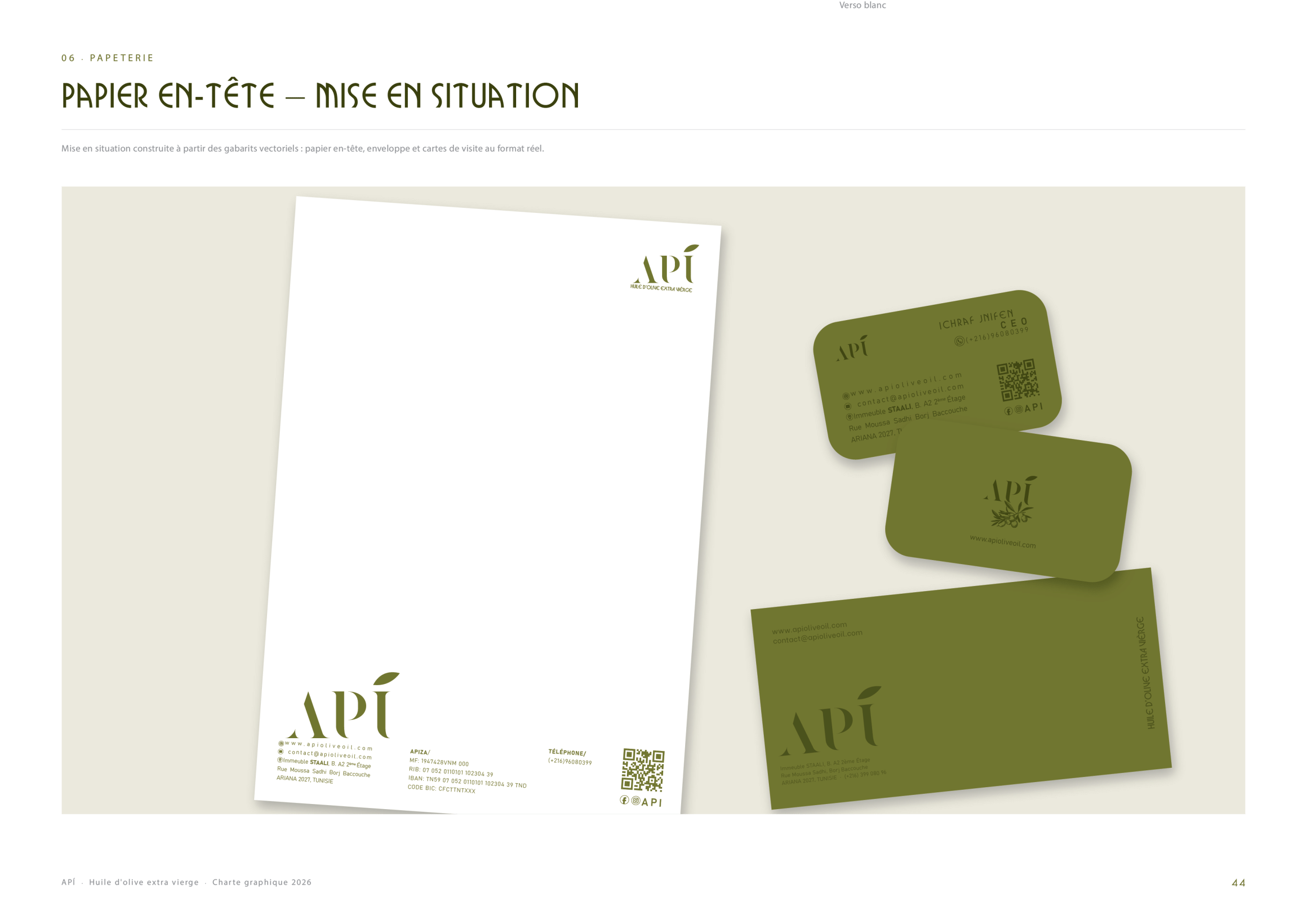
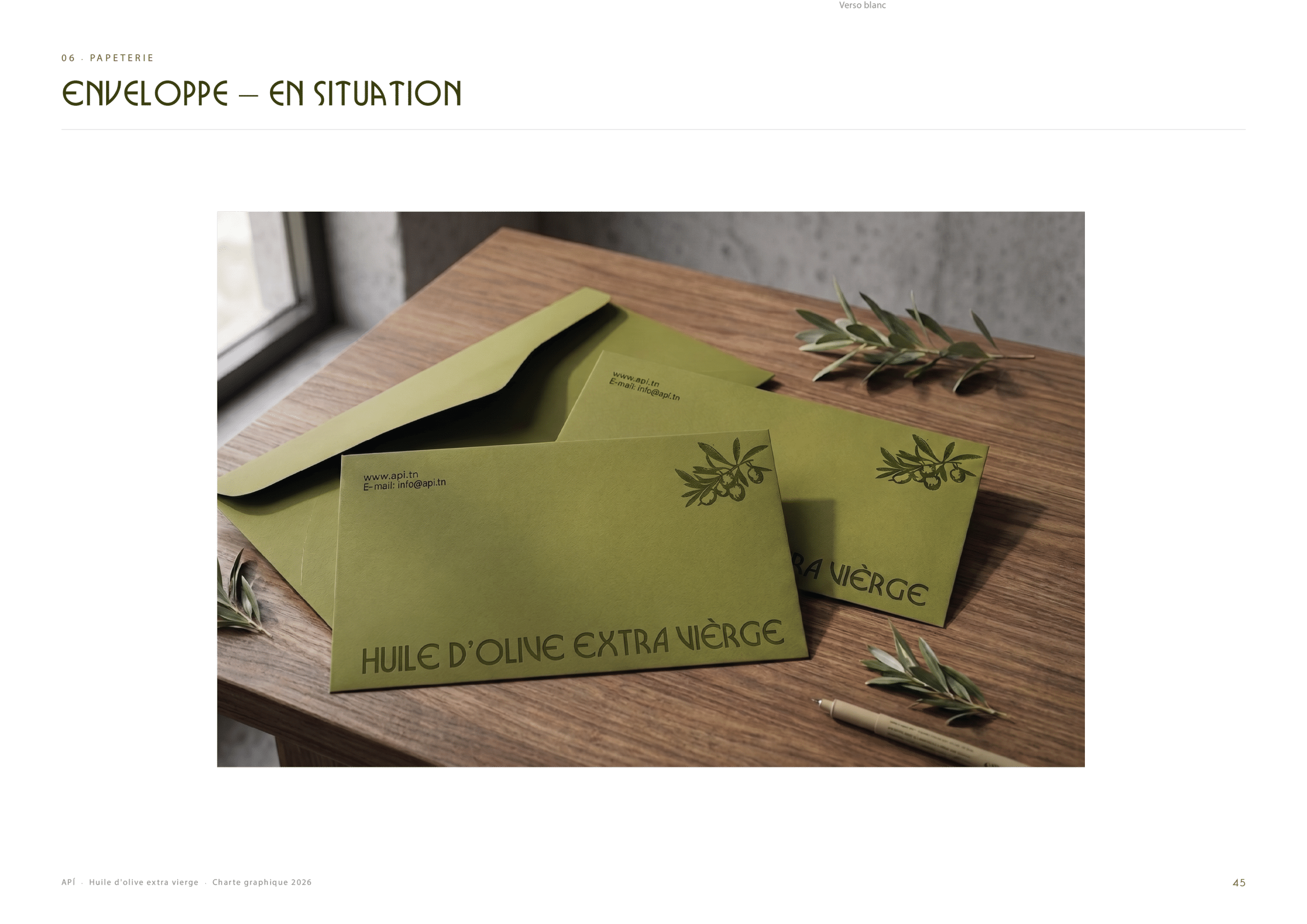
The identity carries through to the business tools: business cards in three colourways (olive, gold-rose and brown-olive) with letterpress-style embossing, a letterhead and envelopes, all sharing the same palette, logo and patterns.

Communication & Digital
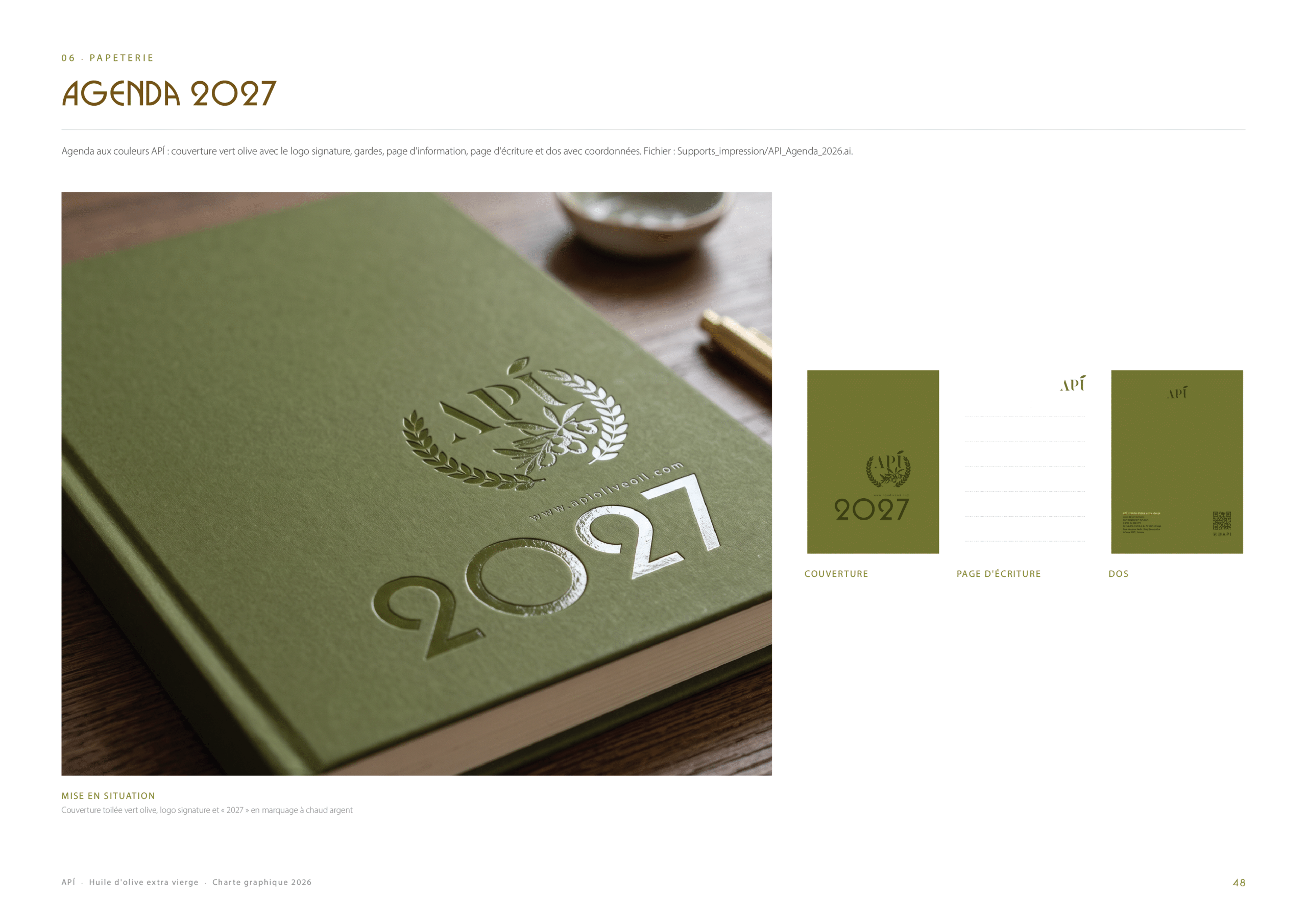
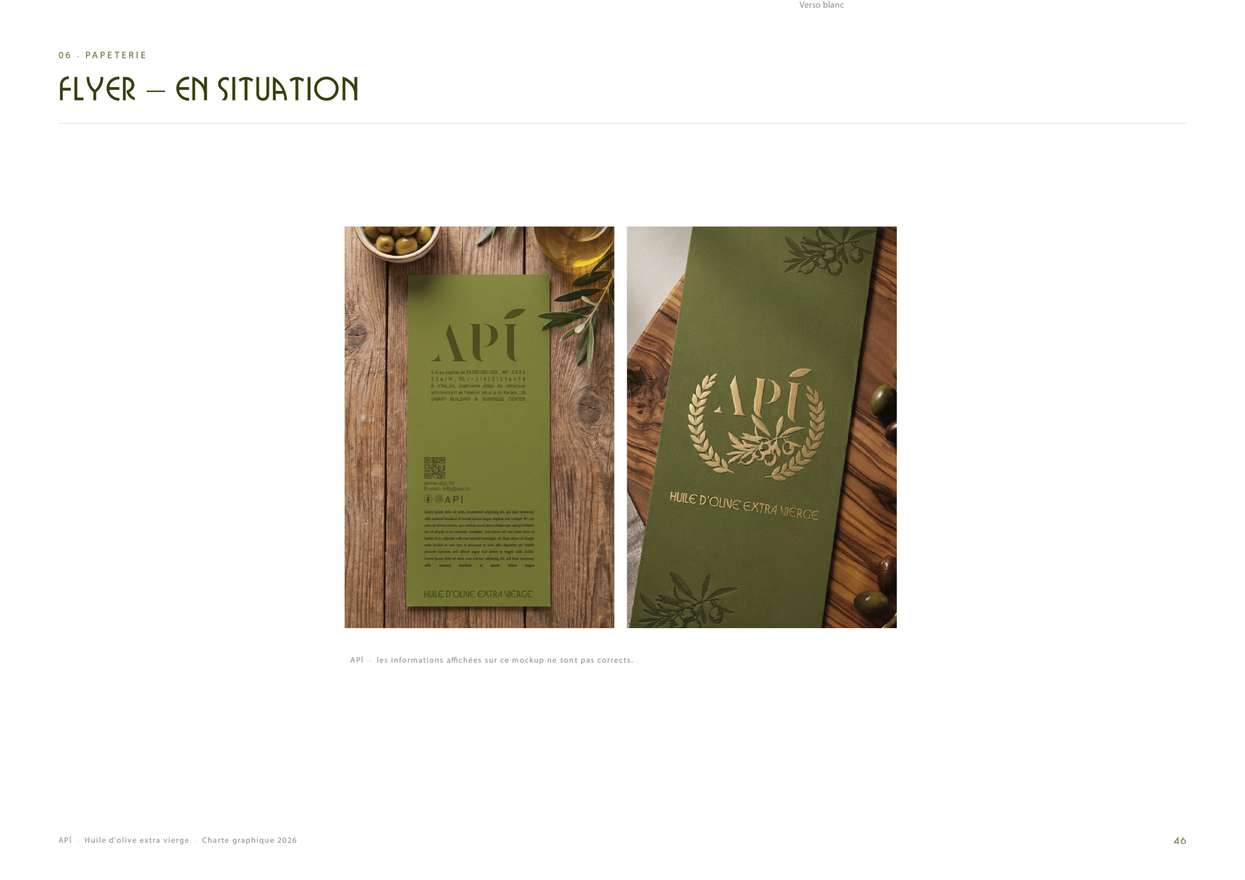
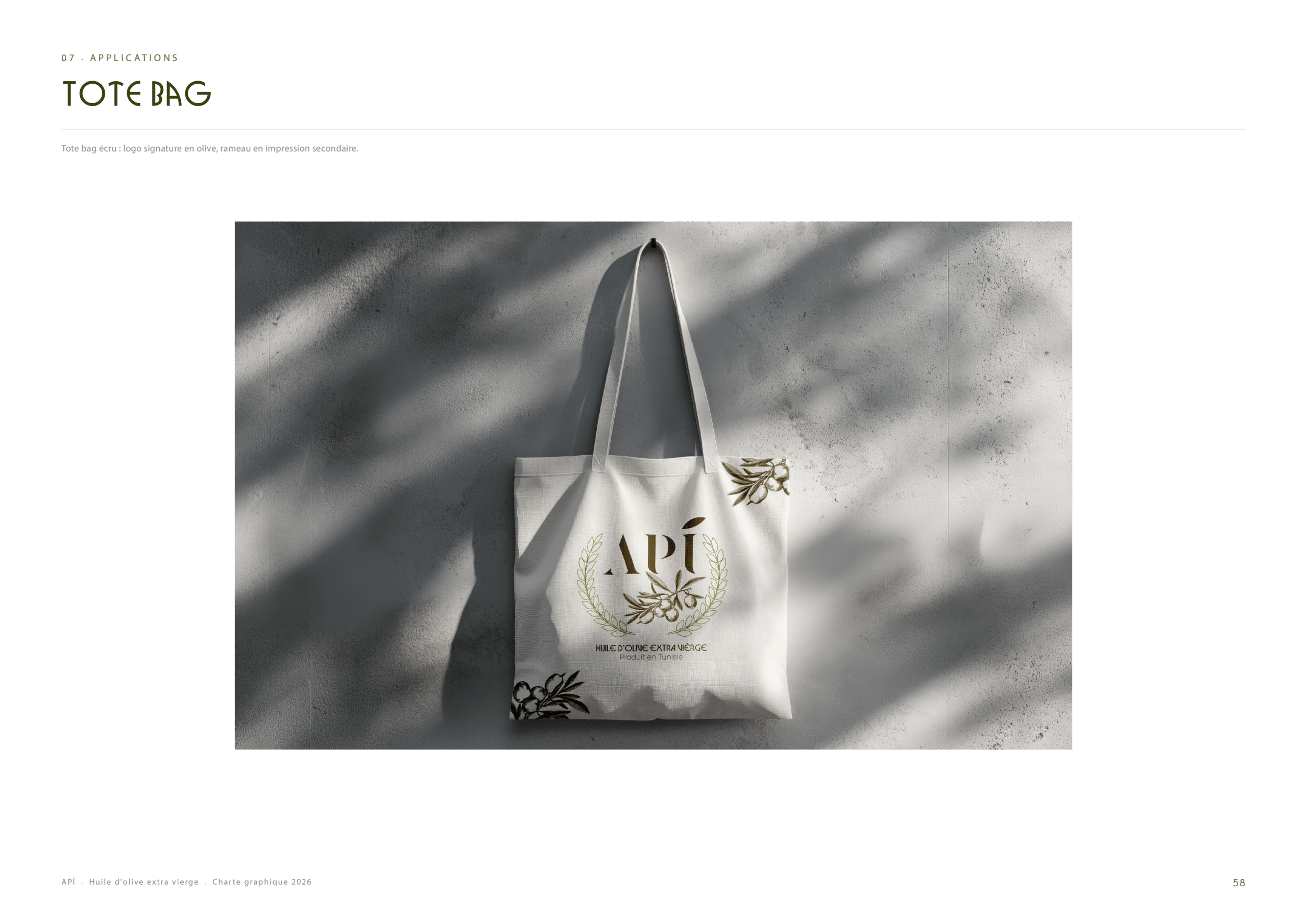
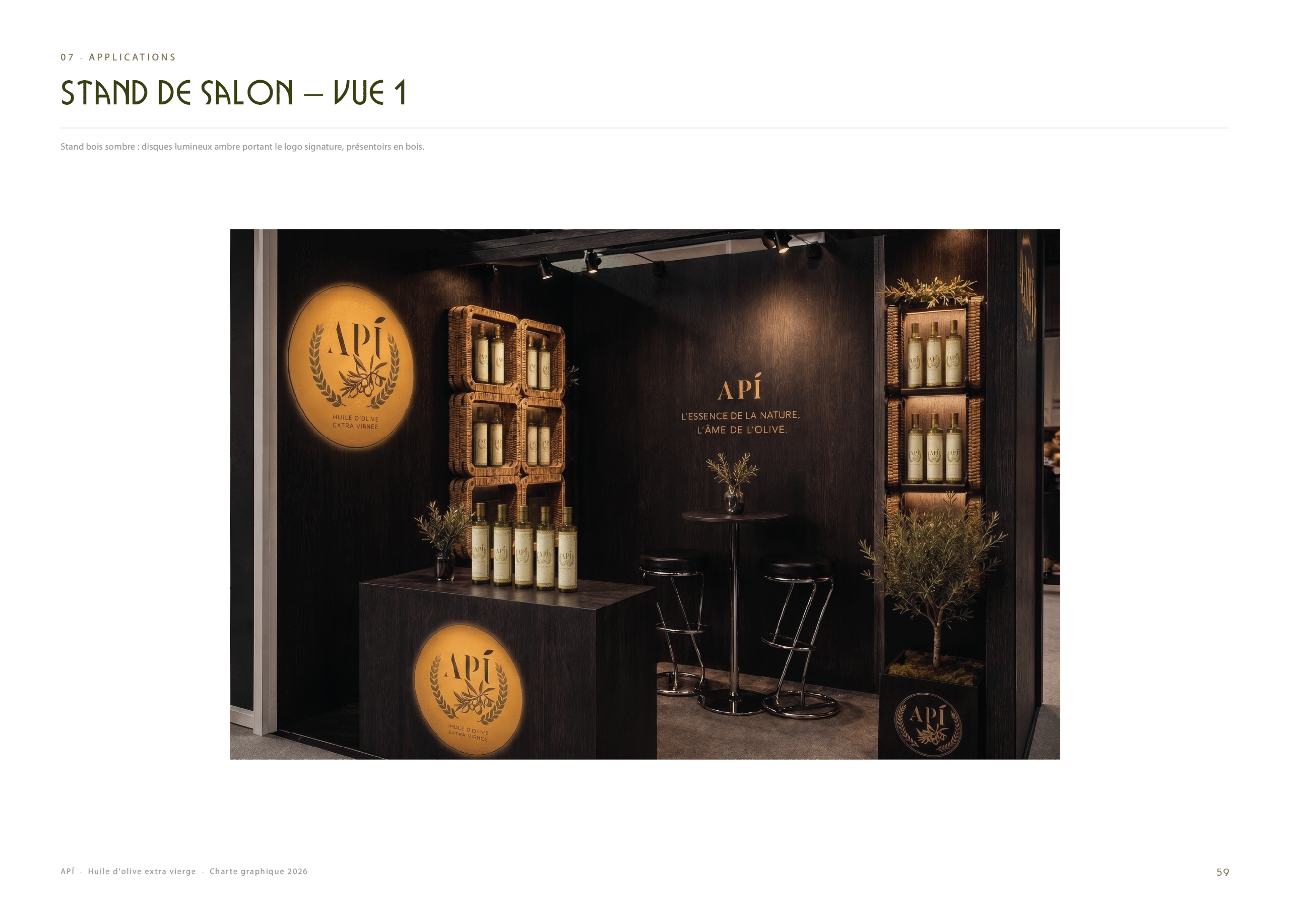
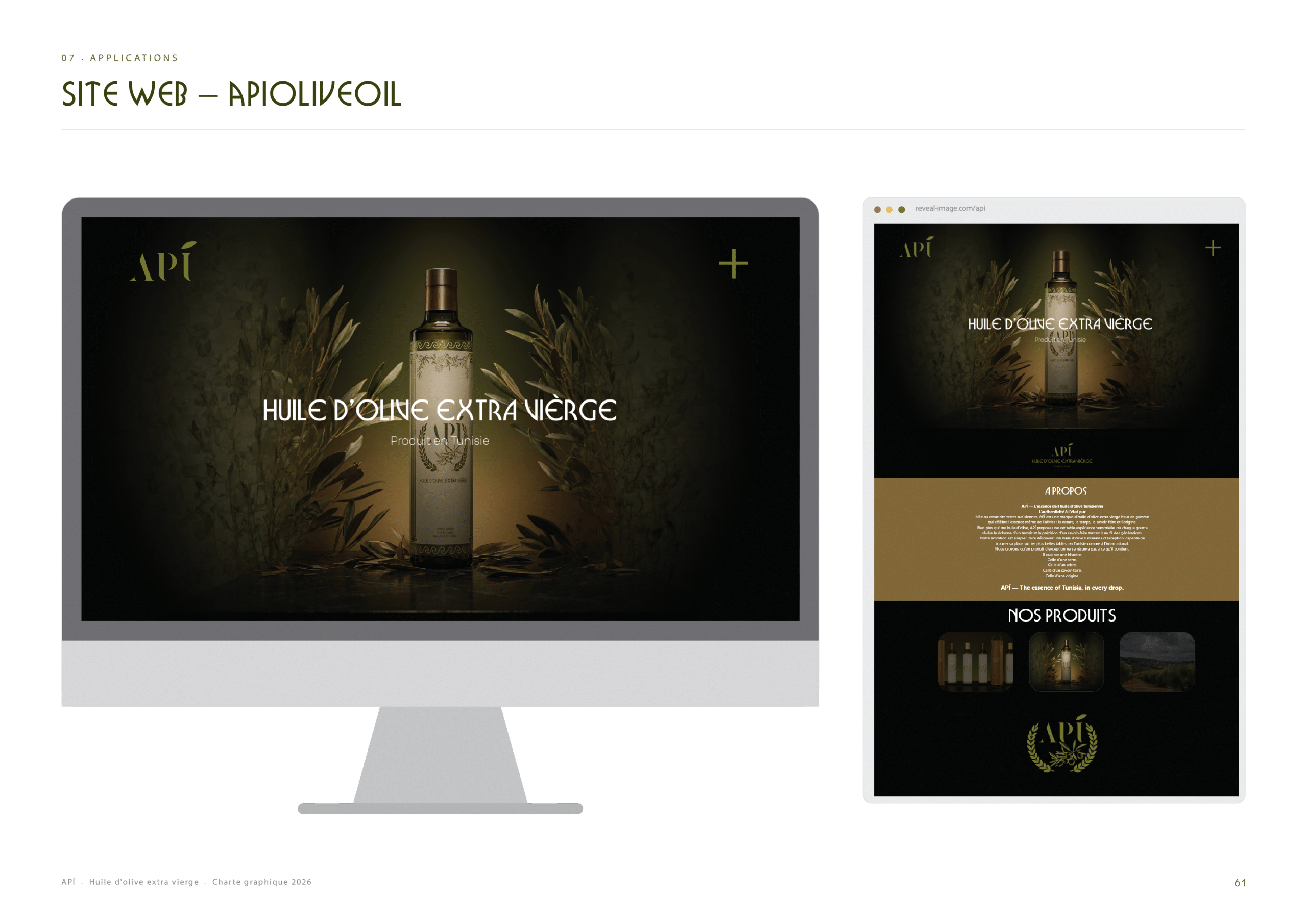
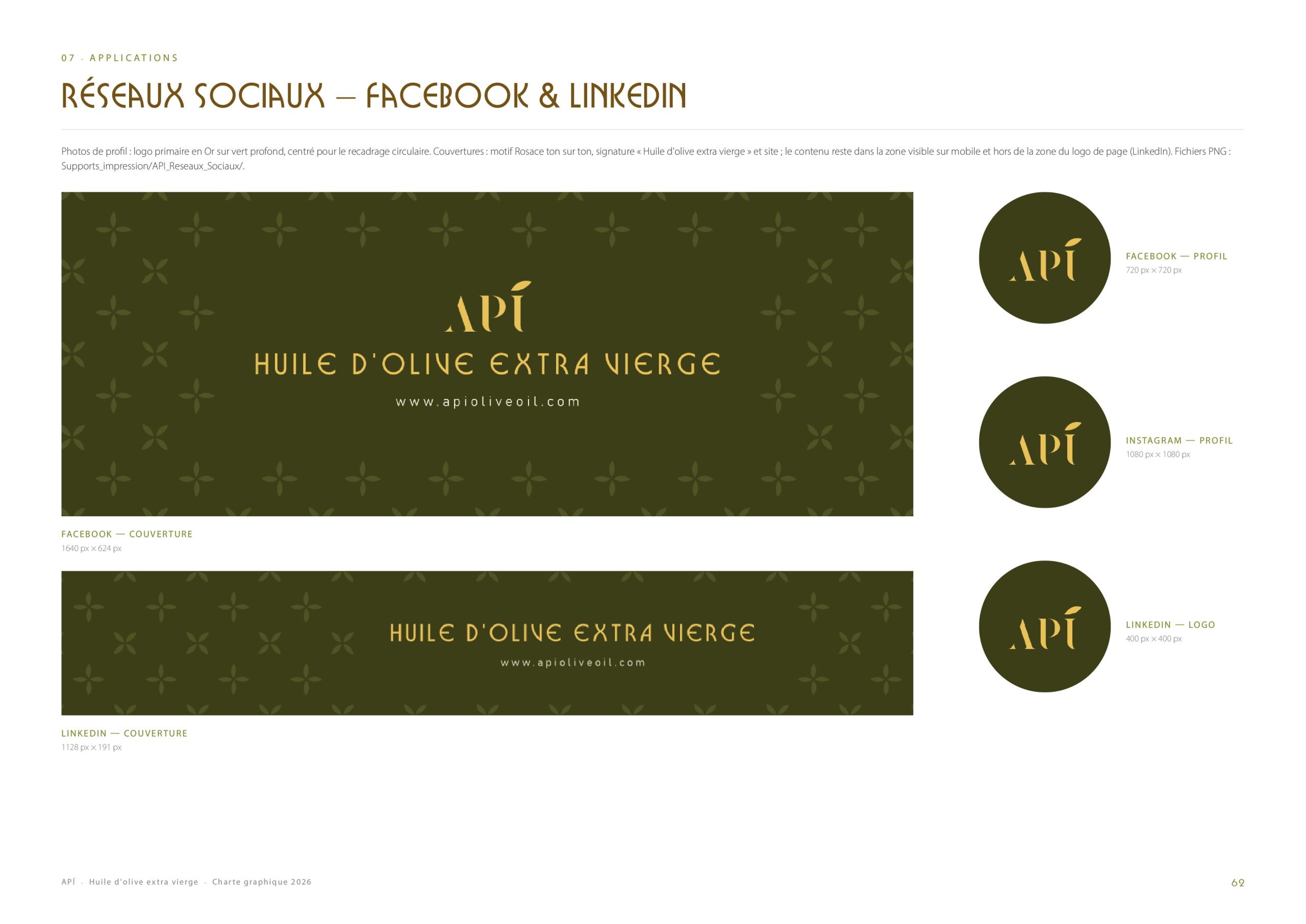
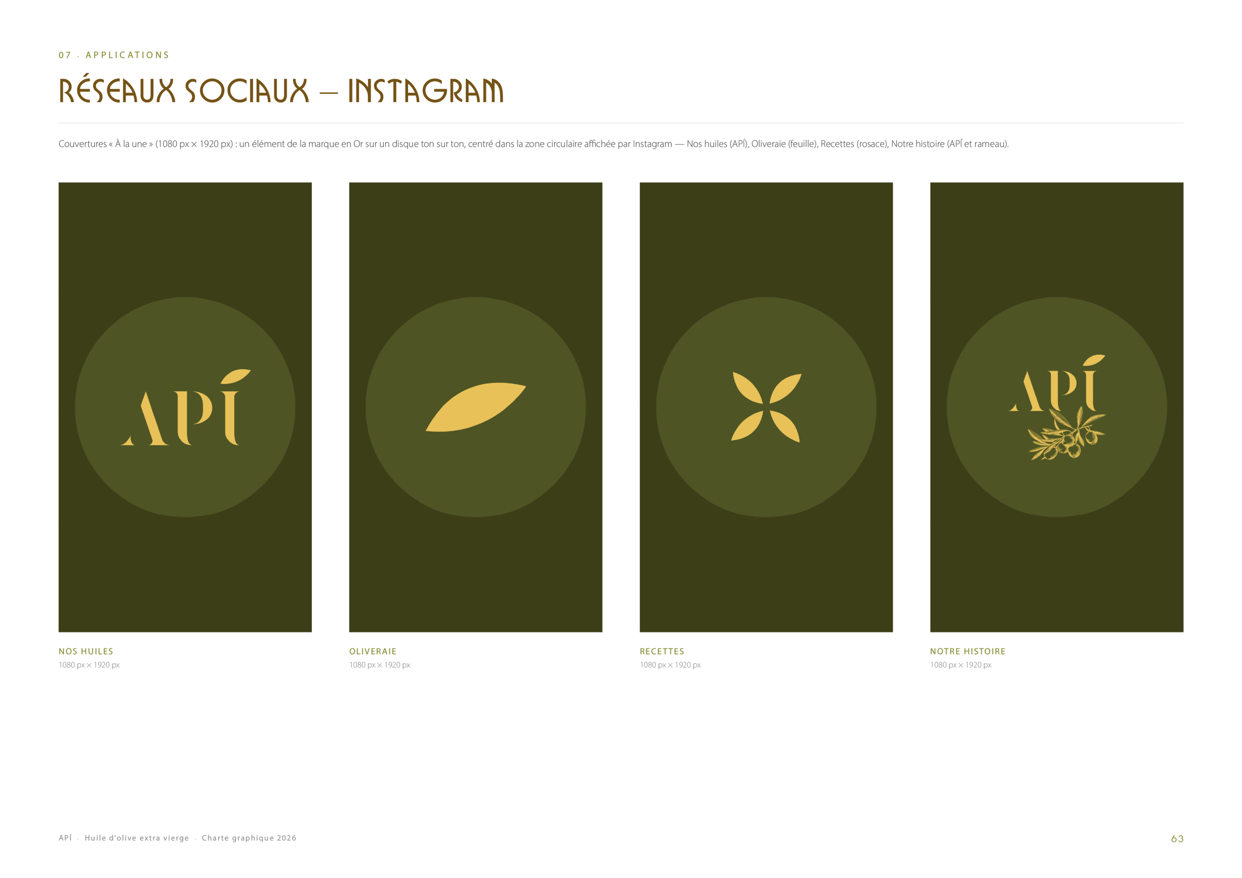
Finally, the guidelines show the brand in use: a flyer, a 2027 planner, a tote bag, a trade-show stand, a website and social media templates for Facebook, LinkedIn and Instagram, giving API a coherent presence from the shop shelf to the screen.