About LAFICO
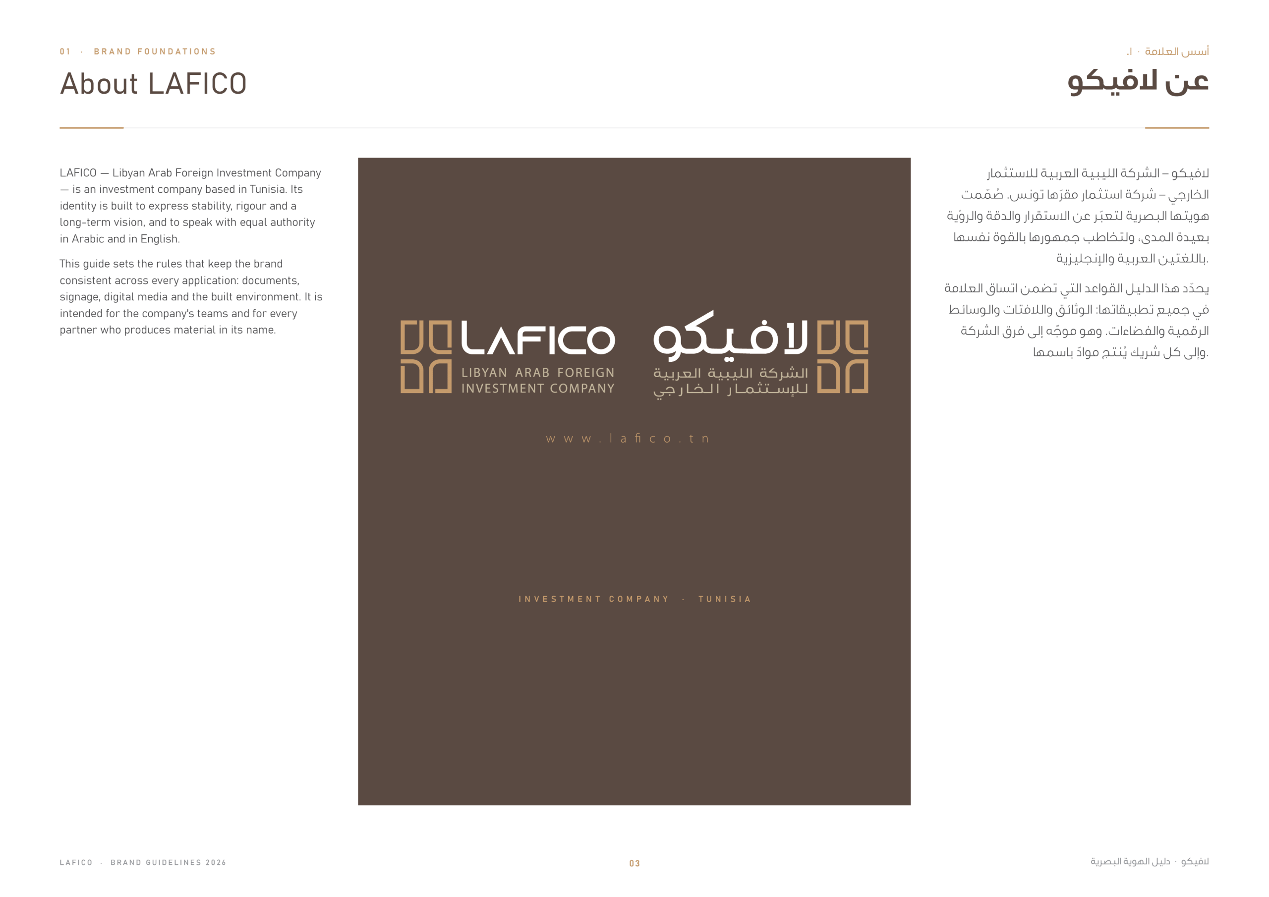
LAFICO (Libyan Arab Foreign Investment Company) is an investment company based in Tunisia. Its new identity had to express stability, rigour and a long-term vision, and to speak with equal authority in Arabic and in English. The brand guidelines set the rules that keep the brand consistent across documents, signage, digital media and the built environment.
The Logo: One Brand, Two Languages
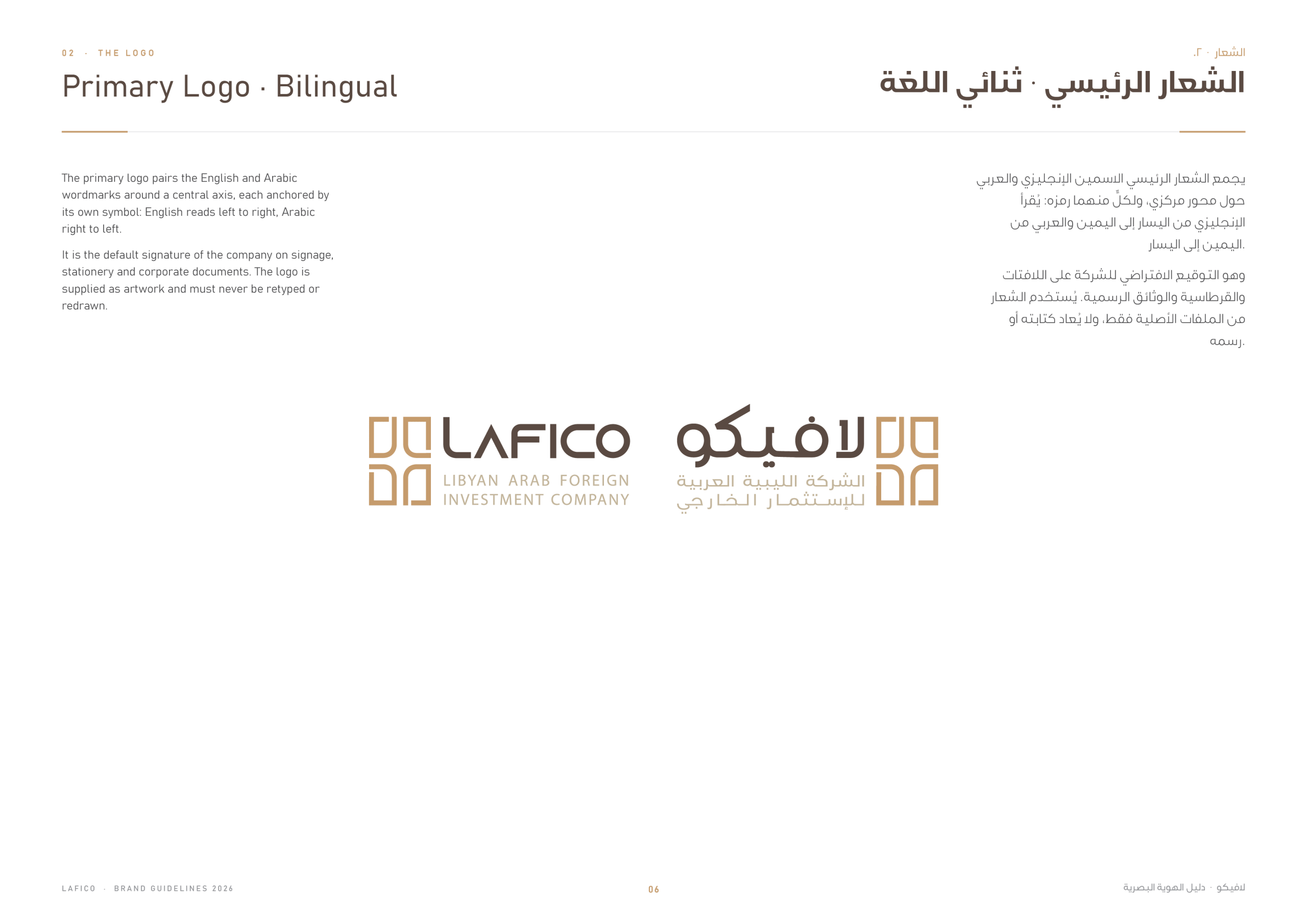
The primary logo is bilingual: the symbol sits between the English wordmark “LAFICO” and the Arabic “لافيكو”, each with its descriptor. Dedicated English and Arabic versions are also defined for documents in a single language, with the descriptor always kept as part of the logo.
The Symbol
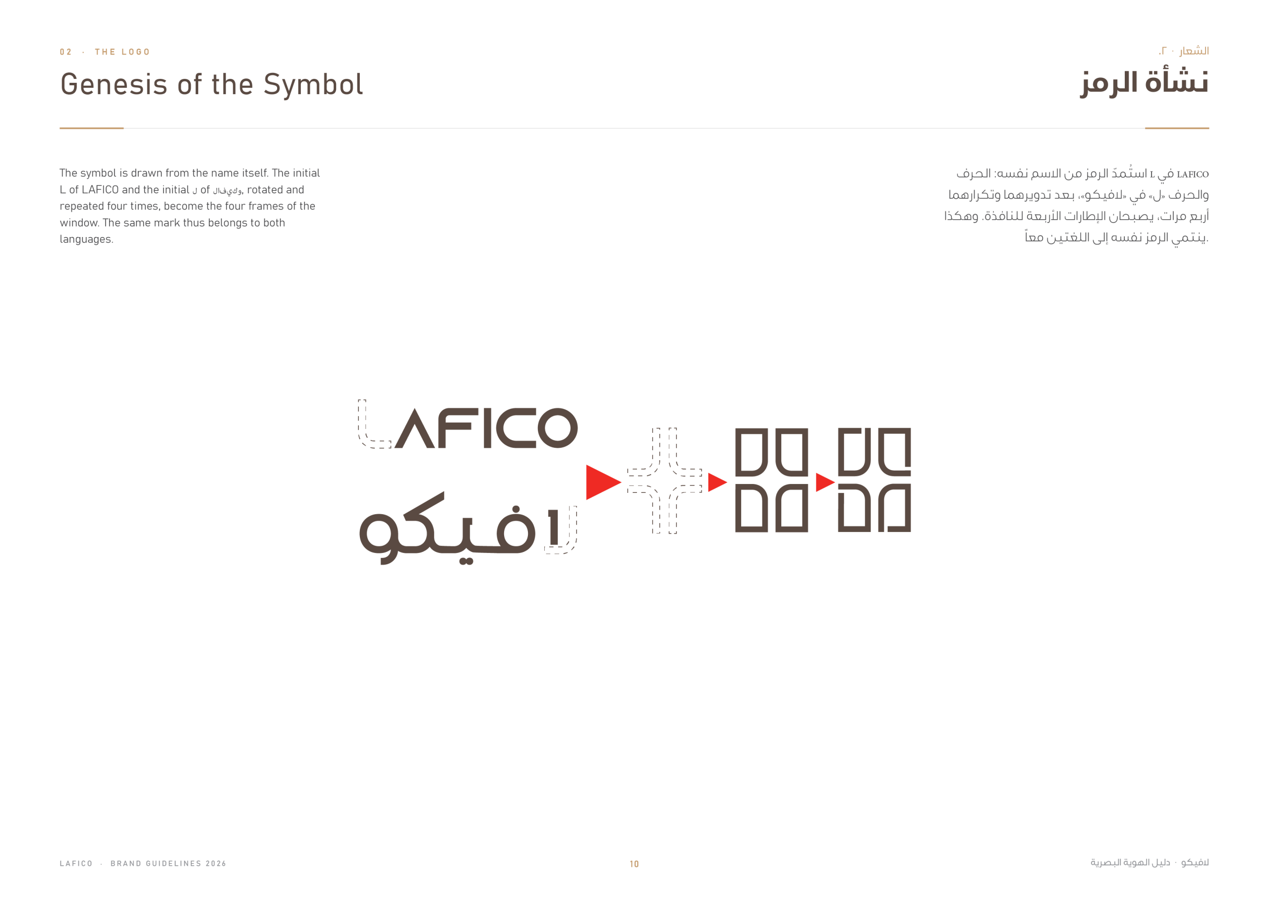
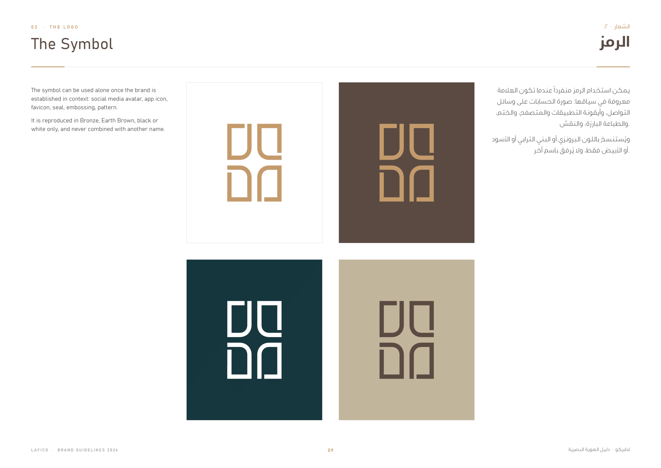
The symbol is drawn from the name itself: the initial L of LAFICO and the Arabic letter ل, rotated and repeated four times, become the four frames of a window. The same mark therefore belongs to both languages, and can live on its own as an avatar, seal, app icon or embossing, in bronze, earth brown, black or white.
Colour Versions & Correct Use
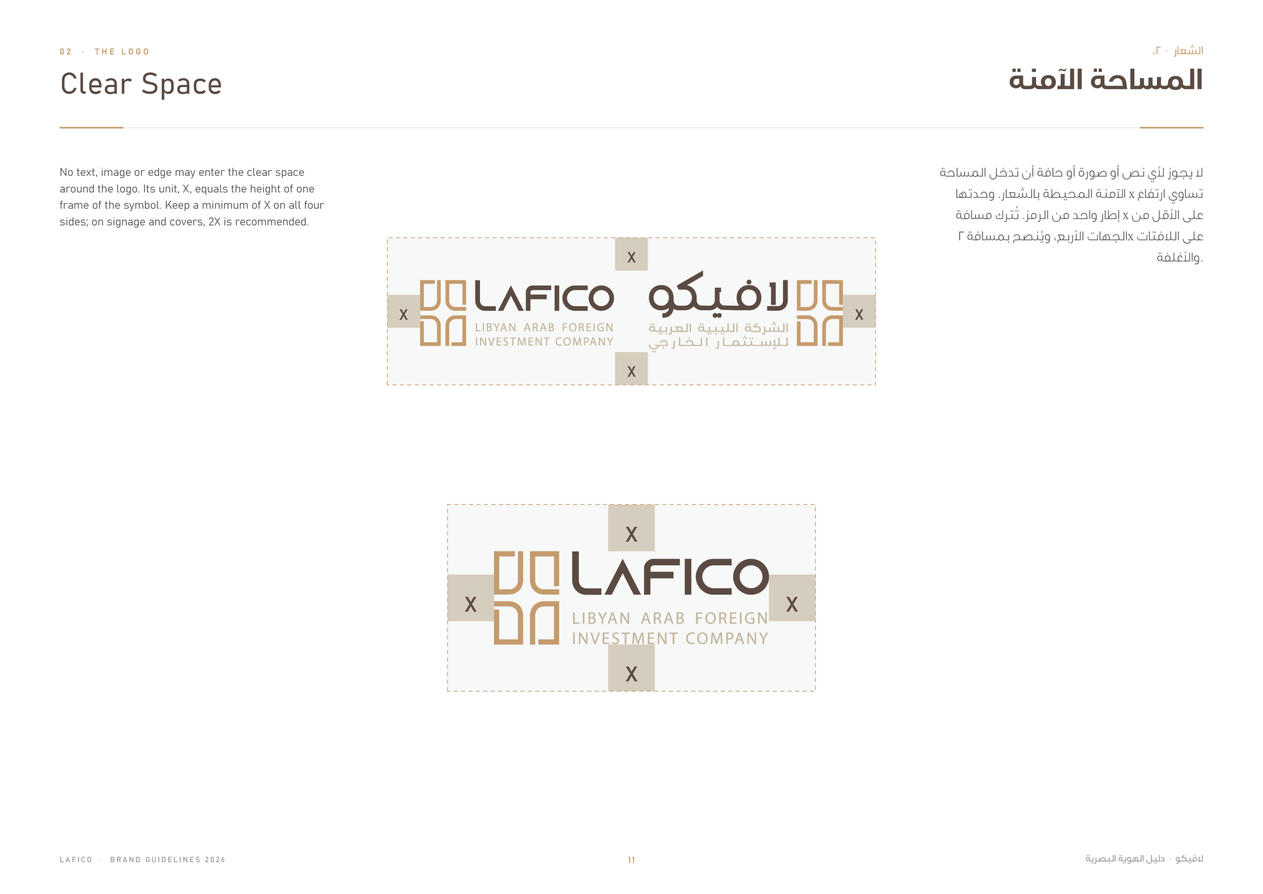
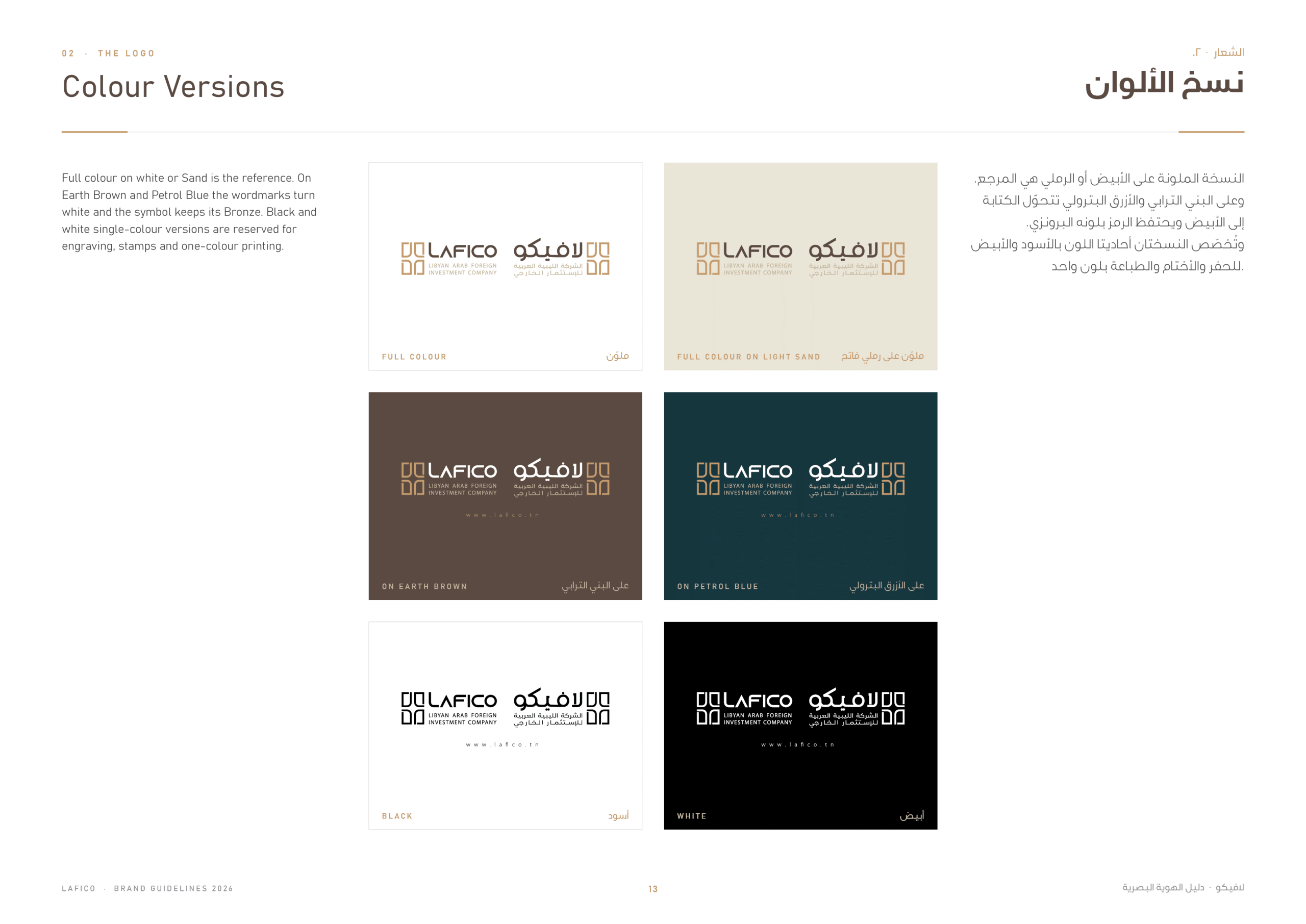
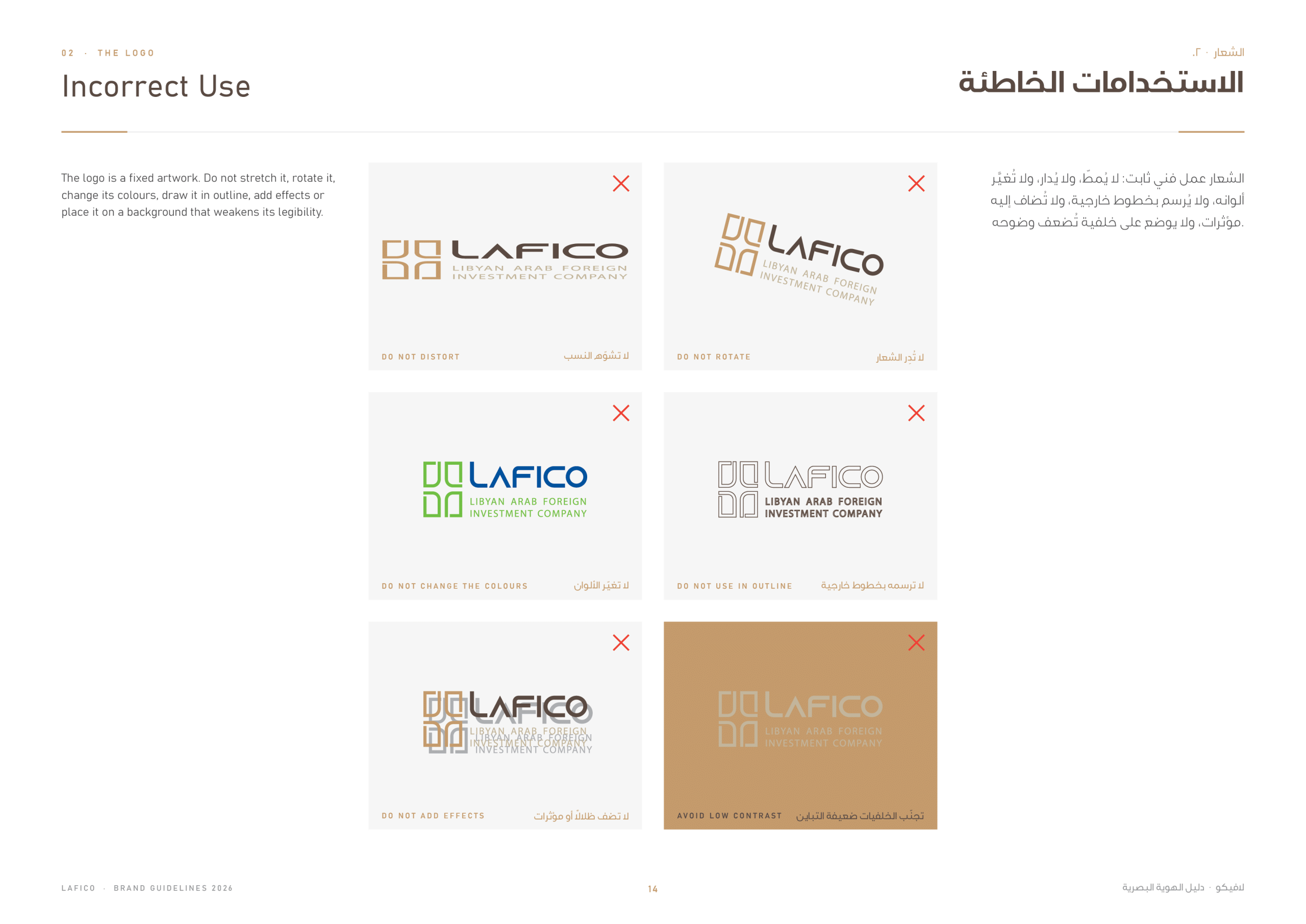
The guidelines define the clear space around the logo, its colour versions on light and dark backgrounds, and the incorrect uses to avoid, so the brand stays precise in every application.
Palette, Pattern & Supergraphic
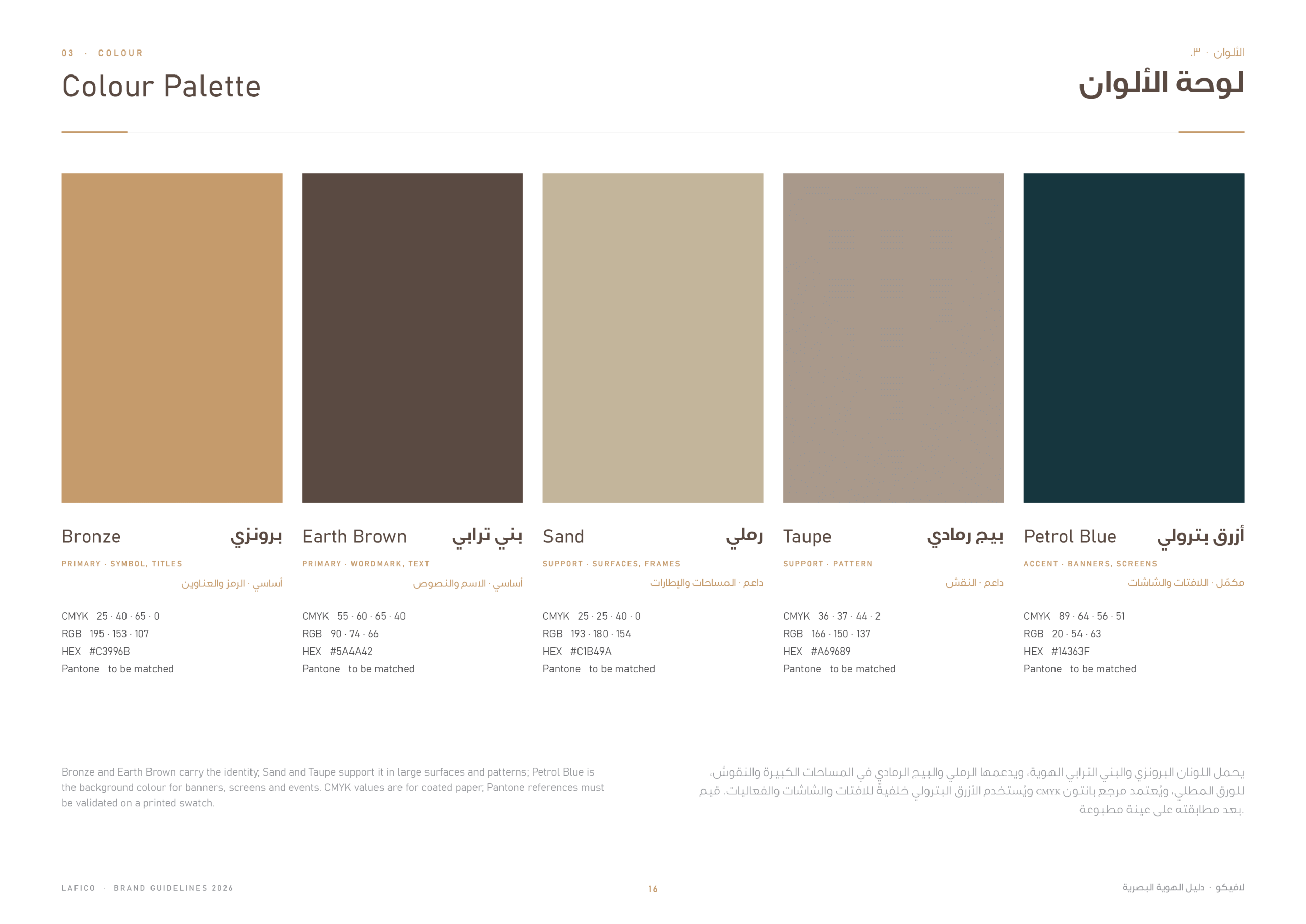
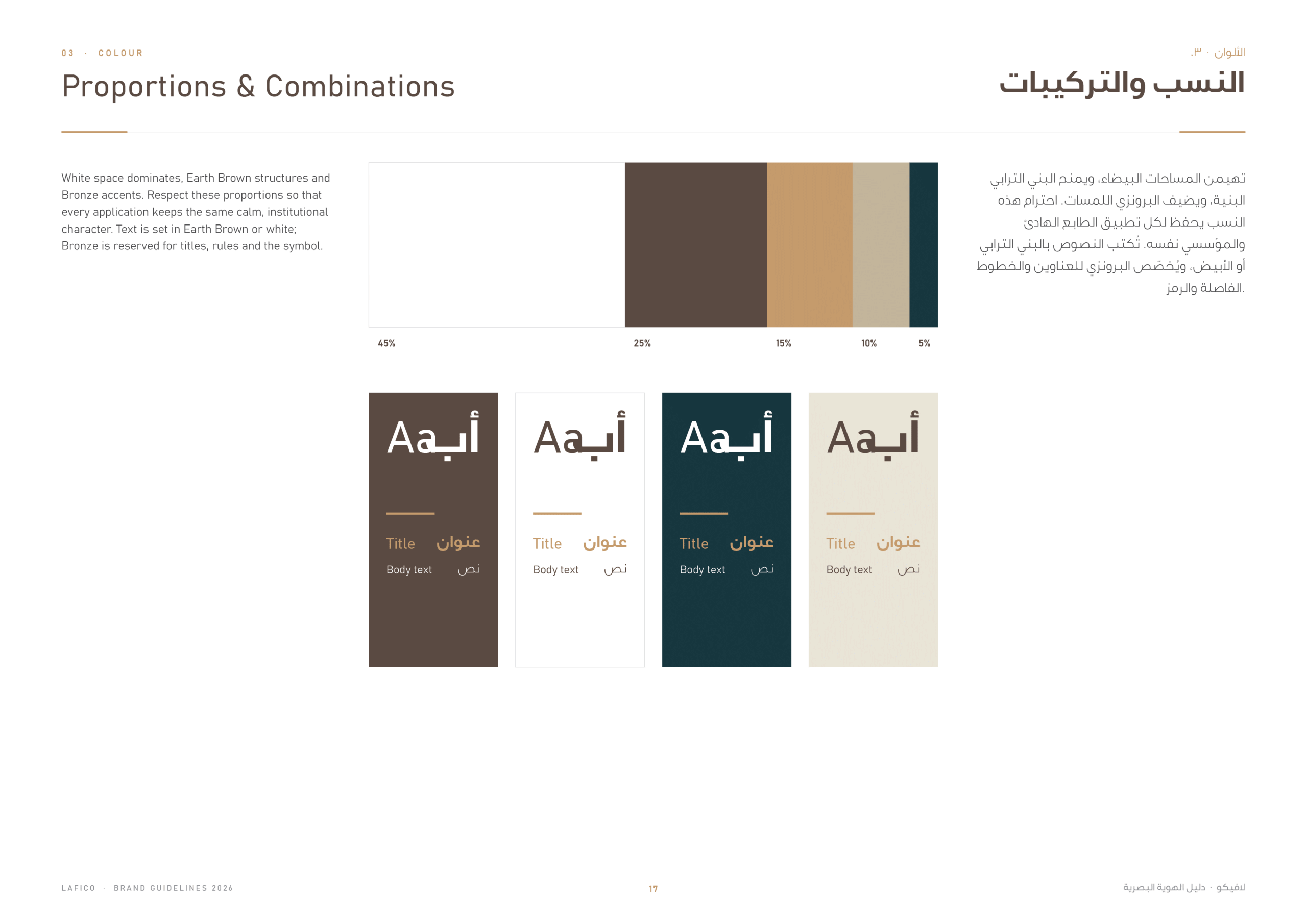
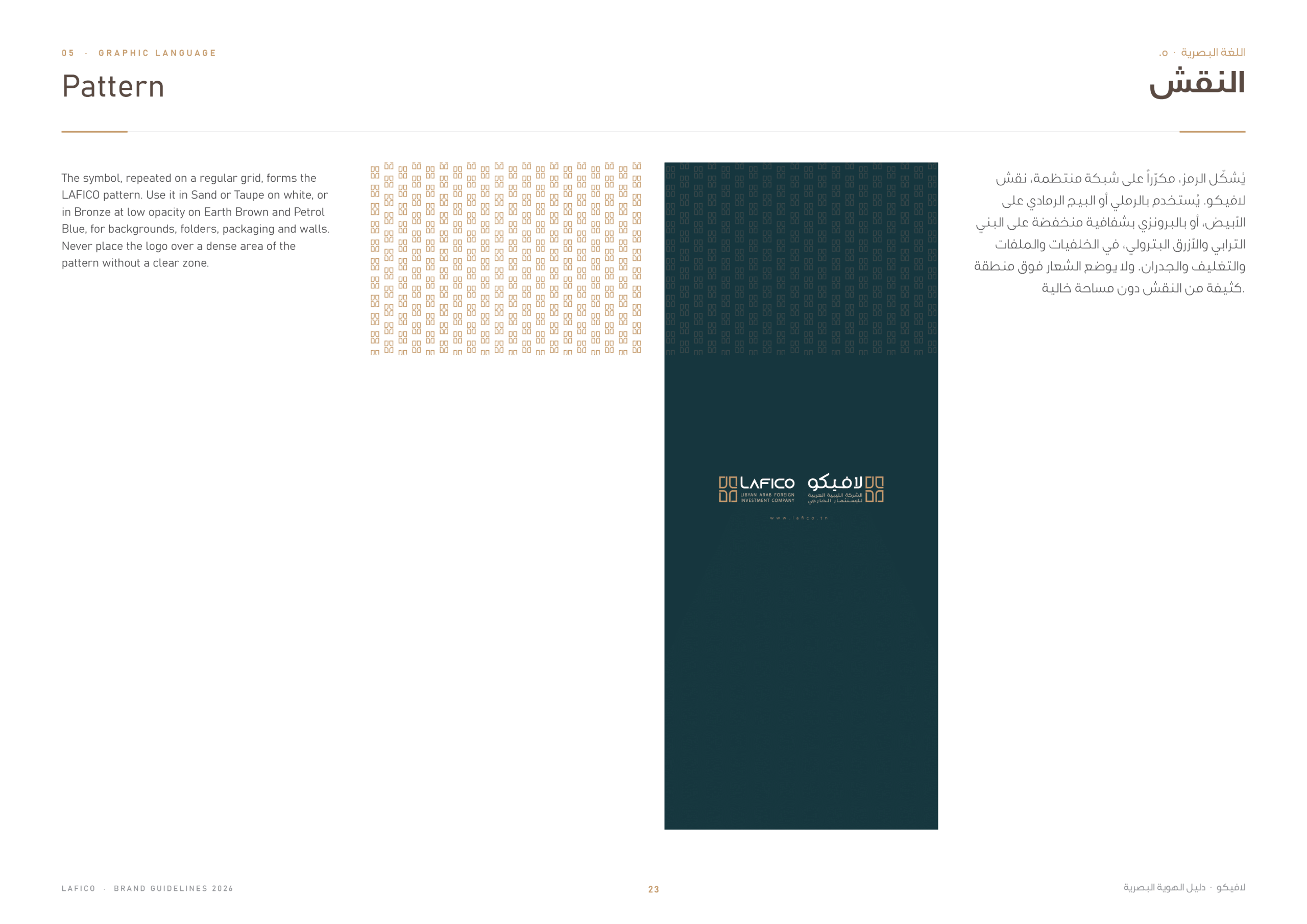
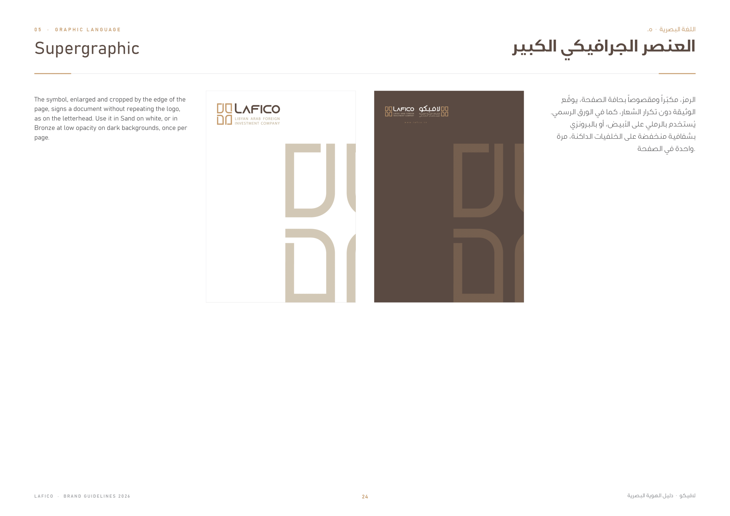
The palette pairs warm bronze, sand and earth brown with a deep teal, with clear proportions for each combination. The symbol also becomes a pattern and a large supergraphic, giving the brand a strong presence on walls, covers and digital backgrounds.
Stationery
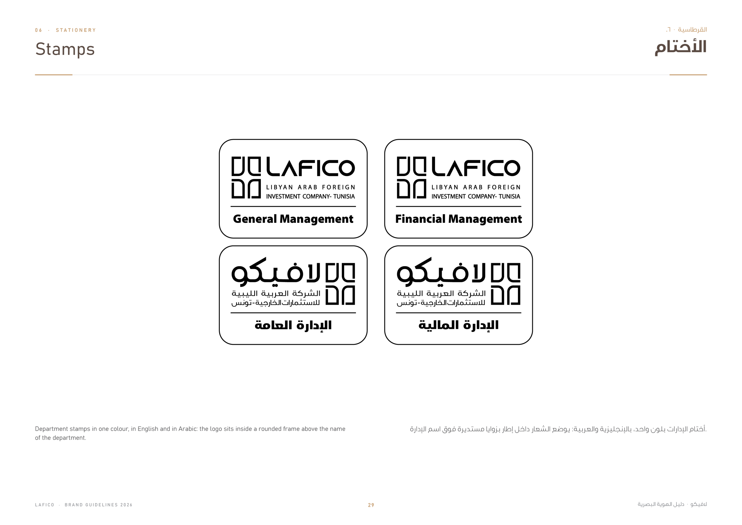
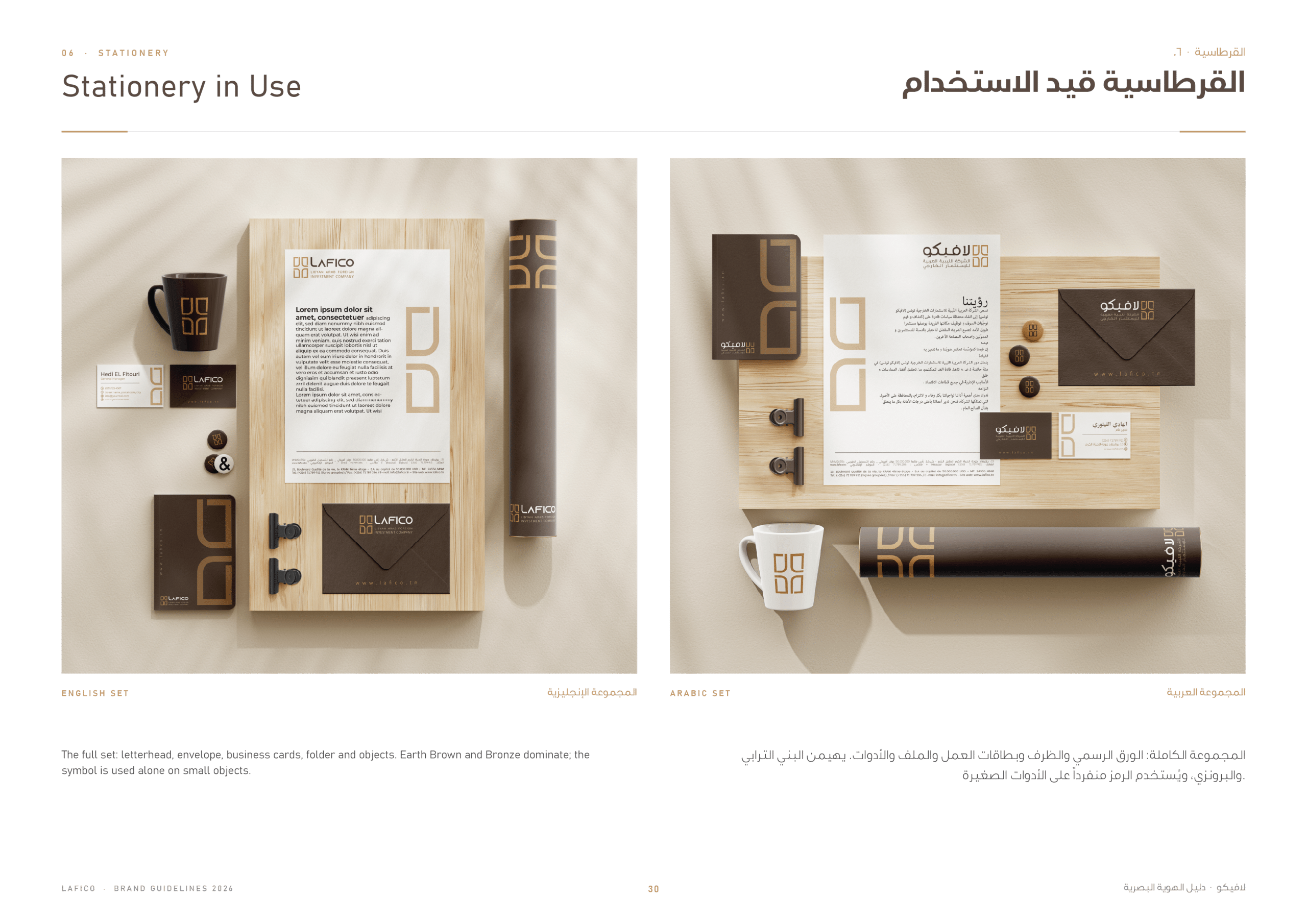
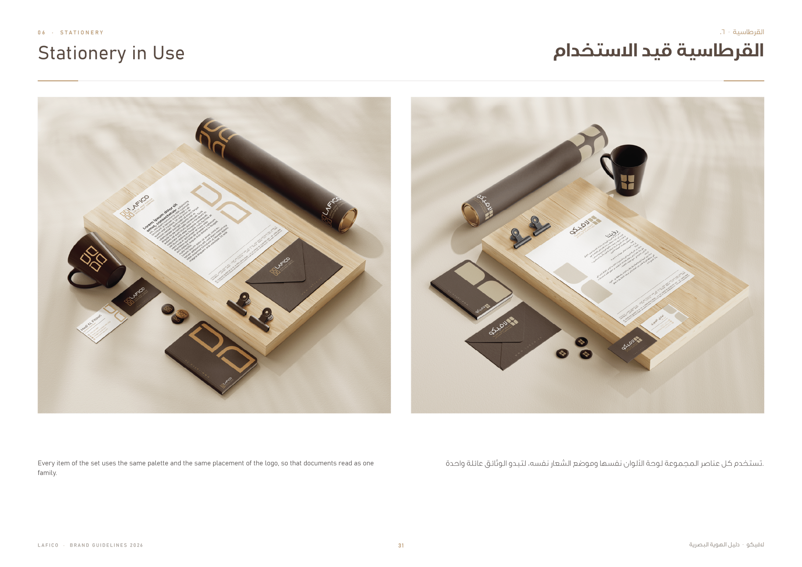
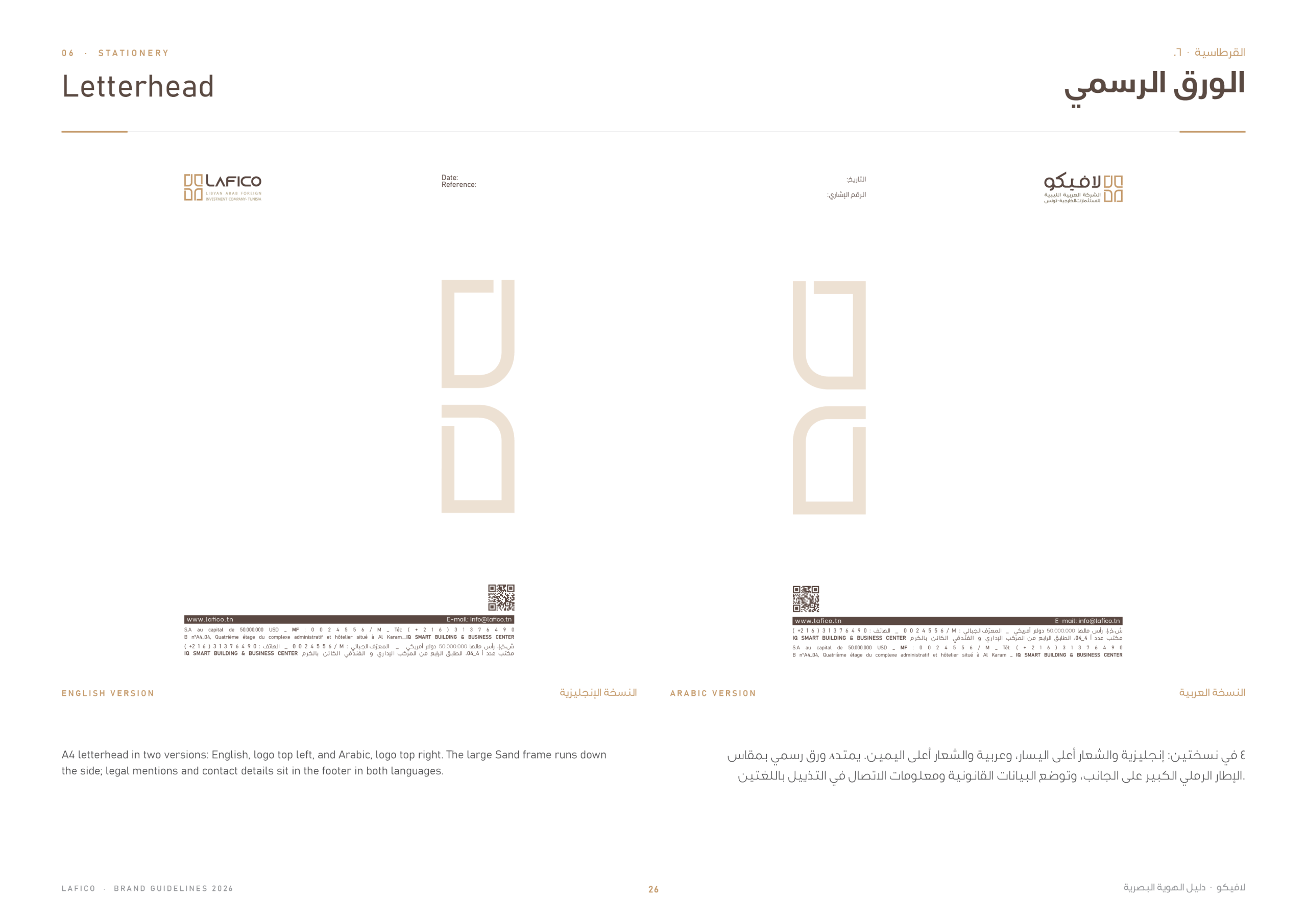
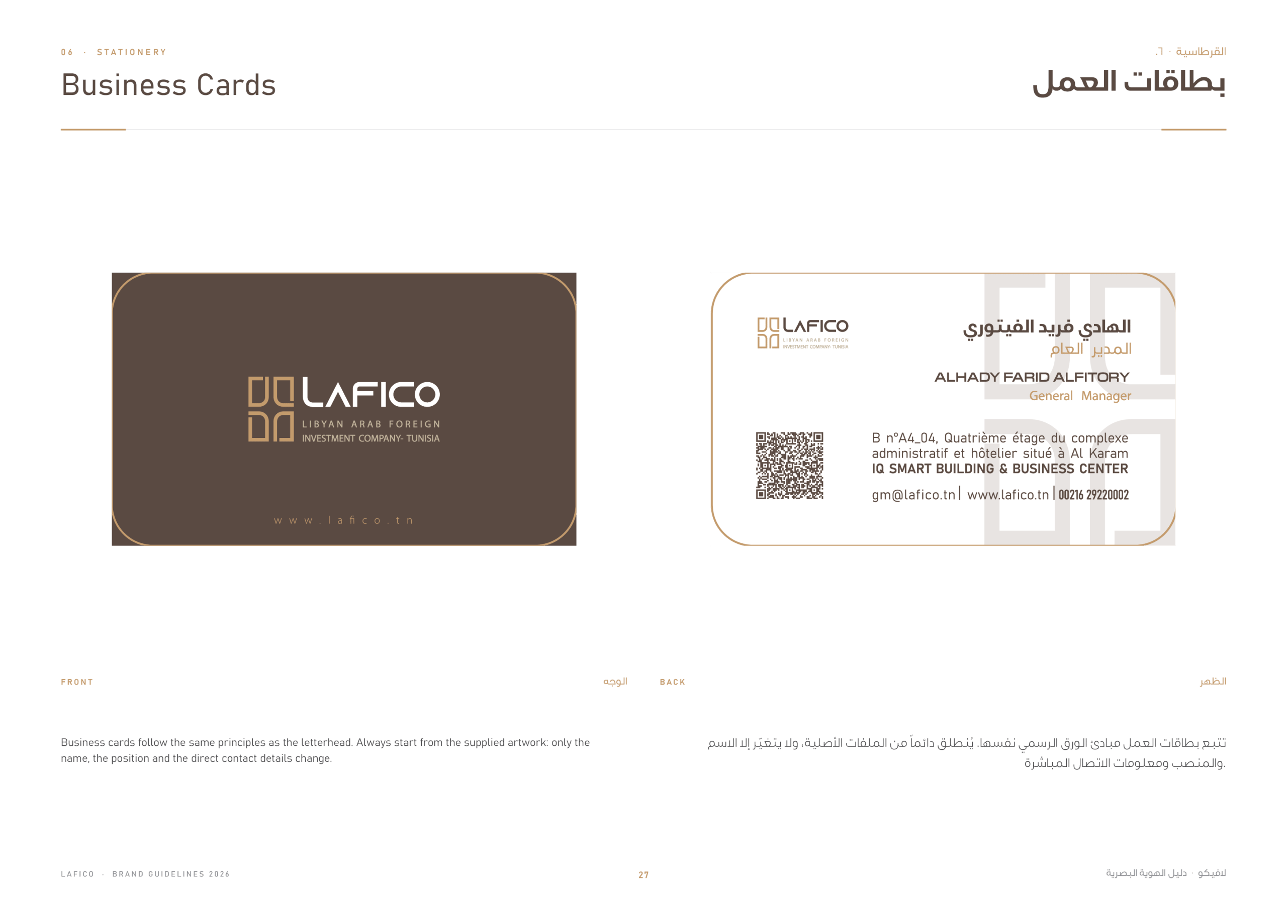
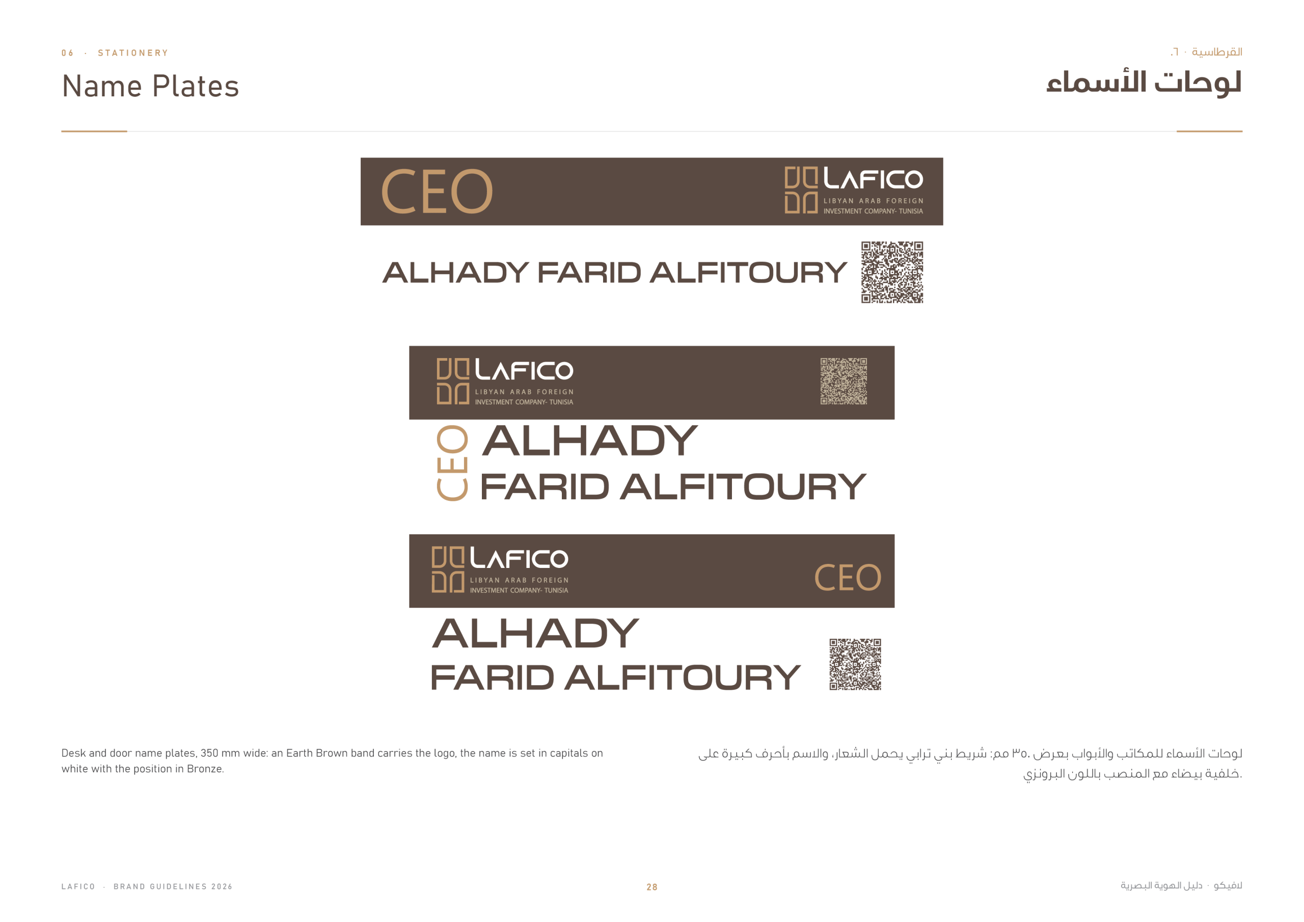
The identity carries through to the company’s documents and tools: letterhead, business cards, name plates and official stamps, all bilingual and shown in use on the desk.
Signage, Environment & Digital
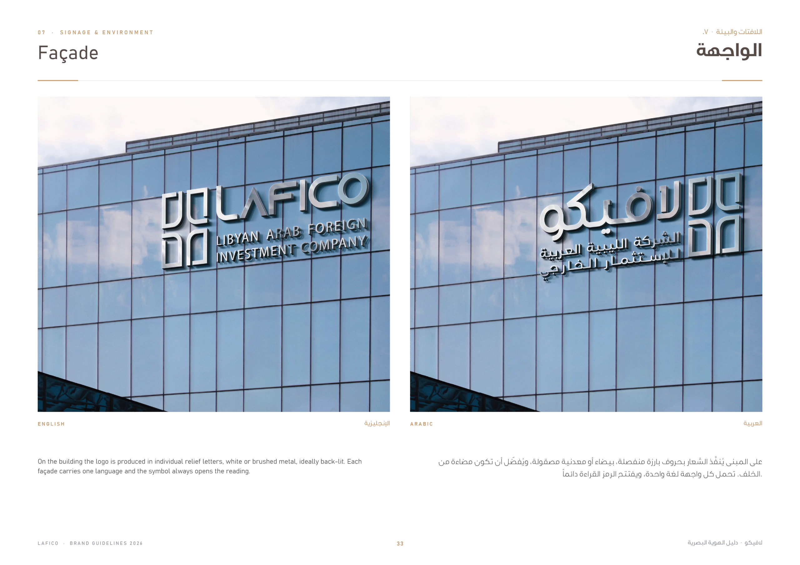
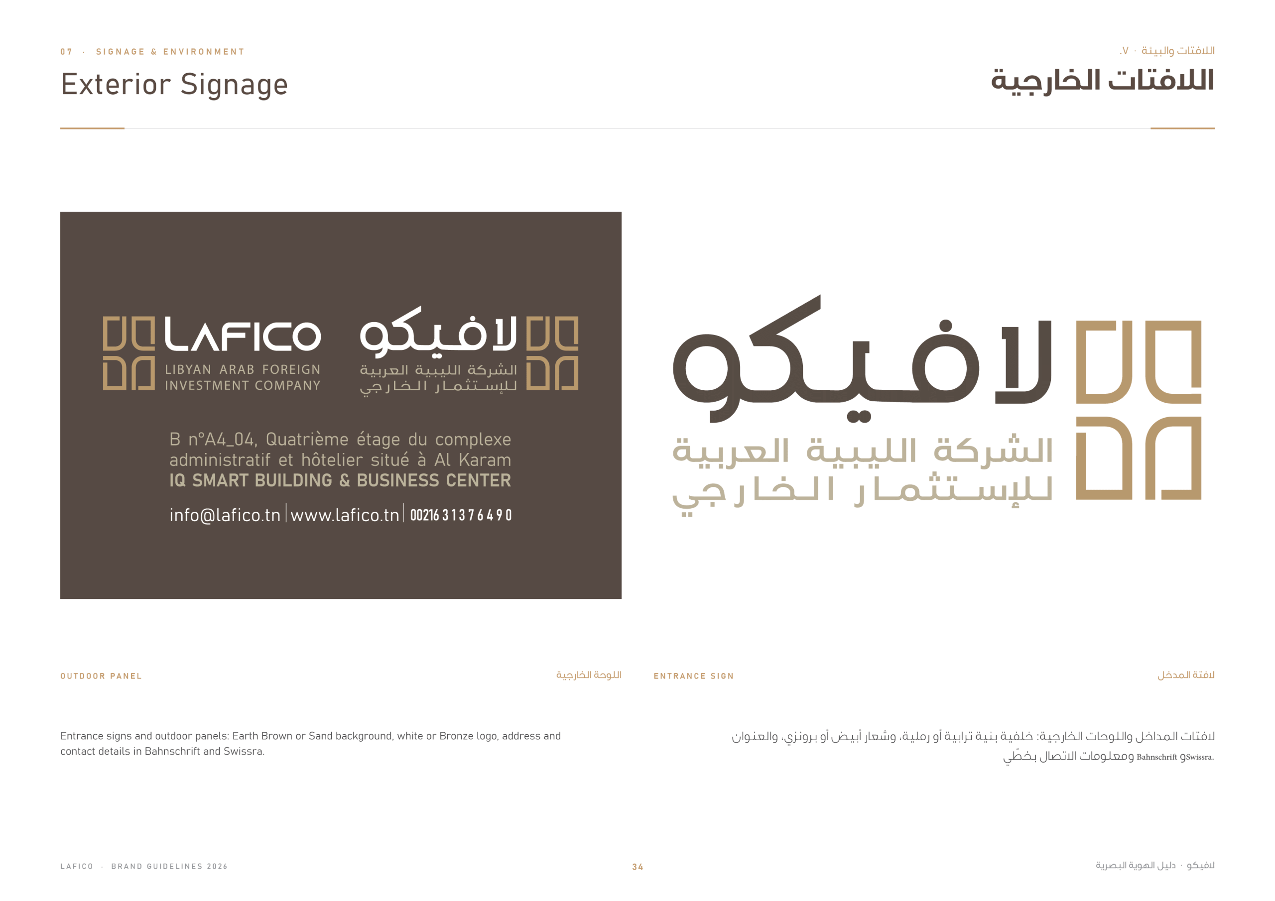
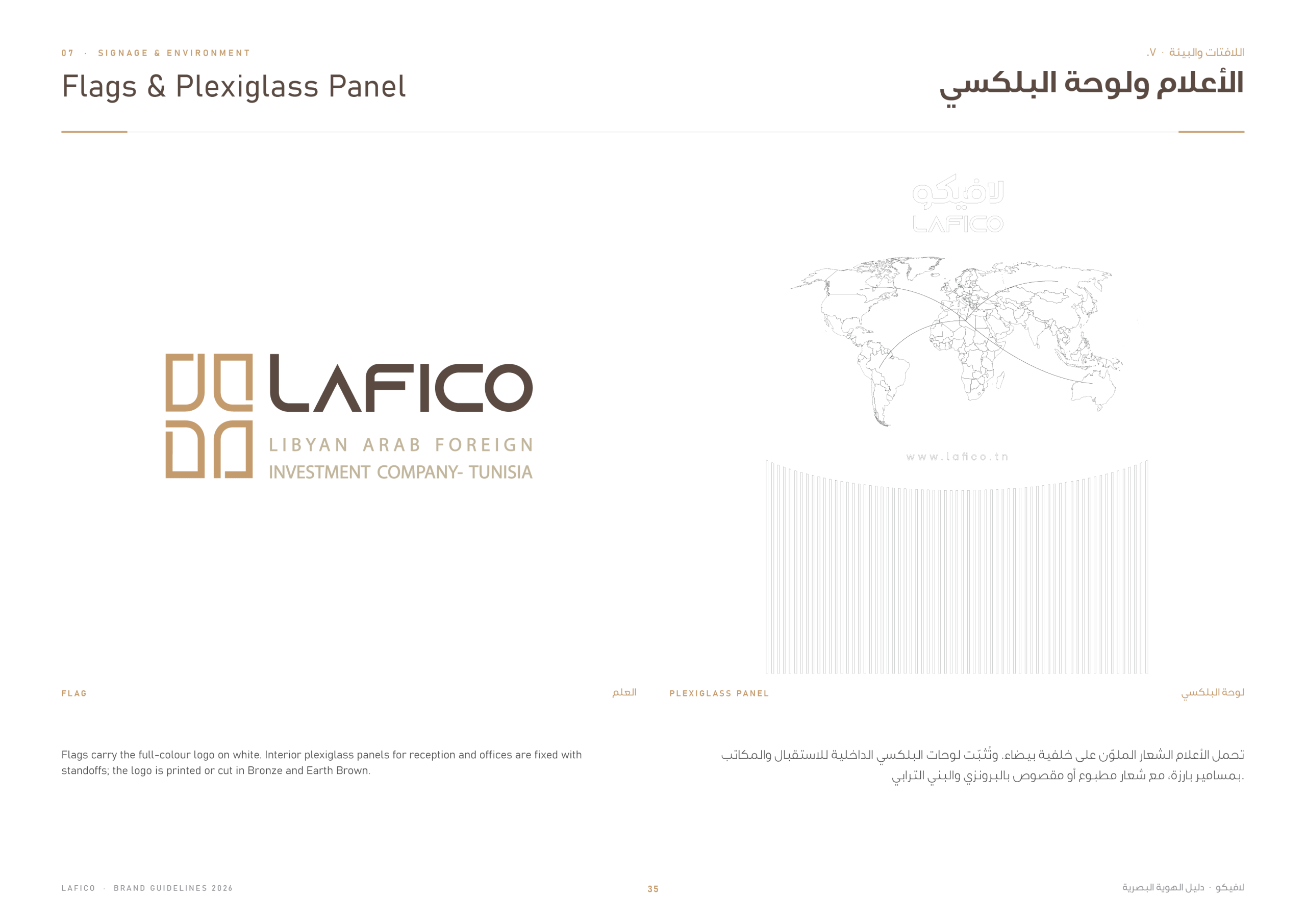
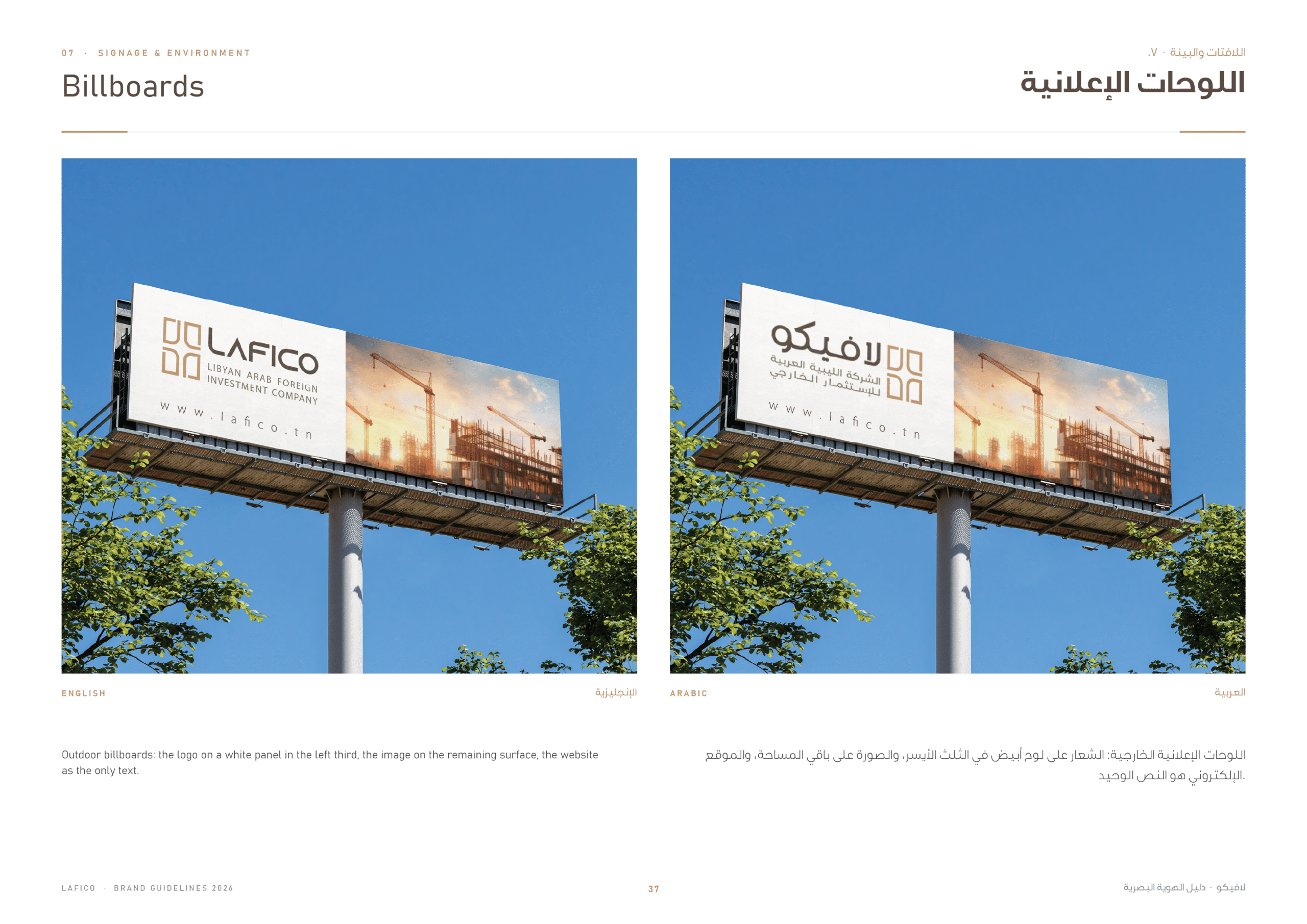
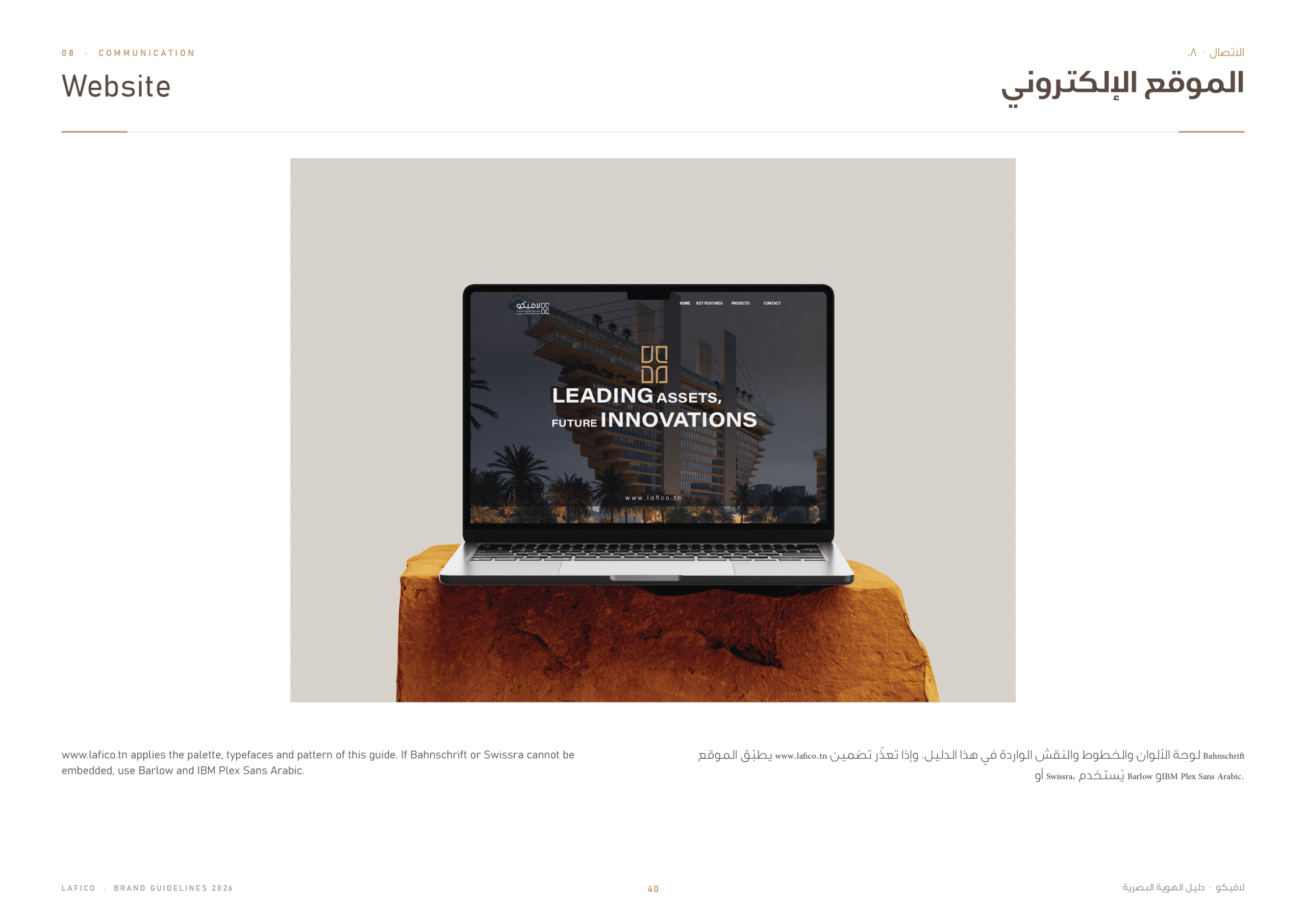
Finally, the brand is applied to the building and the city: the illuminated façade, exterior signage, flags and plexiglass panels, billboards, and the company website.