Etherya: The Couture House
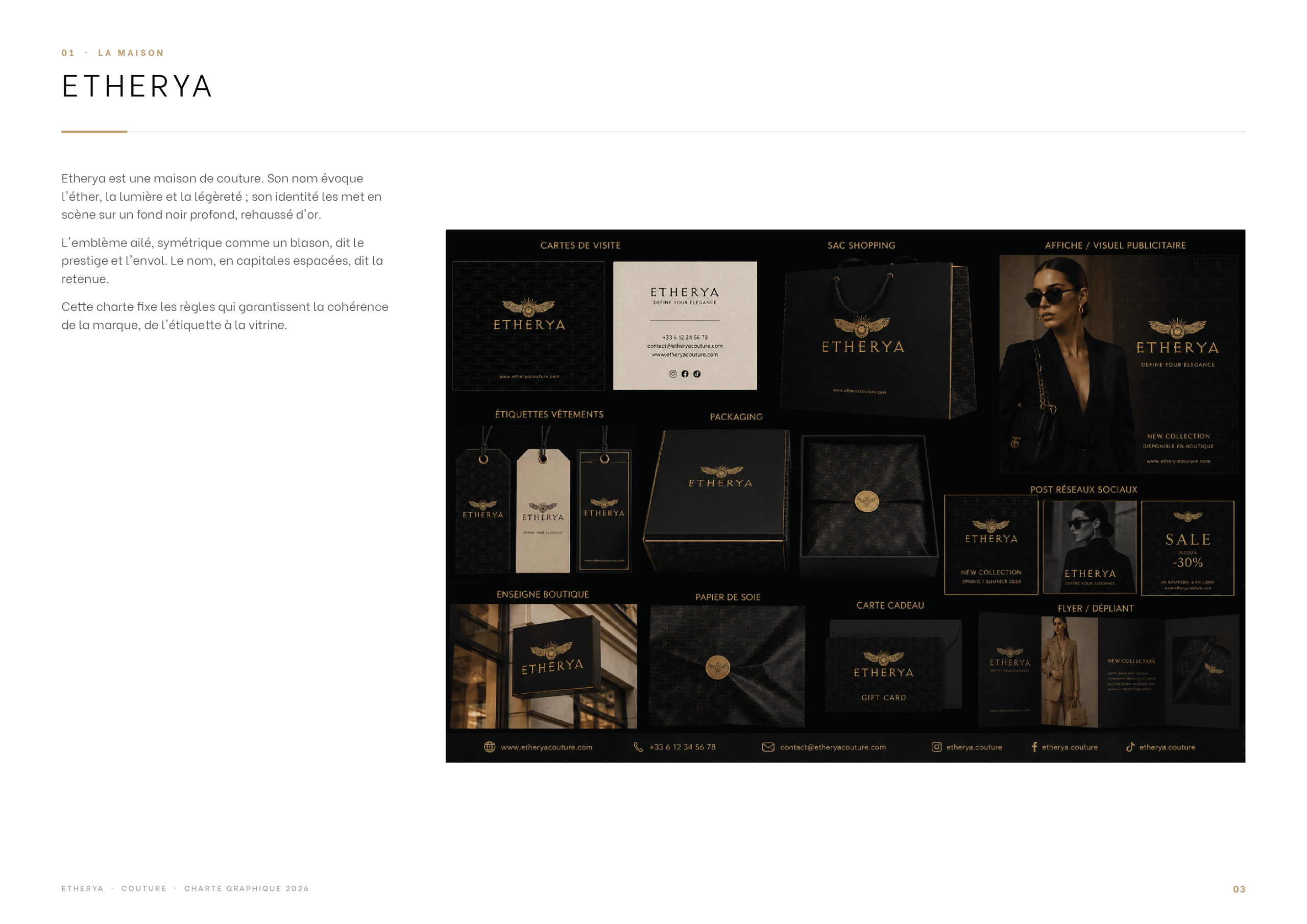
Etherya is a couture house. Its name evokes the ether, light and lightness, and its identity stages it on a deep black background, lifted with gold. The winged emblem, symmetrical like a coat of arms, speaks of prestige and taking flight, while the name, set in widely spaced capitals, expresses restraint. The guidelines keep the brand consistent from the garment label to the shop window.
The Universe
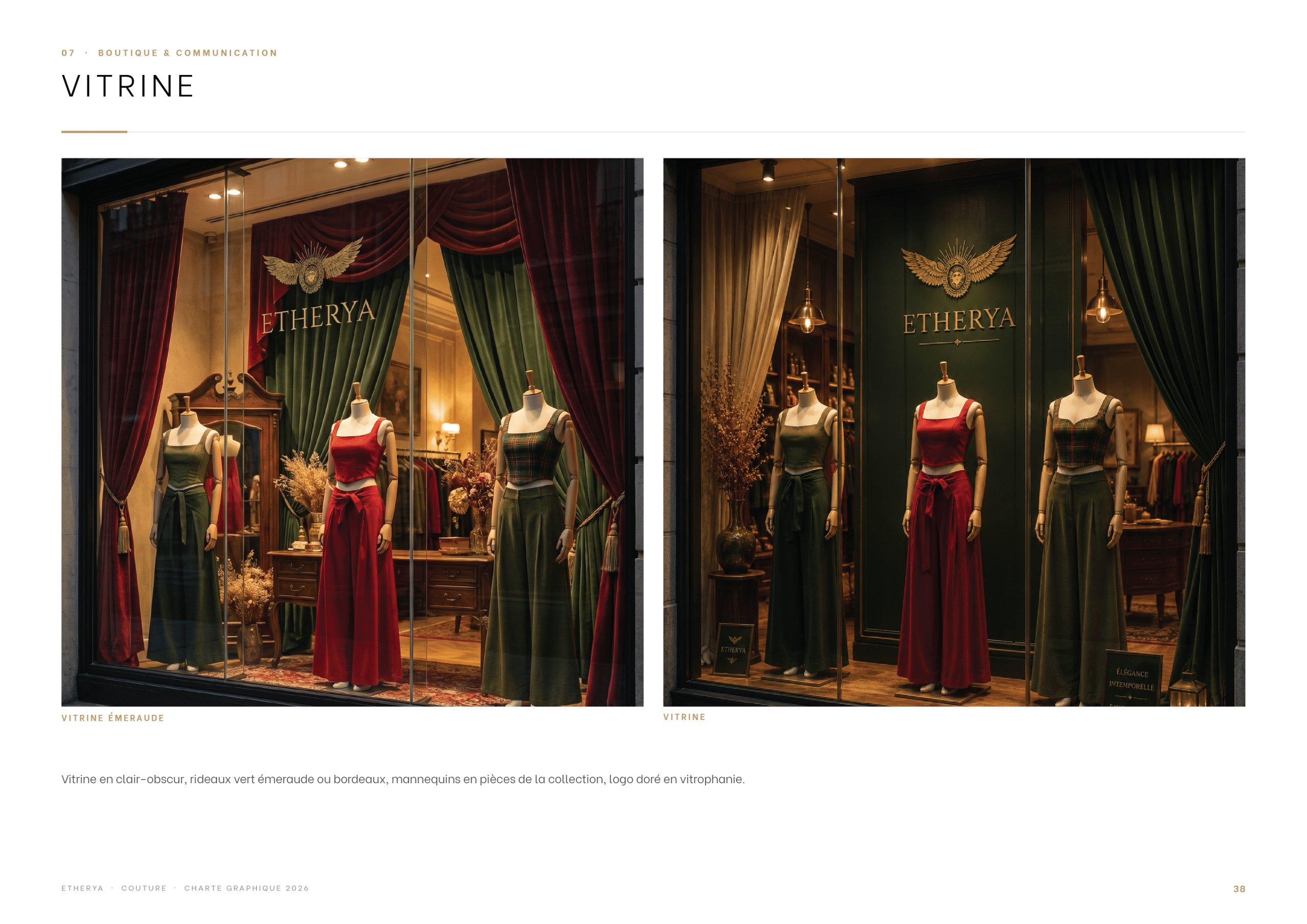
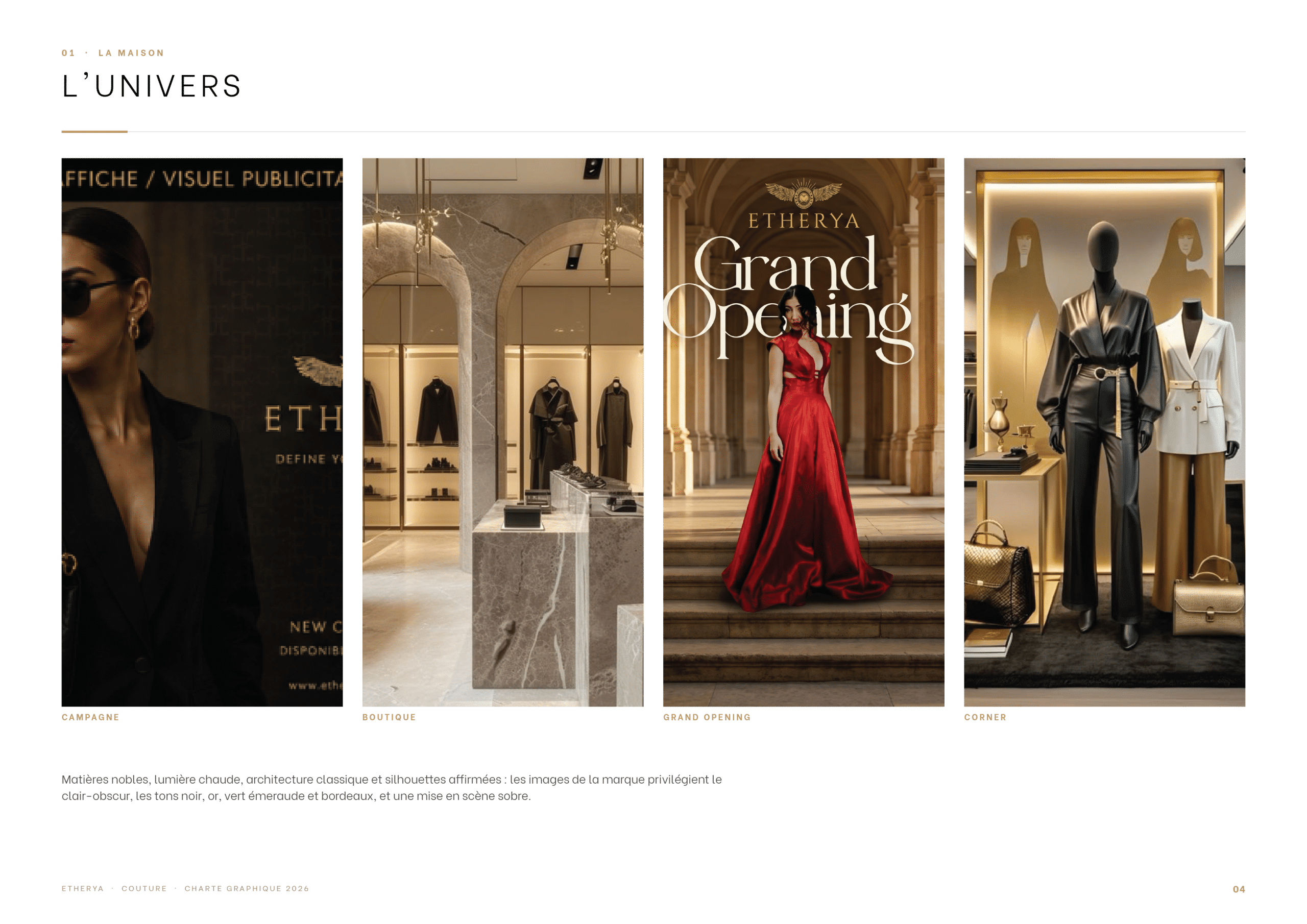
Noble materials, warm light, classical architecture and confident silhouettes: the brand imagery favours chiaroscuro, with black, gold, emerald green and burgundy tones, and a sober, elegant staging, from the campaign to the boutique, the grand opening and the corner.
The Logo & Emblem
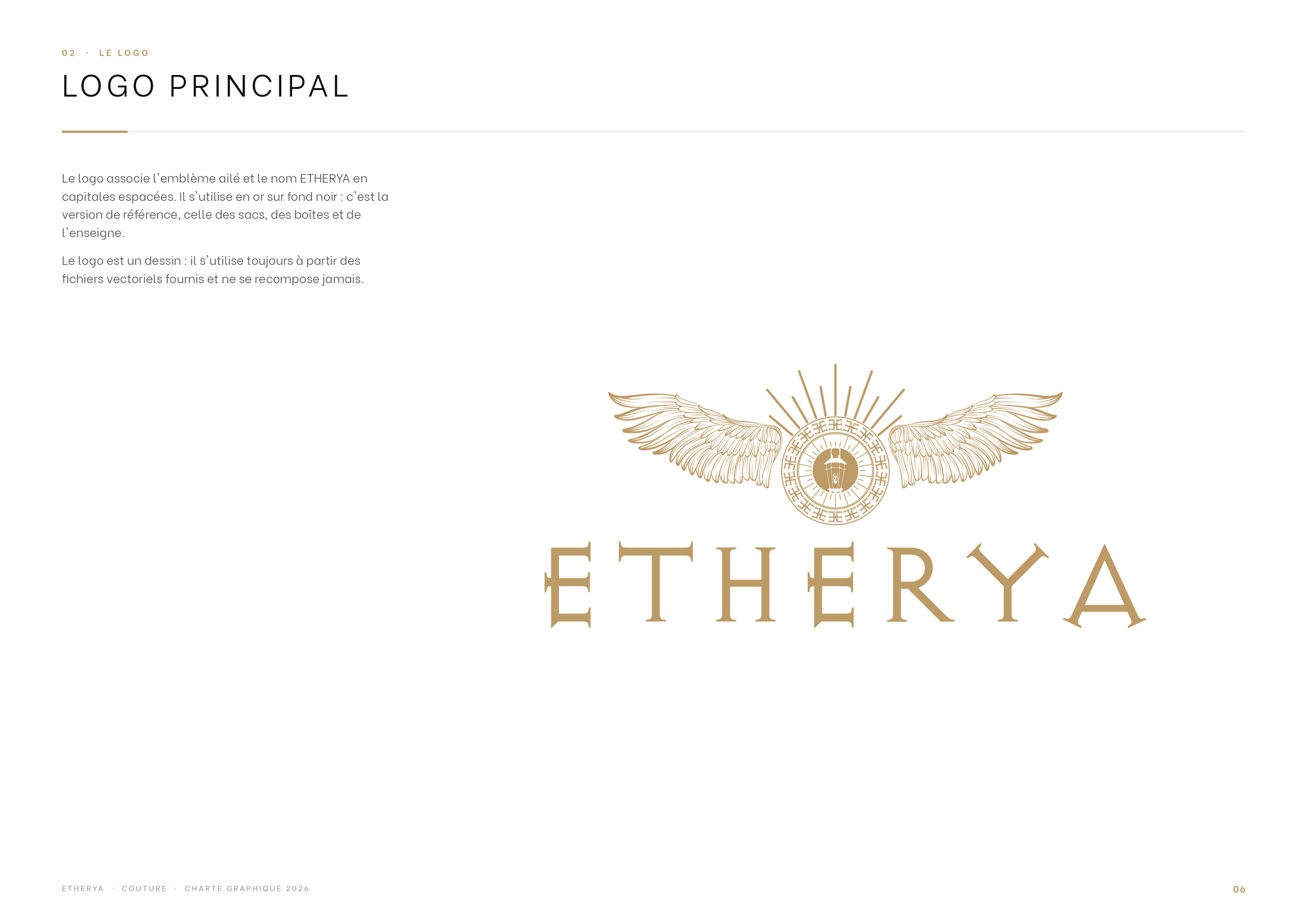
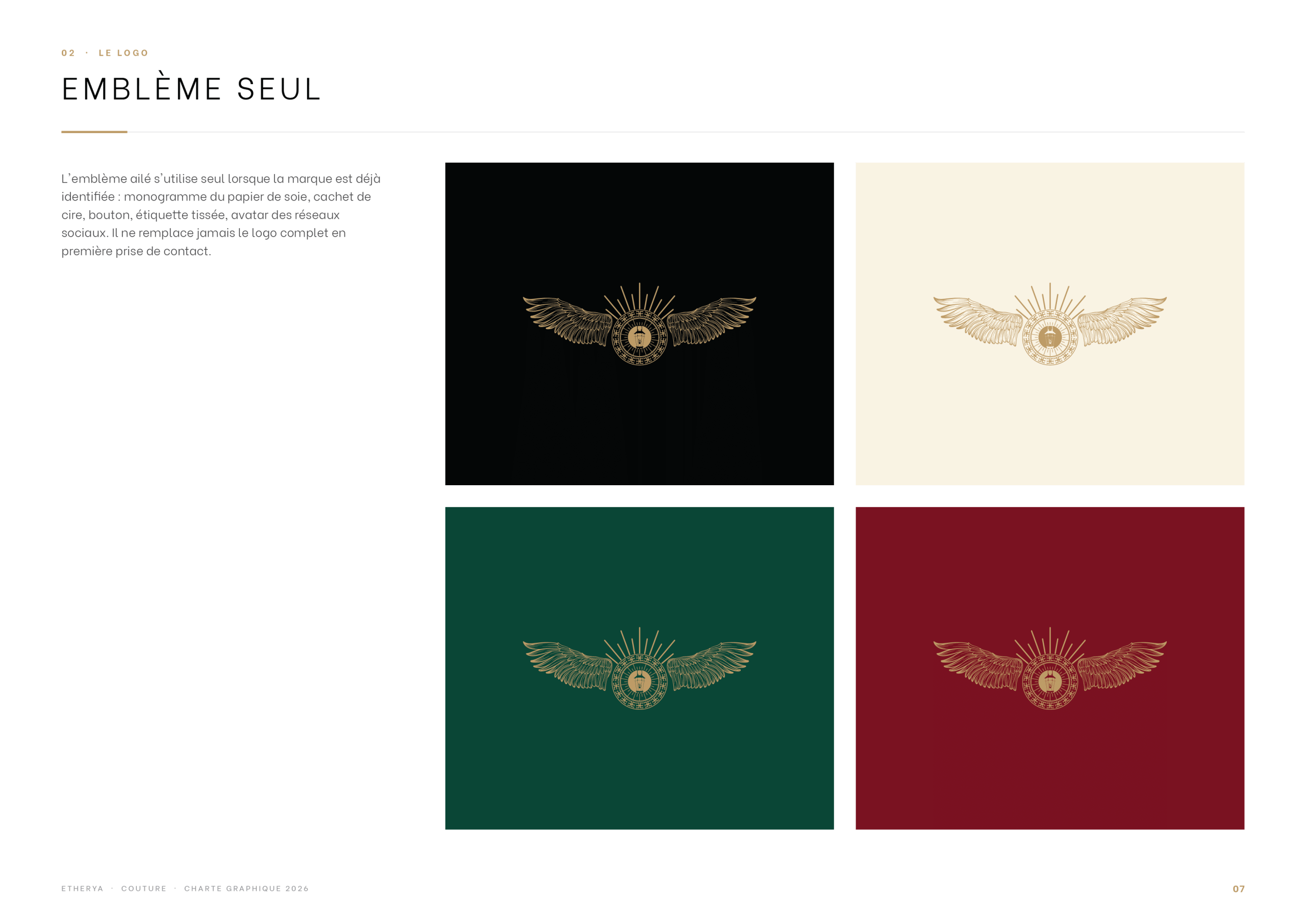
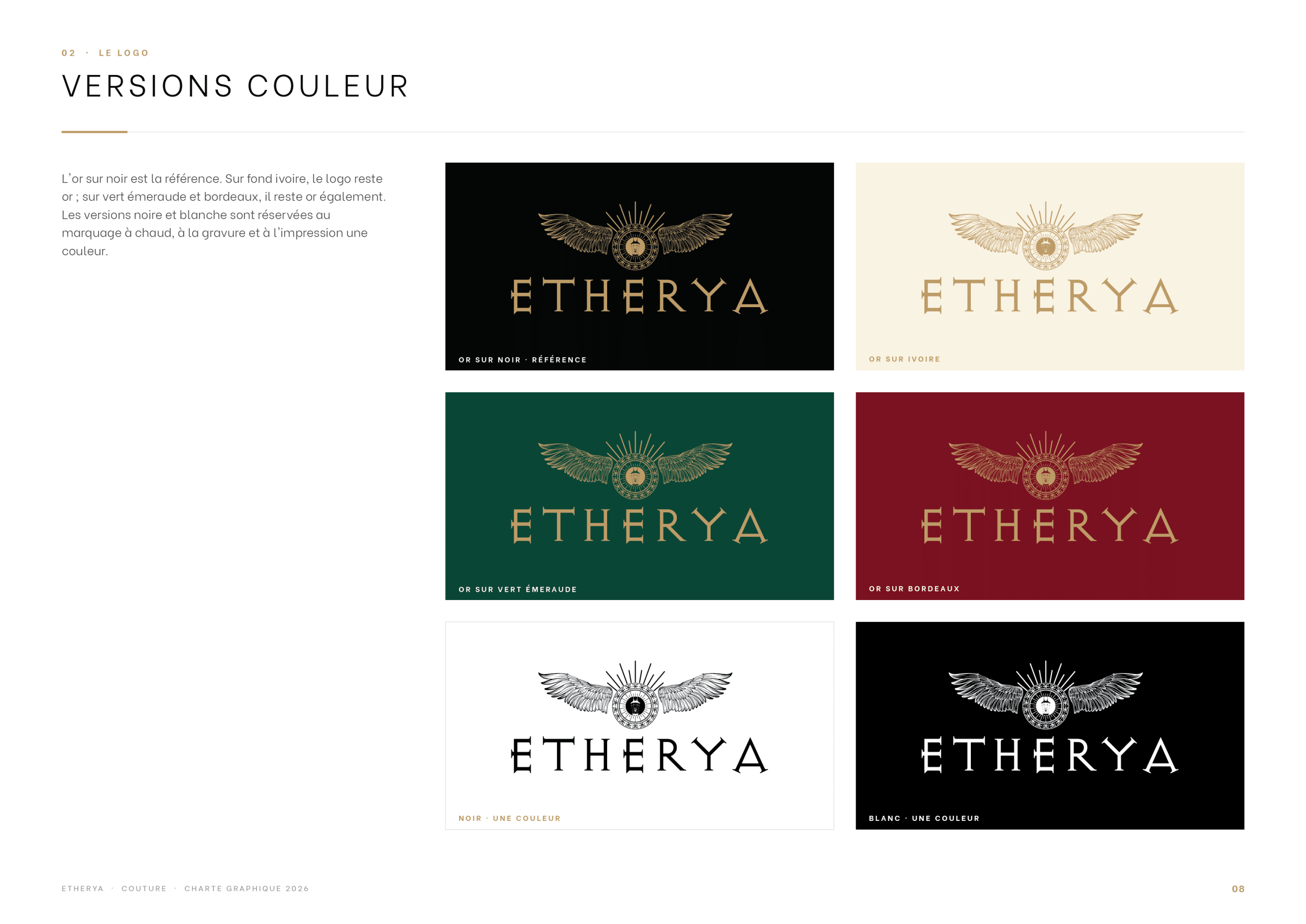
The primary logo pairs the gold winged emblem with the ETHERYA wordmark. The emblem can also live on its own, and the guidelines define its colour versions on dark and light backgrounds.
Clear Space & Colour Palette
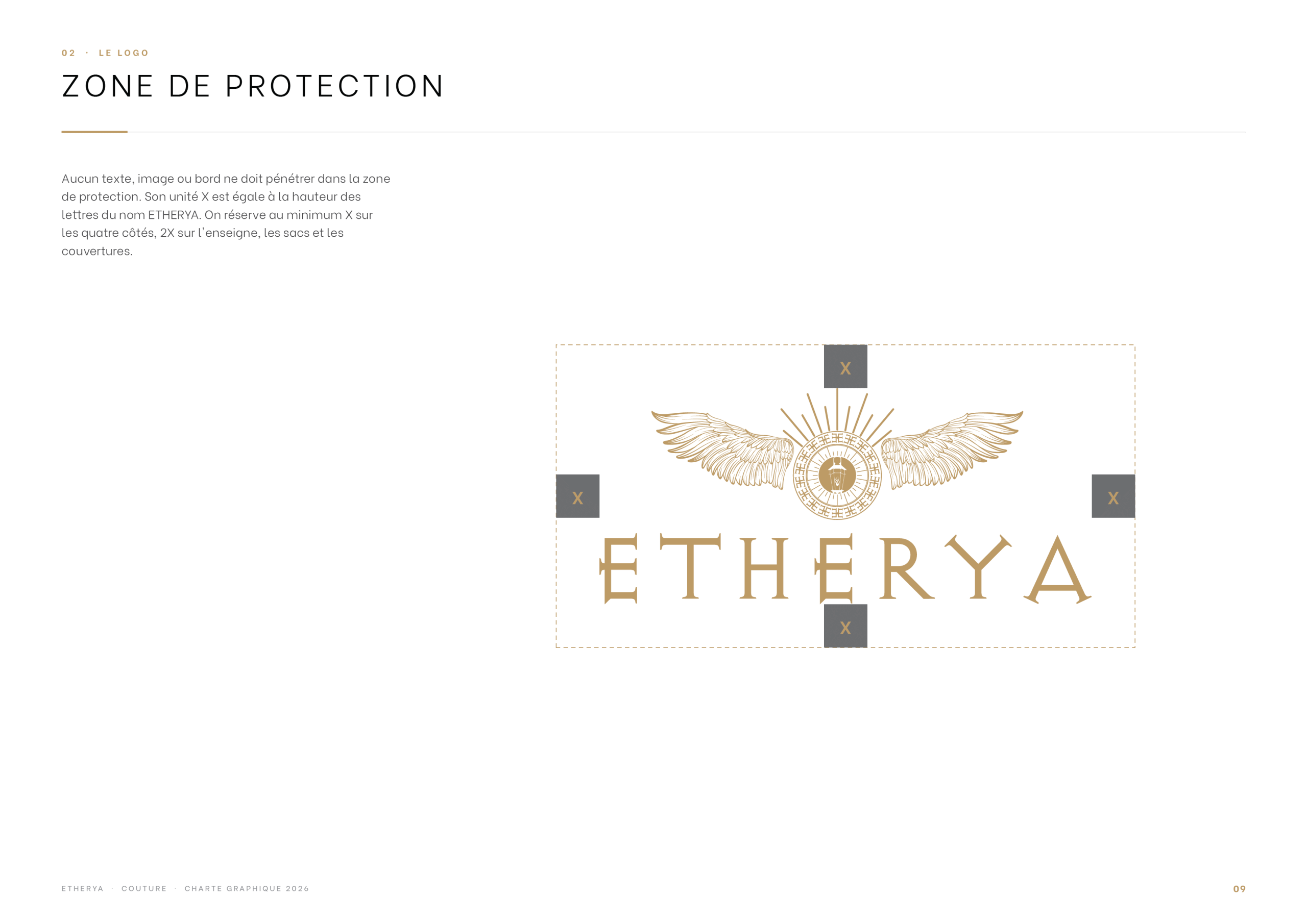
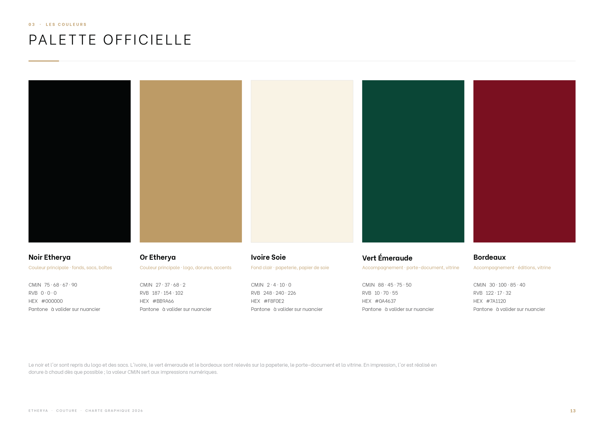
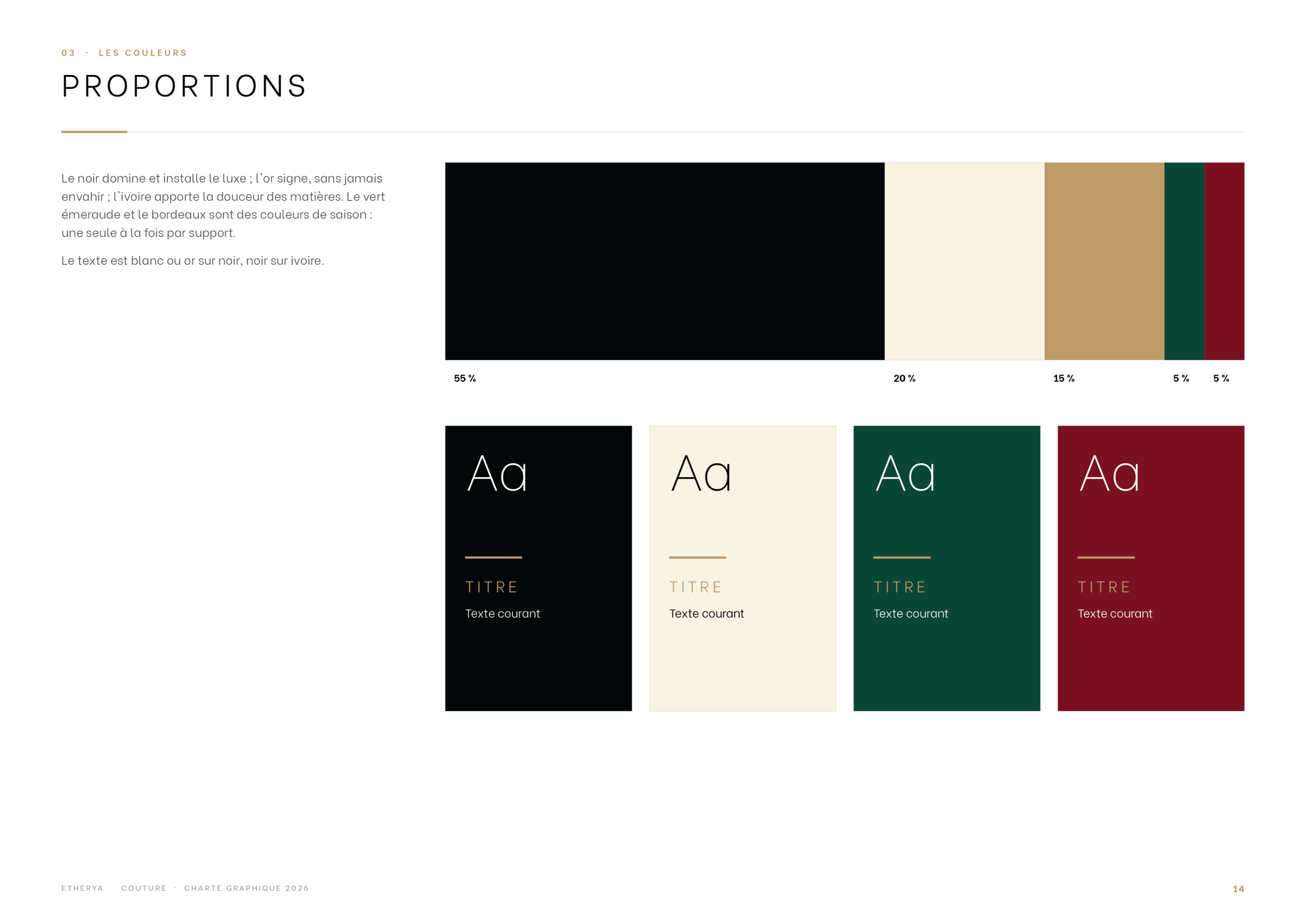
Clear space rules protect the logo, and the palette is built on deep black and refined gold tones, with precise proportions for every combination.
Pattern & Stationery
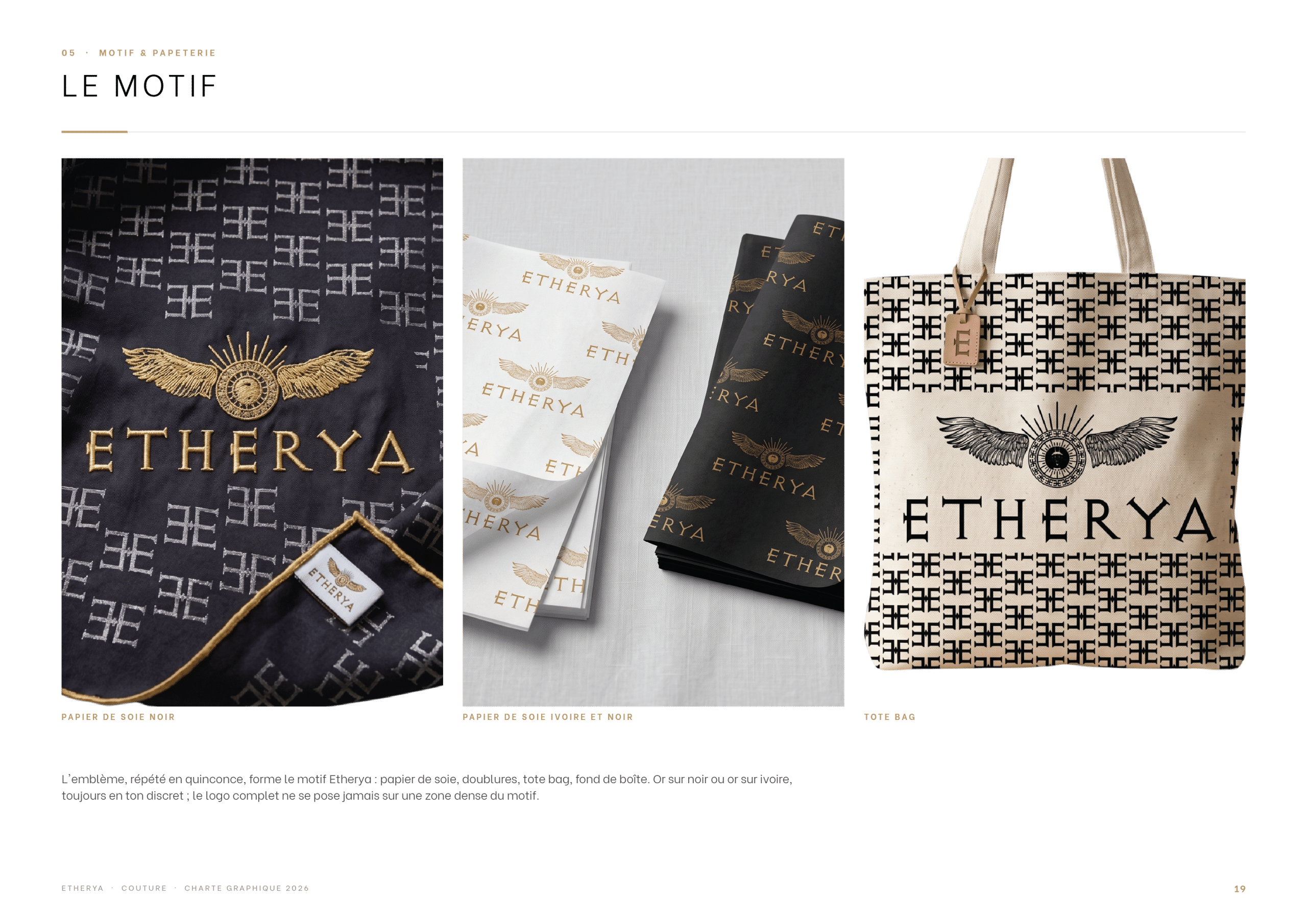
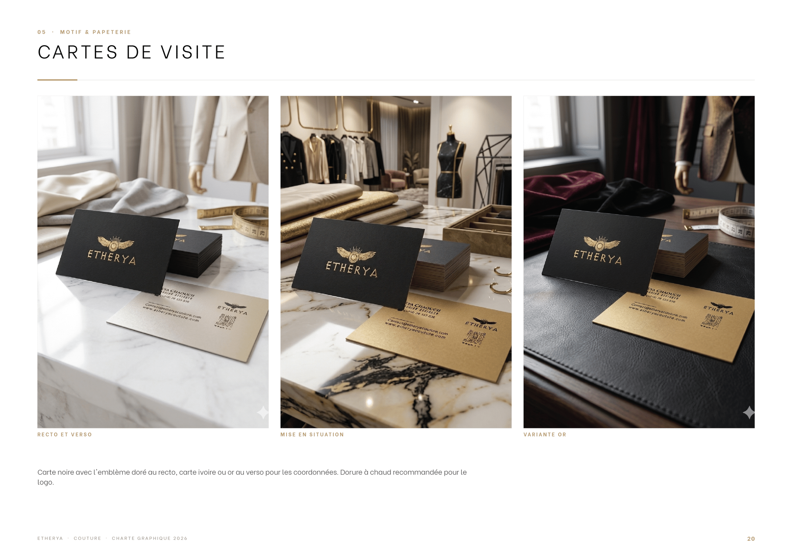
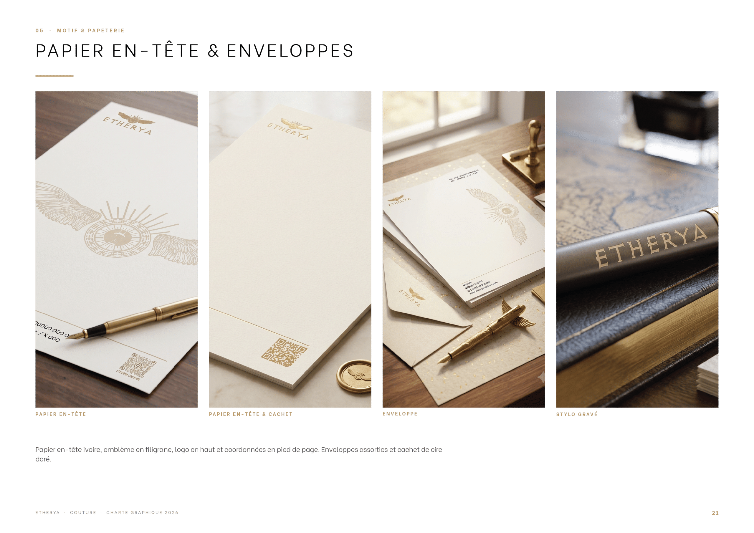
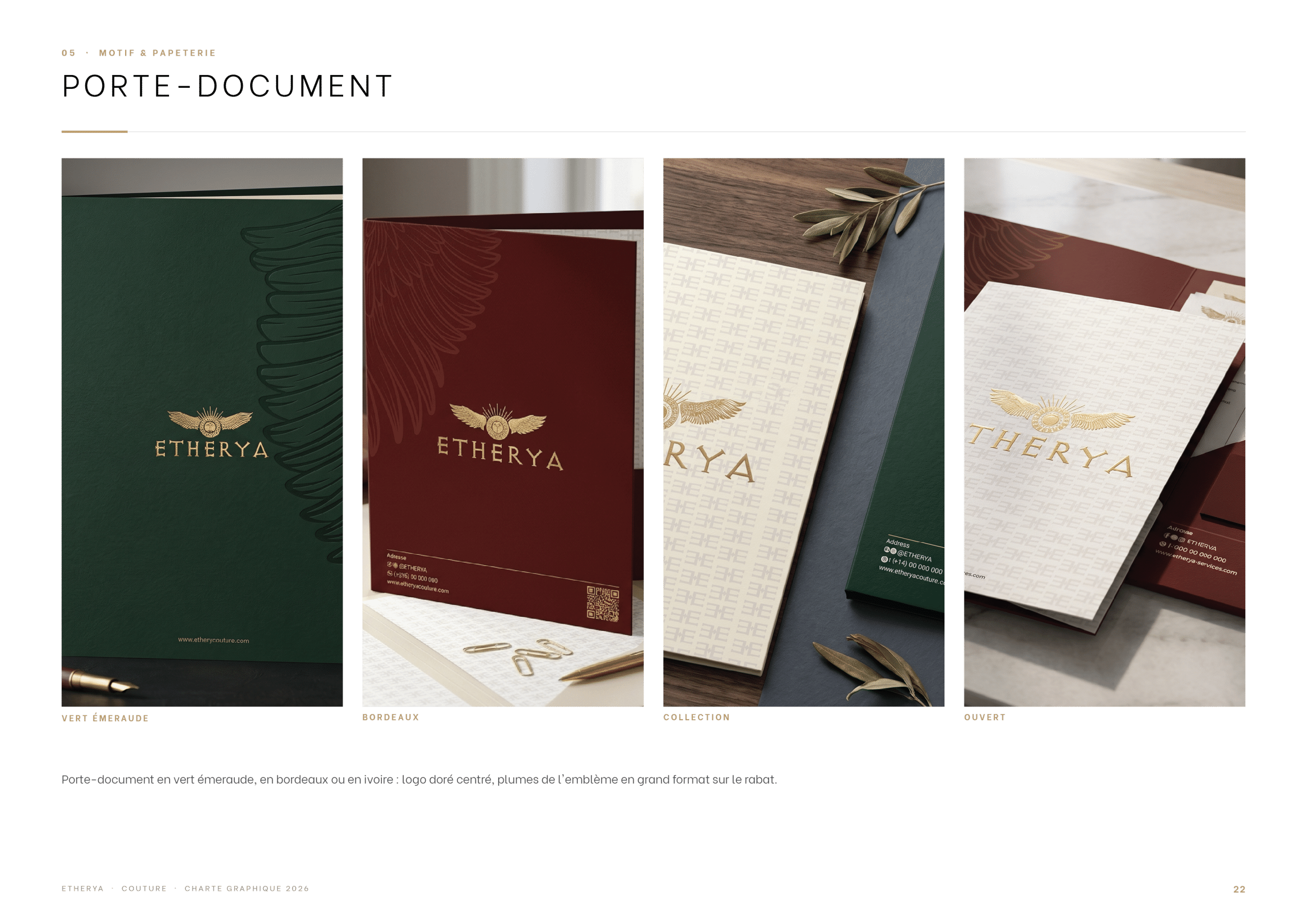
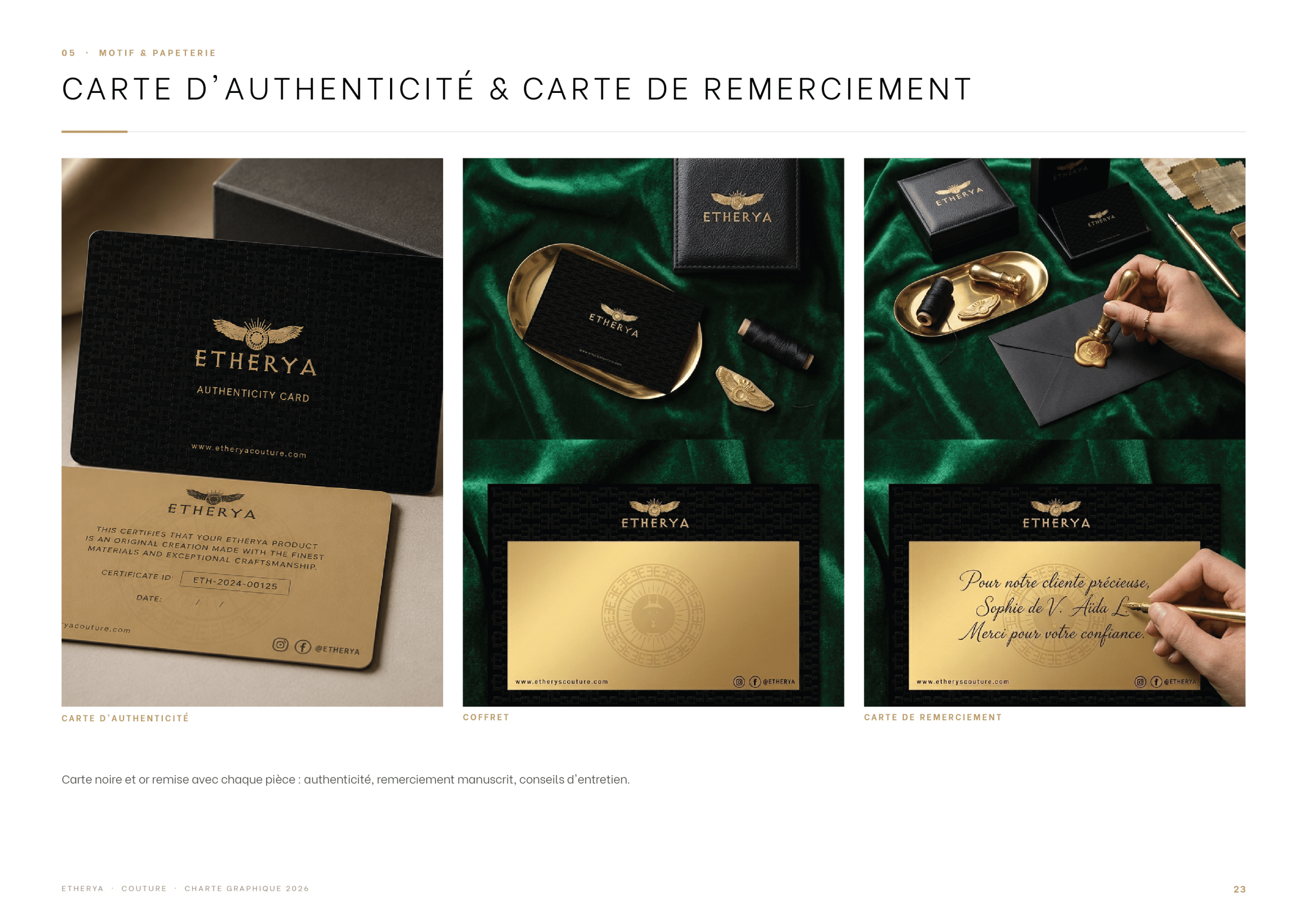
A monogram pattern derived from the emblem dresses the brand’s supports. It carries through the stationery: business cards, letterhead and envelopes, document folder, certificate of authenticity and thank-you card.
Packaging
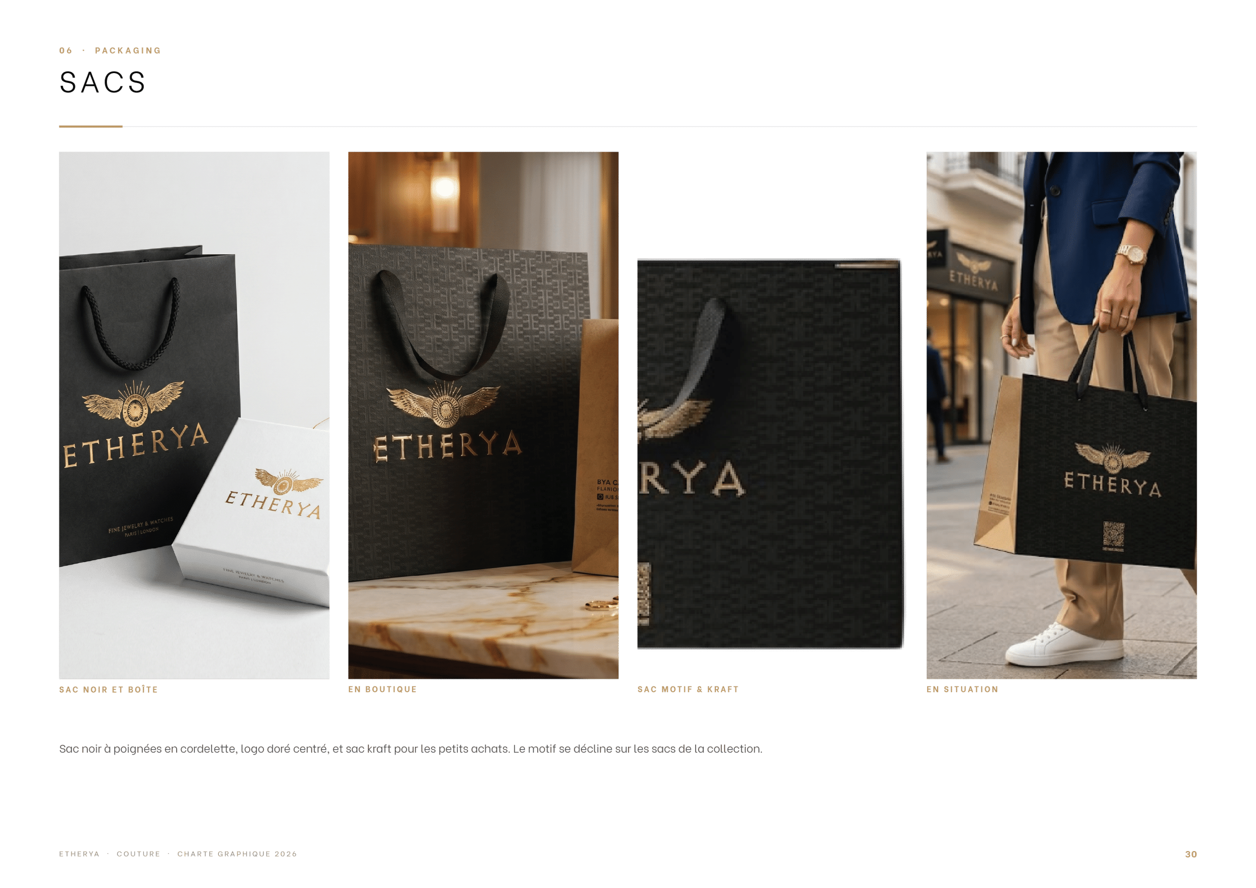
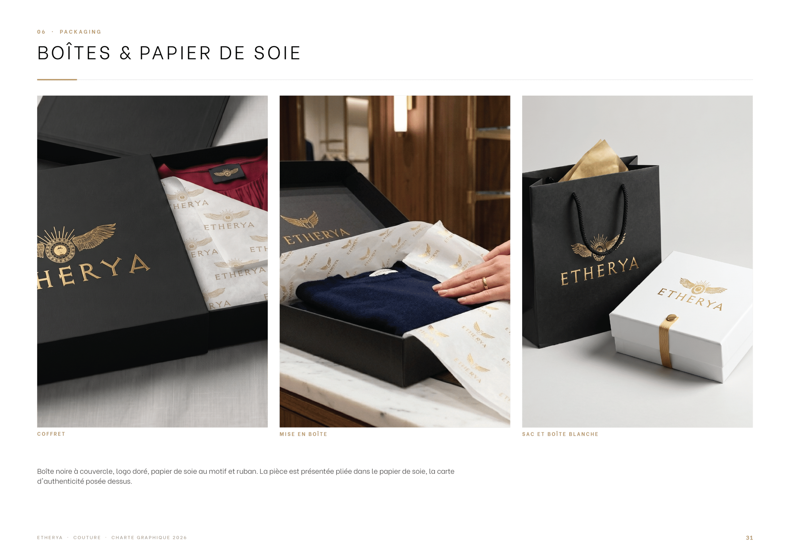
Shopping bags, gift boxes and tissue paper turn every purchase into a ceremony, in black and gold with the emblem as a seal.
Boutique, Uniforms & Communication
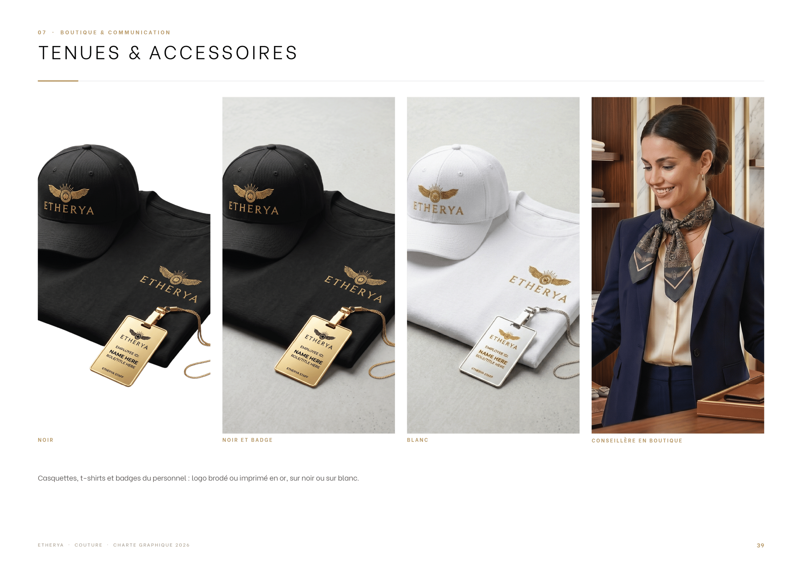
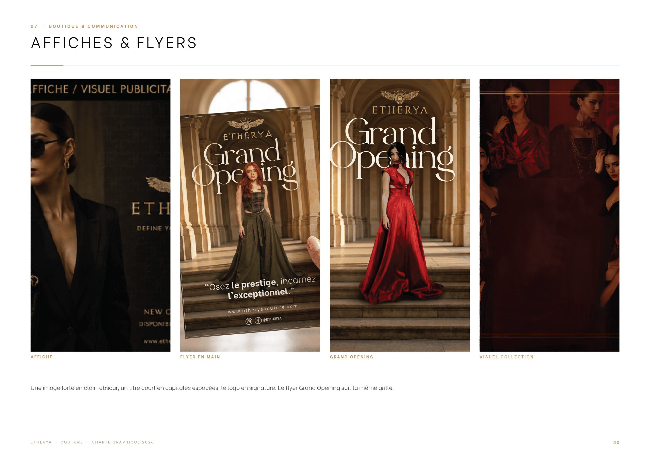
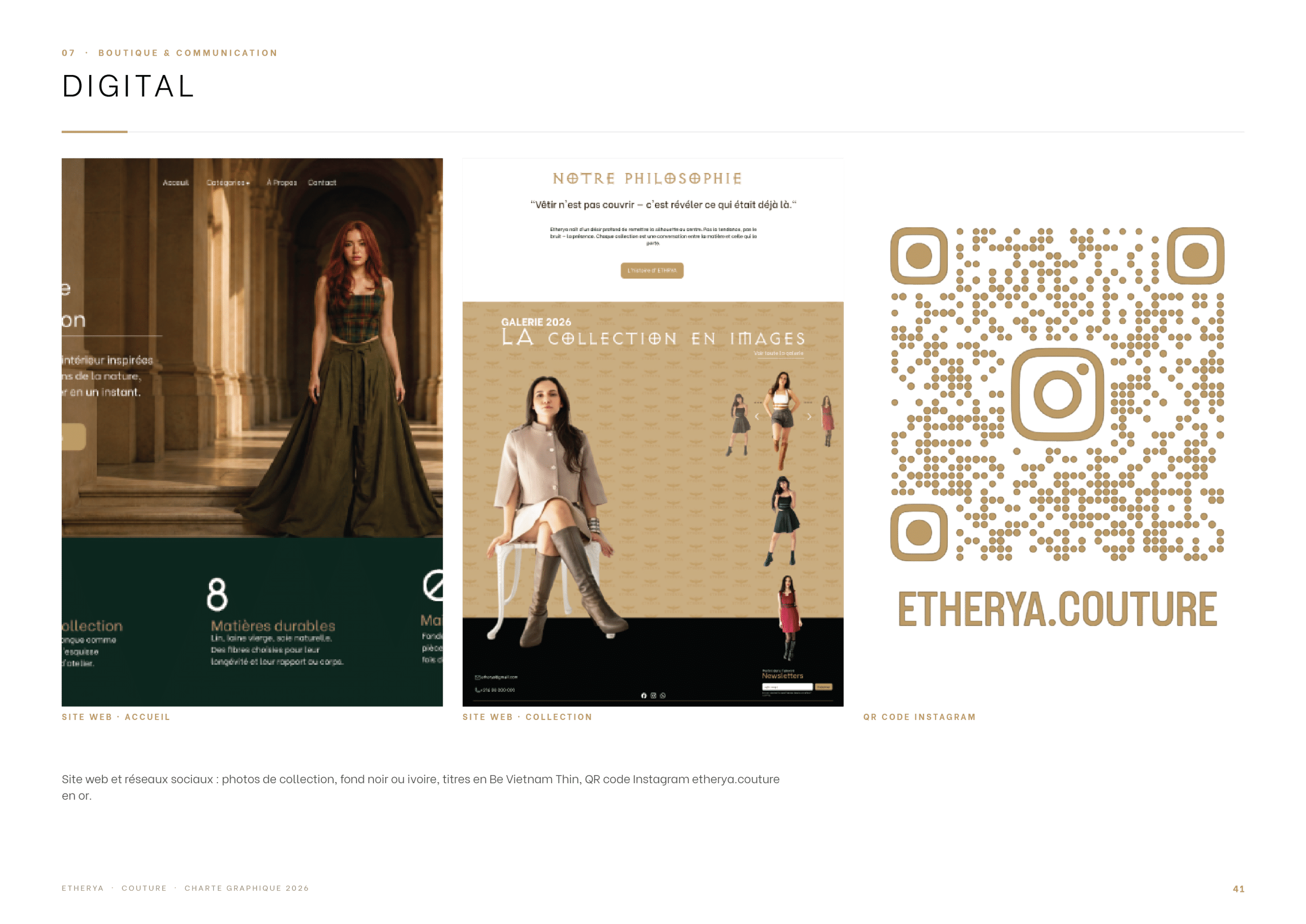
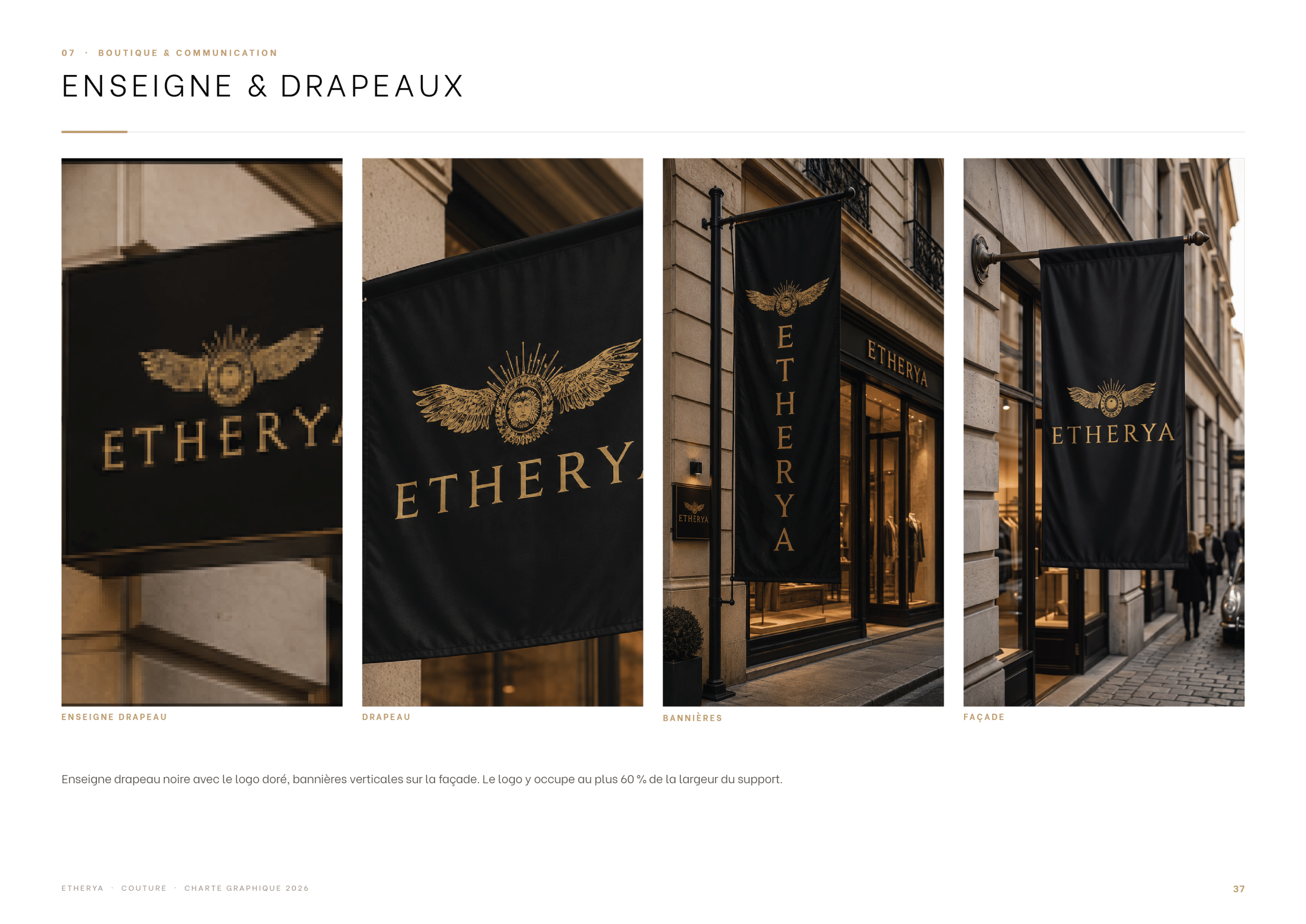
In the boutique, the identity extends to the shop window, the staff outfits and accessories, then to posters, flyers and digital communication.